2021 Summer of Math Exposition results
Based on 3Blue1Brown's video on YouTube. If you like this content, support the original creators by watching, liking and subscribing to their content.
The contest’s rules were intentionally broad: any math topic, audience, or format was acceptable as long as the work explained math.
Briefing
A math-explainer contest that drew more than 1,200 submissions has produced a standout set of five winners—chosen not for polish, but for clarity, empathy, and genuinely useful mathematical insight. The event’s core idea was deliberately open-ended: any math topic, any audience, any format, as long as the work explains math. Cash prizes were added by Brilliant, but the organizer stressed that “winning” is a misnomer; the real success is expanding the amount of math material online that helps people learn and stay curious.
Selection began with peer review to narrow the field to a little over 100 entries for close review, then used about half a dozen guest judges to refine the final choices and reduce the impact of personal preferences. The organizer framed the contest’s structure—clear deadlines and small stakes—as a way to counter perfectionism and stagnation. Still, the emphasis remained on long-term value: ten years from now, arbitrary winner lists won’t matter, but the explainers themselves can keep helping learners.
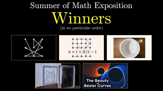
The five featured winners highlight a range of approaches to mathematical exposition. Paralogical’s entry starts with a practical puzzle—why light reflected at the bottom of a mug forms a cardioid-like shape—and builds the key concept of envelopes, using carefully chosen examples and a friendly tone. The post by Matt Ferraro focuses on light redirection through an acrylic square whose shadow reveals a deliberate image; it walks through the math and algorithms behind the design, including false starts, while guiding readers toward what matters most.
Freya Homare’s “The Beauty of Bézier Curves” was a special case: it’s visually polished, but the selection rationale was that the graphics serve the math. The emphasis is on motivating why Bézier curves matter, showing multiple facets of how they’re used, and delivering clean intuitions rather than aesthetic flourishes. Another pick, “the most complicated passcode” video, turns a seemingly silly question about swipe-pattern phone locks into a rigorous problem-solving story that threads in number theory, induction, and the habit of generalizing after solving subproblems.
The final winner is a geometry proof of Pick’s theorem that multiple guest judges flagged as both clever and underappreciated. Beyond the proof itself, it reflects on what different kinds of proofs do for learners and teachers—arguing for staying power through ideas rather than production value.
Even with five winners, the organizer called the choice “absurdity,” pointing to many other entries that deserved attention. Additional favorites include an animated deep dive into Dehn twist/4D-sphere connections via Durock’s belt trick, a long explanation of the unsolvability of the quintic, and a wide spread of topics—from the two-envelope problem and Buffon’s needle to interactive pieces, Babylonian multiplication, and narrative-driven explainers like multiple entries on Hackenbush. The takeaway is less about a trophy list and more about a curated roadmap to hours of math learning, discovery, and delight—especially for underseen creators.
Cornell Notes
More than 1,200 math-explainer submissions were narrowed through peer review and guest judging to select five featured winners. The contest was intentionally open-ended—any math topic, audience, or format—because the goal was to increase the amount of engaging, empathetic math content online. The organizer warned against treating “winning” as the point: long-term educational value matters more than arbitrary selections. The five picks emphasize different strengths: envelope-based optics (mug light), algorithmic design for light redirection (acrylic square), Bézier curves with motivated intuition, a passcode puzzle turned rigorous via number theory and induction, and a memorable Pick’s theorem proof with thoughtful commentary on proof styles. Many additional entries were also praised as hidden gems, encouraging viewers to explore the full playlist and blog archive.
Why did the contest treat “winning” as secondary to educational impact?
How were submissions filtered before final picks were chosen?
What mathematical idea anchors Paralogical’s mug-light explanation?
What makes Matt Ferraro’s acrylic-square project stand out as an explainer?
How does the passcode video turn a casual question into real math?
What is the significance of the Pick’s theorem proof selection?
Review Questions
- Which contest design choices (scope, stakes, deadlines, judging process) were intended to change creator behavior, and how?
- Pick one featured explainer and identify the specific mathematical concept it centers (envelopes, Bézier curves, Pick’s theorem, etc.). What teaching technique does it use to make that concept feel motivated?
- Why does the organizer argue that long-term educational value outweighs the importance of being named a winner?
Key Points
- 1
The contest’s rules were intentionally broad: any math topic, audience, or format was acceptable as long as the work explained math.
- 2
Peer review reduced 1,200+ submissions to a little over 100, followed by guest judges to refine final selections.
- 3
Cash prizes from Brilliant existed, but the organizer emphasized that “winning” is a poor proxy for success.
- 4
The five featured explainers were chosen for clarity, empathy, and motivated mathematical insight—not for production polish alone.
- 5
Paralogical’s mug-light puzzle uses the math of envelopes to connect a visual pattern to a structured curve family.
- 6
Matt Ferraro’s acrylic-square project demonstrates how algorithms and iterative design can redirect light so a shadow encodes an intended image.
- 7
Beyond the winners, many additional entries were praised as underappreciated, with viewers encouraged to explore the full playlist and blog archive.