A Better Way To Picture Atoms
Based on minutephysics's video on YouTube. If you like this content, support the original creators by watching, liking and subscribing to their content.
Atomic orbitals should be visualized as wavefunction-based probability patterns, not as literal paths electrons travel.
Briefing
Atomic orbitals have long been depicted either as friendly cartoons that hide the real physics or as fuzzy “cloud” art that looks accurate but doesn’t clearly connect to what an electron is doing. The core fix offered here is a new way to picture the electron’s quantum state: treat the wavefunction as something like a fluid and the electron as a tiny speck moving through it, then use the actual mathematics of that wave to generate 3D visuals.
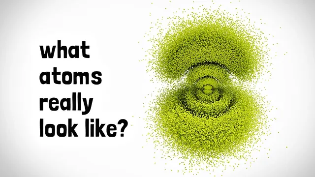
Instead of implying that electrons travel along paths, the visuals represent a single electron’s wavefunction. The “dots” in the renderings are not separate particles; they mark all the possible locations the electron could occupy. Where the dot density is higher, the probability of finding the electron is higher. That probability structure is what orbitals really are—spatial patterns tied to the wavefunction—so the images aim to make those patterns feel intuitive in the same way a solar-system diagram can be both simplified and still faithful to orbital relationships.
Energy and size follow directly from the quantum state. Orbitals with more energy appear larger because the electron is more likely to be farther from the nucleus. The animation also conveys a kind of “flow” in the wavefunction: the motion of the dots corresponds to how the wavefunction evolves, and it aligns to an extent with the orbital’s angular momentum. The visuals are careful to avoid claiming these are electron trajectories; they are wavefunction renderings. A brief philosophical aside notes that only if one adopts Bohmian trajectories as physically real would the picture resemble actual paths.
The most striking payoff is how much structure emerges once the wavefunction is rendered in 3D. Ground-state hydrogen orbitals look compact and “cute,” while excited states become more elaborate and “majestic,” with clear patterns that feel like orbitals rather than decorative blobs. The approach also addresses why different orbital shapes look so different—why some resemble donuts and others look like other lobed forms—by tying those shapes to the underlying wavefunction rather than to artistic convention.
The transcript also clarifies two visual conventions used in the 3D art. First, the rainbow coloring corresponds to the wavefunction’s phase, which matters because phase controls how different wavefunctions interfere. Second, the motion in the renderings is used to represent that phase-related behavior in a way that can be seen.
Finally, for people who want a simpler cartoon that still respects atomic physics, a “MinutePhysics-approved” proposal is offered based on the three P orbitals: one oriented one way, one opposite, and a third perpendicular orientation. Because the electron’s direction in the sideways case can’t be pinned down the same way, the middle orbital is drawn without moving points and the perpendicular option is indicated with a dotted line and a question mark. Optional additions—one electron per orbital, or two with opposite spin—complete the simplified model. The result is a spectrum of representations: from rigorous wavefunction-based 3D renderings to a compact, physics-grounded cartoon for everyday intuition.
Cornell Notes
The transcript argues that atomic orbitals become understandable when the electron’s wavefunction is visualized directly in 3D. The “dots” in the images do not represent separate electrons; they represent possible locations for a single electron, with higher dot density meaning higher probability. Higher-energy orbitals appear larger because the electron is more likely to be farther from the nucleus. The motion of dots depicts the wavefunction’s flow and relates to angular momentum, but it is not an electron trajectory (unless one adopts Bohmian trajectories). Rainbow colors encode the wavefunction’s phase, which controls interference between wavefunctions.
Why aren’t the dots in the orbital visuals separate electrons?
How does the visual size of an orbital connect to electron energy?
What does the motion of the dots mean, and what does it not mean?
What do the rainbow colors represent in the orbital images?
How does the simplified “P orbital” cartoon preserve physics better than generic atom cartoons?
Review Questions
- In these visuals, what quantity does dot density correspond to, and how does that relate to measuring electron position?
- How do phase and interference connect to the rainbow coloring used for orbitals?
- Why does the transcript insist that the moving dots are not electron trajectories, and what interpretation would change that?
Key Points
- 1
Atomic orbitals should be visualized as wavefunction-based probability patterns, not as literal paths electrons travel.
- 2
In the 3D renderings, dots represent possible electron locations for a single electron; higher dot density means higher probability.
- 3
Higher-energy orbitals appear larger because the electron is more likely to be farther from the nucleus.
- 4
The animation conveys wavefunction “flow” linked to angular momentum, but it does not depict electron trajectories.
- 5
Rainbow colors encode the wavefunction’s phase, which governs how wavefunctions interfere.
- 6
A simplified but physics-grounded cartoon can be built from the three P orbitals, including orientation uncertainty and optional spin-up/spin-down electrons.