A Defense of Comic Sans
Based on Vsauce's video on YouTube. If you like this content, support the original creators by watching, liking and subscribing to their content.
Typography is inseparable from communication because text always appears through a chosen typeface, even in everyday digital contexts.
Briefing
Comic Sans is widely mocked, but its real significance isn’t that it’s “good” in a traditional design sense—it’s that it became a mass-market gateway to typography. By putting a distinctive, readable font into the hands of millions of everyday users, it turned type from a specialist craft into something ordinary people could experiment with, publish with, and learn from.
The case starts with a basic reminder: writing is never “naked.” Even a simple comment on YouTube is delivered through someone else’s chosen typeface—Arial, for example—meaning communication always carries visual styling. That framing matters because typefaces function like clothing for letters, a metaphor echoed by designers such as Adrian Frutiger, who compared type design to dressmaking, and Alan Fletcher, who called a typeface “an alphabet in a straitjacket.” Type design has long been treated as both aesthetic and functional, with differences like serifs versus sans-serifs and “neutral” versus “silly” styles.
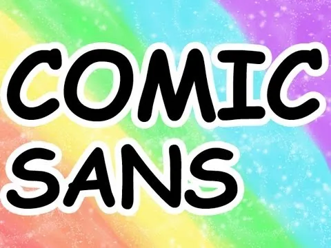
Comic Sans earns its reputation for being instantly recognizable and frequently misused, from casual cards to official contexts like a Canadian coin and even a gravestone. The backlash is so intense that it has spawned jokes, games, and sites dedicated to banning it. Yet the transcript argues the font’s popularity is partly a distribution problem: Comic Sans was designed in 1994 by Vincent Connare for a cartoon dog character in Microsoft Bob after a request attributed to Melinda Gates. Connare produced it quickly—within three days—drawing on hand-drawn comic-book letter styles. Although it didn’t land in the final Microsoft Bob release, it spread through Microsoft products, giving amateurs easy access to a typeface that once would have required specialized tools and expertise.
That mass access is where the defense sharpens. David Kadavy’s critique is acknowledged: Comic Sans is “unbalanced” and not well kerned, and it doesn’t match the precision of fonts like Trajan. It also isn’t “organic” handwriting; instead, it sits in an uncanny valley—almost human, but not quite. Still, the transcript points out that Comic Sans was designed for screens that were often aliased, and in that environment it can perform better than more traditional typefaces such as Garamond.
The deeper argument is cultural and educational. The British Dyslexia Association has recommended Comic Sans for children who struggle with reading because its letterforms—like the capital A—are easier to distinguish. And while overuse can make it look amateurish, the transcript reframes that as a sign of design literacy in progress: interchangeable type helped spread literacy after Gutenberg, and personal publishing with fonts like Comic Sans could similarly broaden public understanding of “type means more than words.” Even if it’s ugly, it’s ugly like early practice—evidence that people are learning to use powerful tools to make ideas legible and shareable.
Cornell Notes
Comic Sans is criticized for being ugly and often used in the wrong places, but its broader impact is more important than its design purity. Created in 1994 by Vincent Connare for Microsoft Bob’s cartoon dog (after a request attributed to Melinda Gates), it spread widely when Microsoft bundled it into many products. That distribution gave millions of non-experts access to typography, turning type design from a specialist craft into something everyday users could experiment with. The transcript also notes practical strengths: the British Dyslexia Association has recommended Comic Sans for children with dyslexia, and it can render well on aliased screens. Even with acknowledged flaws like poor balance and kerning, Comic Sans is framed as a stepping-stone toward design literacy.
Why does the transcript insist that typography is unavoidable, even in everyday writing?
What origin story is given for Comic Sans, and how did it become ubiquitous?
What are the main design criticisms of Comic Sans mentioned in the transcript?
How does the transcript defend Comic Sans on functional grounds?
What is the transcript’s “defense” beyond aesthetics—what does Comic Sans represent?
Review Questions
- What does the transcript claim about why people can’t avoid typography when they write or comment online?
- Which two functional arguments are used to justify Comic Sans despite design criticisms (one about reading/dyslexia and one about screen rendering)?
- How does the transcript connect the spread of Comic Sans to broader historical shifts in literacy and design literacy?
Key Points
- 1
Typography is inseparable from communication because text always appears through a chosen typeface, even in everyday digital contexts.
- 2
Comic Sans was created in 1994 by Vincent Connare for Microsoft Bob’s cartoon dog, after a request attributed to Melinda Gates, and it spread through Microsoft product bundling.
- 3
The font’s widespread misuse—on items like coins and gravestones—helps explain its intense public backlash.
- 4
Critics such as David Kadavy point to design weaknesses like poor balance and weak kerning, and some argue it sits in an uncanny valley rather than resembling real handwriting.
- 5
Practical defenses include recommendations from the British Dyslexia Association for children with dyslexia and better performance on aliased screens compared with fonts like Garamond.
- 6
The transcript frames Comic Sans as a gateway to design literacy: mass access to fonts lets non-experts learn by using type tools in real publishing.
- 7
Overuse can look amateurish, but it can also reflect people practicing with powerful design tools to make ideas legible and shareable.