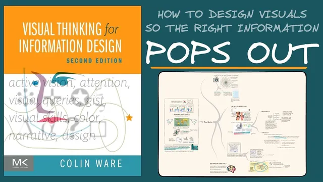
Book Review: Visual Thinking for Information Design
Based on Zsolt's Visual Personal Knowledge Management's video on YouTube. If you like this content, support the original creators by watching, liking and subscribing to their content.
Design visuals to match the audience’s mental models by providing clear reference points for fast orientation.
Briefing
“Visual Thinking for Information Design” frames seeing as an active, goal-driven process shaped by what people already know. The central takeaway is that effective diagrams and slides don’t just “present” information—they guide attention through a tight feedback loop between internal mental models and external visual cues. That matters because most communication failures in charts, interfaces, and teaching materials come down to mismatched expectations: audiences search for familiar reference points, and if the layout or visual encoding doesn’t support their search strategy, key information becomes hard to find.
The book’s starting point is a “dance” between internal and external information. On one side is bottom-up processing: the visual system rapidly extracts features, detects patterns, identifies objects, and binds them into meaningful units. On the other side is top-down processing: attention is steered by objectives and “visual queries,” so the viewer plans eye movements and selectively samples what matters. Together, these mechanisms determine what stands out, what gets ignored, and how quickly someone can orient themselves in a visual scene.
A major concept underpinning this is predictive cognition. Memories function less like a replay of the past and more like predictive models that prepare the brain for likely next actions. When someone enters a supermarket or reads a map, the brain immediately applies a mental model of how such spaces usually work—helping the viewer locate items quickly. If the environment violates those learned expectations, frustration follows. For information design, the implication is practical: designers must anticipate the mental models their audience brings and build visuals that provide clear reference points so viewers can orient themselves and complete their tasks without getting lost.
The transcript also emphasizes why some elements pop out while others require effort. Early feature processing is described as fast, automatic, and relatively uniform—meaning certain visual differences are detected before conscious search begins. The classic “P vs Q” example illustrates this: P-like targets are easier to locate because they exploit pop-out effects driven by visual distances such as contrast and shape/color differences. Q-like targets, by contrast, blend into the surrounding feature landscape and demand more deliberate scanning.
To make those effects designable, the book uses the idea of feature spaces: objects can be clustered (or not) across dimensions like color and size. When a target sits far from the cluster of distractors in one or more feature dimensions, it becomes more salient. Designers can strengthen search by combining multiple dimensions—so the target is separated in several ways at once.
Finally, the transcript links these mechanics to a broader philosophy: graphic design acts as a cognitive tool. By placing ideas in spatial layouts—like a whiteboard—people gain “detachment,” enabling reflection that memory alone can’t provide. Visual thinking then becomes a strategy for solving problems through pattern finding, where the tool makes the solution easier to access than trying to hold everything in working memory. The practical design guidance ends up being a search strategy: first locate multiscale structure (title, legend, major regions), then use subsequent glances to extract the details.
Cornell Notes
“Visual Thinking for Information Design” treats seeing as an active process driven by a loop between internal mental models and external visual cues. Bottom-up processing extracts features and patterns automatically, while top-down attention uses objectives (“visual queries”) to guide eye movements and selective sampling. Predictive cognition explains why audiences expect certain layouts: memories act as predictive models that help people orient quickly, and mismatches create frustration. Salience and search difficulty depend heavily on early feature processing—targets pop out when they are separated from distractors in feature space (e.g., strong color/shape/contrast differences), while harder-to-find elements blend into clusters. The design implication is to build visuals that support fast orientation and multistage search (structure first, details next).
What does “seeing” mean in this framework, and how do internal and external information interact?
Why does predictive cognition matter for information design?
Why are some targets easy to find (like “P”) while others are harder (like “Q”)?
How do “feature spaces” explain pop-out and clustering?
What is the multiscale search strategy for designing visuals?
How does “graphic design as a cognitive tool” connect to active vision and pattern finding?
Review Questions
- How do bottom-up feature processing and top-down attention jointly determine what a viewer notices first?
- In what ways can predictive cognition fail during visualization design, and how would you correct for it?
- What design choices increase pop-out according to feature-space clustering and visual distance?
Key Points
- 1
Design visuals to match the audience’s mental models by providing clear reference points for fast orientation.
- 2
Treat seeing as an interaction between bottom-up feature extraction and top-down, goal-driven attention guided by visual queries.
- 3
Use predictive cognition to anticipate where viewers expect structure, and redesign when the layout violates those expectations.
- 4
Exploit pop-out effects by increasing visual distance (contrast, shape, gray value, color) between targets and distractors.
- 5
Model salience using feature spaces: targets stand out when they are separated from distractor clusters across one or more dimensions.
- 6
Strengthen search by designing multiscale structure—make titles, legends, and major regions easy to find before details are read.
- 7
Use spatial tools (like whiteboards) to gain detachment and support reflection beyond what working memory can manage.