Build a Year Map and Finally Be Prepared
Based on Linking Your Thinking with Nick Milo's video on YouTube. If you like this content, support the original creators by watching, liking and subscribing to their content.
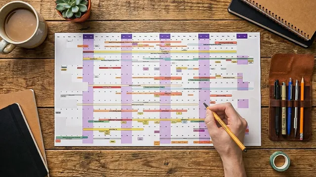
A linear calendar shows the entire year in one view, replacing day/week/month boxes with a connected “shape of the year” perspective.
Briefing
A linear calendar is a single-page (or single-canvas) view of an entire year that replaces the usual day-by-day grind with a “shape of the year” perspective—so people can spot patterns, manage energy, and remember what the year actually felt like. Instead of getting trapped in daily, weekly, or monthly boxes, this approach lays every month as a row and every day as a cell, letting events appear as single dates or as ranges that stretch across weeks. The result is clarity: commitments stop feeling like an endless stream and start looking like a connected system.
That year-at-a-glance view delivers three practical benefits. First is context. When the whole year sits in front of you, the brain shifts from “what can I fit in?” to “how does the year flow?”—making it easier to see how workshops, travel, and writing periods connect. Second is better energy management. Clusters become visible: multiple high-intensity commitments landing close together can be identified early, preventing burnout before it happens. Third is a record of lived experience. A monthly calendar often fails to capture emotional hindsight, but a zoomed-out annual map becomes a reminder of the year’s emotional journey—something people can revisit on a computer or as a physical artifact.
Building one starts with layering information, not just filling squares. People should add life events (anniversaries, travel, vacations, birthdays), then obligations (work commitments, deadlines, projects), and finally “sneaky efforts”—ongoing initiatives that consume mental bandwidth even without a specific deadline. Extended trips and busy seasons should be drawn as ranges, not forced into single-day markers. The system can also be customized with personal milestones or reflections.
Once the calendar is populated, the method becomes a planning and decision tool. Color-code categories so imbalances pop visually (for example, workshops in yellow, sabbaticals in gray, big launches in red on a team calendar). Then look for two kinds of risk patterns: vertical clusters (stacked commitments that can overload energy) and horizontal chains (long sequences with no recovery time). The calendar also acts as a reality check for priorities—if family time is a stated value but no events reflect it, the mismatch becomes obvious.
The transcript lays out three ways to implement the linear calendar. A digital version can be built in Miro for collaborative planning and quick adjustments in team meetings. A physical version—print sizes like 11×17 or 8.5×11—can be kept on a desk or folded into a notebook, creating fewer distractions and a tangible record, though it’s harder to collaborate and edit. A third option is Annukal, an app designed for linear calendars by Satoshi, featuring pre-populated entries, editable ranges and categories, notes on click, display controls like fading past events, and a standout ability to toggle categories on and off. It also supports Google account login, year switching, fiscal-year view, and optional Google Calendar sync—though the creator discourages importing every microscopic detail, arguing the point is to zoom out and manage life at a higher level.
Overall, the linear calendar is positioned as a preparation system: it helps people stop reacting to events as they happen and instead make space for what matters most, supported by an annual review process called “You and Review,” a two-hour reflection session plus course materials.
Cornell Notes
A linear calendar turns a whole year into one continuous map, making it easier to see patterns that normal day/week/month views hide. By laying months as rows and days as cells, people can place both single-date events and multi-week ranges, then layer life events, work obligations, and “sneaky efforts” that drain bandwidth even without deadlines. The payoff comes from three outcomes: context (the year’s flow), energy management (clusters and burnout risks), and a record of lived experience that supports reflection. Color-coding and scanning for vertical clusters and horizontal chains help reveal where priorities and recovery time are missing. Options include collaborative digital planning in Miro, a printable physical artifact, or the Annukal app with category toggles and optional Google sync.
How does a linear calendar differ from a traditional monthly calendar, and why does that change behavior?
What three layers should be added to make the calendar useful for real life planning?
What are the two main burnout warning patterns to look for on a linear calendar?
How do color-coding and priority checks turn the calendar into a values tool?
What are the three implementation options, and what tradeoffs come with each?
Review Questions
- What specific “sneaky efforts” in your life consume bandwidth without deadlines, and how would you represent them as ranges on a linear calendar?
- When you scan a year map, how would you distinguish a vertical cluster risk from a horizontal chain risk, and what action would you take for each?
- Which category colors (work, personal, travel, recovery) would make priority mismatches easiest to spot for you, and why?
Key Points
- 1
A linear calendar shows the entire year in one view, replacing day/week/month boxes with a connected “shape of the year” perspective.
- 2
Events should be entered as both single dates and multi-week ranges to reflect reality, not just scheduling convenience.
- 3
Use three layers—life events, obligations, and “sneaky efforts”—so the calendar captures both deadlines and ongoing mental bandwidth.
- 4
Color-code categories to make imbalances visible and to speed up pattern detection across the year.
- 5
Scan for burnout risks by identifying both vertical clusters (stacked intensity) and horizontal chains (no recovery time).
- 6
Treat the calendar as a values audit: compare stated priorities against what actually appears on the map.
- 7
Choose an implementation that matches your needs: collaborative planning in Miro, reflective artifact planning via print, or category-toggling and editing in Annukal.