Complete Guide to Notion Layouts?! | The Best New Feature!
Based on The Organized Notebook's video on YouTube. If you like this content, support the original creators by watching, liking and subscribing to their content.
Notion layouts are configured at the database level, so changes become the default for every page inside that database.
Briefing
Notion’s new database “layouts” feature lets users redesign how database properties and content appear on every page—turning a cluttered template into a structured, purpose-built dashboard. The biggest practical shift is that layouts are configured at the database level: once a layout is customized, it becomes the default look for every page inside that database, so teams and personal workflows can stay consistent without reformatting each entry.
Accessing the feature starts with a database. Inside a database page, users can open layout settings via “Customize layout” (for example, after creating or inserting an inline database). From there, the layout controls are organized around page-level presentation and property placement. In “Page settings,” users can switch comment density between inline comments and minimal comments, toggle page discussions on or off, and—one of the more notable changes—turn off property icons entirely. That last option matters because it reduces visual noise and makes dense templates easier to scan.
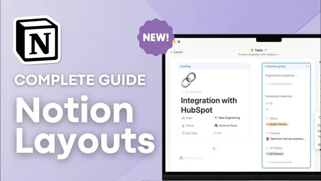
The layout builder also supports “pinning” up to four properties so key fields sit directly under the page title. In a personal finance example, pinning the date demonstrates how critical metadata can remain visible while other properties move lower in the page hierarchy. Beyond pinning, the builder introduces “property groups” (the container that holds properties in the layout). While the main group itself can’t be deleted, properties can be shown or hidden, and users can reorganize what appears where.
A major new capability is sectioning. Users can add sections to cluster related properties—such as keeping budget-related formulas together while surfacing “Key info” fields like budget graph, expenses due, expenses paid, and income. The layout can also treat single properties as standalone blocks, with size options (large or small). This helps long property names display fully and allows prominent visuals—like a budget graph—to appear bigger than in older, more constrained layouts. Notes and files/media benefit particularly from this approach, since they can be given dedicated space rather than squeezed into a small header area.
Relations require extra attention. Relations can appear as a “relations group” in the new layout system, but returning to the older “minimal” relation view takes additional steps: converting between section and relations group, then toggling each relation’s display mode (e.g., showing as minimal when desired). Finally, the “add to panel” option provides a decluttering mechanism by moving selected property groups or individual properties into a sidebar-style panel. The result is a cleaner main page while still keeping less-used details accessible.
Best practices emphasized include using the sidebar/panel for what shouldn’t be immediately visible, pinning high-value fields (like tags) at the top, grouping files and media so images render larger, and sectioning or hiding formula-heavy properties so users understand what’s important at a glance versus what’s informational background.
Cornell Notes
Notion’s new database layouts let users redesign how properties and content appear on every page in a database, using a layout builder that controls page settings, pinned fields, grouping, sections, and sidebar panels. Key upgrades include turning off property icons, pinning up to four properties under the title, and adding sections to cluster related fields (e.g., “Key info” vs. “Formulas”). Single-property blocks can be displayed larger, which helps long property names and makes elements like budget graphs, notes, and files/media more readable. Relations are handled differently now: converting between section and relations group may be required to get back to a minimal relation view. The overall payoff is a cleaner, more intentional template that reduces clutter while keeping important data prominent.
How does a customized Notion layout apply across a database, and why does that matter for templates?
What are the main page-level settings that affect readability in the new layout builder?
What does pinning do in layouts, and what constraint should users plan around?
How do sections and single-property blocks change how properties are organized on a page?
Why are relations tricky in the new layouts, and what steps are needed to regain a minimal relation view?
How does the “add to panel” feature help declutter pages, and what limitation was noted?
Review Questions
- What are the differences between inline comments and minimal comments in layout page settings, and where are those options found?
- How would you design a layout for a database with many formula properties so users know what to focus on first?
- What workflow would you follow to switch a relation from a relations group back to a minimal view in the new layout builder?
Key Points
- 1
Notion layouts are configured at the database level, so changes become the default for every page inside that database.
- 2
Page settings include comment density, page discussion visibility, and the ability to turn off property icons for a cleaner look.
- 3
Users can pin up to four properties so the most important fields stay directly under the page title.
- 4
Sections and single-property blocks enable clearer information architecture, including larger displays for graphs, notes, and files/media.
- 5
Relations require additional conversion steps to switch between relations group and minimal relation views.
- 6
The “add to panel” option declutters the main page by moving less-used properties into a sidebar panel, though relations may not behave the same way.