Debunking Visual Myths: What science says and how to leverage it for better PKM
Based on Zsolt's Visual Personal Knowledge Management's video on YouTube. If you like this content, support the original creators by watching, liking and subscribing to their content.
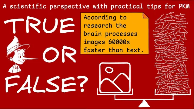
Only the ~13-millisecond image-processing claim is tied to a specific, repeatable research paper; many other popular percentages lack rigorous support.
Briefing
A cluster of popular “visual superiority” claims—like people processing images tens of thousands of times faster than text or remembering most information from what they see—doesn’t hold up under scrutiny. The only widely cited number in the set that traces cleanly to repeatable research is a specific timing estimate: it takes about 13 milliseconds for the brain to process an image. Other headline percentages (including “90% visual” and “80% remembered from seeing”) trace back to older training-industry charts and vague secondary sources, with the trail going cold and no clear experimental basis.
That debunking matters because it changes how people should design knowledge systems. Even if visuals aren’t inherently “better” by default, they can still be powerful when used with intent—especially in PKM (personal knowledge management) workflows that rely on retrieval, understanding, and synthesis. The takeaway isn’t “ignore visuals,” but “stop treating visuals as magic backed by dubious statistics.”
The practical pivot comes through an article on the syntactic theory of visual communication by Paul Martin Lester. The argument starts with a cultural mismatch: education often treats pictures as secondary to text, even though modern life is increasingly visually mediated. From there, Lester challenges the idea that pictures are simply “nonverbal” by proposing that images can carry structured meaning—though not in the same sequential, word-order way as language.
Lester’s core distinction is between pictures as presentational (holistic, taken in at once) versus text as discursive (narrative, sequential). He also argues that pictures lack an established “visual alphabet” and recognized syntax in the strict linguistic sense—yet they still rely on conventions, component recognition, and semiotic rules. References in the discussion point to how humans recognize objects from parts (via “geons,” basic shape-like components) and how meaning emerges when signs are combined and interpreted by viewers.
A key semiotics thread ties visuals to a broader communication model: a single sign doesn’t convey meaning by itself; meaning depends on other signs. In practice, that’s why a newspaper layout works when the front-page photo, caption, headline, and story form a coordinated reading path. The synthesis of words and images is described as complementary—text can “load” an image with cultural and moral context, while images can communicate ideas that would take many words.
From Lester’s syntactic theory, the discussion distills six PKM-oriented takeaways. Visuals and text should reinforce each other through deliberate design and tight alignment between titles, captions, and diagrams. Images function as compression: they can condense complex concepts into “atomic” units that later get rearranged into new narratives. Verbalization—turning visuals into captions or summary sentences—strengthens recall. Finally, illustration is framed as a method for converting abstract ideas into concrete representations, and the overall recommendation is to invest in learning illustration as a high-leverage skill rather than relying on text-only study habits.
Cornell Notes
Popular claims that visuals are processed dramatically faster than text and that people remember most information from seeing it lack solid research support. The one timing figure that does map to repeatable work is an image-processing estimate of about 13 milliseconds; other percentages trace to older charts and secondary sources without clear experimental backing. The discussion then uses Paul Martin Lester’s syntactic theory of visual communication to argue that pictures can carry structured meaning, even if they don’t function like text with word order. For PKM, the practical move is deliberate design: align visuals with captions and titles, use images as compression units for synthesis, and verbalize what the visual means to strengthen recall. The result is a workflow where words and images complement each other rather than compete.
Which “visual superiority” statistics are credible, and which look like folk wisdom?
Why does the discussion insist that visuals still matter even if the big percentages are wrong?
What does “presentational vs discursive” mean for how pictures and text are processed?
How does semiotics explain why a picture alone may not communicate meaning?
What are the six practical PKM takeaways for using visuals effectively?
What role does “verbalization” play in making visuals stick?
Review Questions
- Which of the “visual superiority” claims has a clear research trail, and what is the specific figure?
- How do presentational and discursive systems differ, and why does that matter for designing notes?
- What does “compression” mean in the context of using atomic illustrations for PKM synthesis?
Key Points
- 1
Only the ~13-millisecond image-processing claim is tied to a specific, repeatable research paper; many other popular percentages lack rigorous support.
- 2
Treat visual claims as design guidance, not as proof that visuals automatically outperform text.
- 3
Use deliberate alignment between visuals and their verbal elements (titles, captions, and summary sentences) to improve coherence and recall.
- 4
Build “atomic” illustrations of ideas so they can be rearranged into new narratives for higher-level synthesis.
- 5
Pair images with verbalization to turn a visual into an accessible memory cue rather than a standalone decoration.
- 6
Illustration is framed as a practical method for converting abstract concepts into concrete representations that are easier to remember.
- 7
Investing in illustration skills can be a high-leverage alternative to relying solely on writing-focused learning.