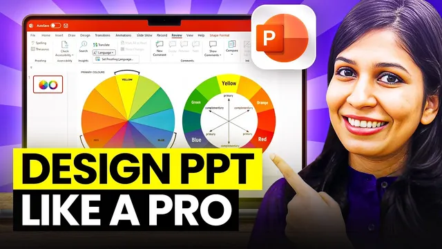
Design PPT Like a Pro | Perfect Color Schemes for Presentations
Based on WiseUp Communications's video on YouTube. If you like this content, support the original creators by watching, liking and subscribing to their content.
Start by identifying what the presentation represents; when it’s brand- or institution-based, build the palette from the logo’s colors.
Briefing
A strong, consistent color theme can make two otherwise identical slides look dramatically different—so the fastest route to a more professional presentation is building a tight palette (usually 3–4 colors) that stays faithful to brand or chosen hues. The core workflow starts by deciding what the presentation represents: if it’s tied to a company, college, or conference, the most reliable approach is to pull colors directly from the organization’s logo and build everything around those shades.
Once a logo is chosen, the next step is extracting exact color codes. Every color can be mapped to a hex code, and those hex values let designers reproduce the same tones across slides. The process shown uses imagecolorpicker.com: upload the logo, hover over key letters or shapes, and read the hex codes displayed for each color. In the example, the palette is derived from multiple blues found in the logo, including 02094D, 3E89FF, and 2963CF, plus an additional darker blue shade. If imagecolorpicker.com doesn’t work, the transcript suggests searching “get color code from image” on Google to find alternative tools.
With the hex codes in hand, the palette is assembled using coolers.co. After starting the generator, the method is to lock in the logo colors so they don’t drift, then use the generator’s suggestions (triggered by pressing the space bar) to produce complementary colors that work with the locked blues. Because palettes can easily become too busy, the guidance is to keep the final set to three or four colors. When the automatically suggested gray is too dark, the workflow uses “view shades” to pick a lighter gray that balances the blues. Another practical hack is to generate lighter shades of the same color by reusing a hex code and selecting a lighter variant, ensuring the palette remains cohesive.
To transfer the palette into PowerPoint, the transcript offers two options: screenshot the palette or use Windows’ Snipping Tool to capture the color swatches and paste them into a blank slide. Then, to apply colors precisely, shapes are filled using the Eyedropper tool: select a shape, open Shape Fill, choose the Eyedropper, and click the corresponding swatch color. Repeating this for each shade ensures the slide’s elements match the palette, and the “recent colors” feature can make future formatting faster.
If there’s no brand logo to extract colors from, the alternative is to use trending palettes from coolers.co—ranging from monochromatic schemes (single-color shade ranges) to multi-color themes (for example, combinations of blue and red). Other palette sources are also suggested, including colorhunt.co and color.adobe.com. The end goal is consistent, modern, and professional-looking slides that help a presentation stand out without relying on random color choices.
Cornell Notes
A professional look often comes down to using a consistent color theme—typically a palette of 3–4 colors. When a presentation represents a brand or institution, the most dependable method is extracting hex codes from the organization’s logo and building a palette around those exact shades. The workflow uses imagecolorpicker.com to read hex codes from the logo, then coolers.co to lock those colors and generate complementary options (with manual selection to keep the palette balanced). The palette can be pasted into PowerPoint using screenshots or the Windows Snipping Tool, and colors are applied precisely via the Eyedropper tool. If no logo exists, trending palettes from coolers.co, colorhunt.co, or color.adobe.com provide ready-made monochromatic or multi-color schemes.
Why does matching a slide’s colors to a logo matter, even when layout and content are identical?
How can someone extract exact colors from a logo instead of guessing?
What’s the recommended size of a presentation color palette, and why?
How does coolers.co help turn logo hex codes into a usable palette?
What are practical ways to bring the palette into PowerPoint and apply it accurately?
What if there’s no logo or brand to pull colors from?
Review Questions
- What steps convert a logo into a PowerPoint-ready color palette, and where do hex codes fit in?
- Why does the transcript recommend limiting palettes to 3–4 colors, and what problems arise when more colors are used?
- How can the Eyedropper tool and a pasted palette (via screenshot or Snipping Tool) speed up consistent formatting across multiple slides?
Key Points
- 1
Start by identifying what the presentation represents; when it’s brand- or institution-based, build the palette from the logo’s colors.
- 2
Extract exact hex codes from the logo using an image-to-hex tool like imagecolorpicker.com to avoid color guessing.
- 3
Create a palette with only 3–4 colors to keep slides professional and visually cohesive.
- 4
Use coolers.co to lock in logo colors, generate complementary shades, and manually adjust tones (e.g., choose lighter grays when needed).
- 5
Transfer the palette into PowerPoint via screenshot or Windows Snipping Tool so colors are available as swatches.
- 6
Apply colors precisely in PowerPoint using Shape Fill and the Eyedropper tool, and rely on “recent colors” for faster reuse.
- 7
If no logo exists, use curated trending palettes from coolers.co, colorhunt.co, or color.adobe.com as a shortcut to modern schemes.