Everything New in Obsidian! October 2025 (Groups, Summaries, List View)
Based on Linking Your Thinking with Nick Milo's video on YouTube. If you like this content, support the original creators by watching, liking and subscribing to their content.
Obsidian bases gain three major upgrades in October 2025: Group by, Table summaries, and List view.
Briefing
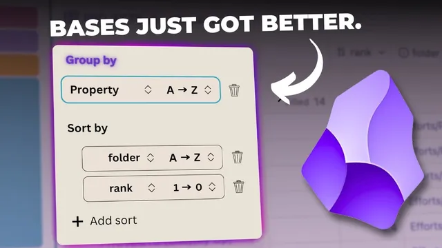
Obsidian’s October 2025 update adds a trio of base-focused features that make project dashboards far more actionable: grouping by properties, automatic table summaries per group, and a new list view that can display linked context without turning into a wall of text. The biggest practical payoff comes from combining “Group by” with “Table summaries.” Once projects are grouped by a field like status (e.g., active vs. simmering vs. sleeping) or any other property, each group gets its own summary row—while the table still shows overall totals. In the example shown, “filled” counts appear both per group (e.g., 14 filled within a group) and for the entire table (64 filled), giving a quick “where things stand” snapshot without manual counting.
The update’s “summarize” field expands what can be computed directly inside base tables. For numeric properties such as “rank,” Obsidian can calculate averages and a range of statistics—empty vs. filled counts, max/min, median, range, standard deviation, sum, and even the number of unique values. The workflow is interactive: switching the summary type changes the bottom-line metric for that column, and the same summary controls apply across different property columns (including file-name-like fields where the options differ). This turns bases into something closer to a lightweight reporting layer rather than just a static index.
Grouping itself is positioned as the fix for clutter. Without grouping, the projects list can become visually messy—especially when high-priority items appear in multiple “folders” or states. By grouping projects by folder, the interface creates clear separation between active work and background work (simmering and sleeping). That separation matters because it reduces confusion: a project with a high rank can still be seen as high rank, but its placement in the correct group makes it easier to decide what deserves attention now.
To make these setups reusable, the update also supports duplicating a configured view. After finding a grouping that works, the view can be duplicated from the Views area, renamed (e.g., “by folder”), and reordered or deleted later—so the best dashboard layouts don’t have to be rebuilt from memory.
The third major change, list view, replaces the old table/cards-only choice with a bullet-based layout where each project becomes its own line. The transcript emphasizes that list view only stays readable when the right properties are displayed—particularly “file links,” which can be turned off to reduce noise. With the right configuration, list view becomes a context tool: in a “nested” list, key properties indent under each project, and turning file links back on reveals what notes a project is linked to (and what links back to it) at a glance. Another highlighted list configuration uses an “up” property to show projects in the context of a shared parent area of effort—useful when multiple versions (like idea verse 1.0, 2.0, 2.5, and 3) all point upward to the same umbrella note.
Overall, the release is framed as a practical upgrade for managing projects: group data by meaningful properties, summarize it automatically, and choose a list layout that can either stay minimal or surface relationship context depending on what the user needs at the moment.
Cornell Notes
Obsidian’s October 2025 base update adds three features aimed at making project dashboards easier to scan and act on: Group by, Table summaries, and a new List view. Group by lets projects be separated visually by a chosen property (such as folder/state), preventing high-rank items from blending together. Table summaries then compute statistics per column, and—crucially—each group receives its own summary alongside overall totals. List view turns each project into a bullet (or numbered) line and can be configured to show or hide “file links” for readability. With nested lists and an “up” property, list view can also display relationship context and parent/umbrella structure at a glance.
How do “Group by” and “Table summaries” work together to improve decision-making in bases?
What kinds of summary calculations are available for numeric properties like “rank”?
Why does grouping by folder reduce confusion compared with a flat, ungrouped project table?
What makes list view readable, and what role does “file links” play?
How can nested list view and an “up” property be used to show context and hierarchy?
Review Questions
- When you group a base by a property and enable table summaries, what two levels of totals become visible at once?
- Which list view setting helps prevent “file links” from overwhelming the layout, and when might you turn file links back on?
- How does an “up” property change how projects are interpreted compared with listing them flat?
Key Points
- 1
Obsidian bases gain three major upgrades in October 2025: Group by, Table summaries, and List view.
- 2
Group by plus Table summaries provides both per-group metrics and overall totals in the same table.
- 3
Numeric properties (like “rank”) support rich summary options including average, max/min, median, range, standard deviation, sum, and unique counts.
- 4
Grouping by folder/state reduces confusion by separating active work from simmering and sleeping projects.
- 5
List view turns each project into a bullet or numbered line and can be tuned for readability by showing or hiding properties like “file links.”
- 6
Nested list view can surface relationship context by displaying file links directly under each project.
- 7
Duplicated views let users save a preferred grouping/list configuration (e.g., “by folder”) for reuse and reordering.