GPT 4 Got Upgraded - Code Interpreter (ft. Image Editing, MP4s, 3D Plots, Data Analytics and more!)
Based on AI Explained's video on YouTube. If you like this content, support the original creators by watching, liking and subscribing to their content.
Code Interpreter can ingest multiple file types (CSV, images, short videos) and auto-handle file-type detection before analysis begins.
Briefing
Code Interpreter turns GPT-4 into a hands-on data and media lab: upload files, ask for transformations or analysis, and get back working outputs—interactive charts, downloadable artifacts, even basic video edits—often with the underlying code and reasoning included. The most consequential shift isn’t the flashy visuals; it’s the ability to move from raw tables to new derived metrics and “unexpected insights,” then package results as files professionals can reuse.
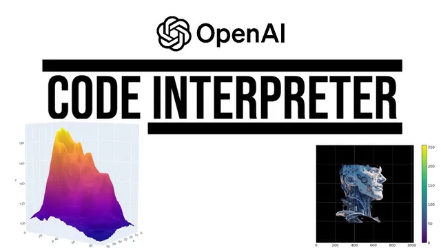
A typical workflow starts with uploading many file types (CSV, Word, images, short videos). The system auto-detects the file type, then runs a conversation around it. One early example uses a 3D surface plot based on a real contour map of a volcano in New Zealand. After generating a small plot, the user requests a natural-language change—“make it four times bigger”—and the output scales with improved lighting and shadows, demonstrating that the tool can iterate on visualization parameters rather than just produce a one-off chart.
From there, the transcript stacks capabilities that compound in usefulness. Code Interpreter can generate QR codes that scan to a specified URL, build 3D scatter plots from Gapminder data (median age across 100+ countries from 1950 projected to 2100), and improve readability through follow-up prompts—such as isolating the 30 most populous countries with distinct colors. It also supports interactive time-series charts with range sliders and selectors, letting users filter large datasets without manually writing plotting code.
The “game-changing” part arrives when the system performs analytics, not just visualization. Using a dataset called “median age years,” it computes global median age (a value not present in the original table), estimates it rising from about 22 years to over 38 years in 2023, and projects it continuing to roughly 44 years by 2100. It then attaches plausible explanations—rising life expectancy alongside declining fertility rates—and repeats the pattern for countries with the biggest increases (including hypotheses like youth emigration affecting Albania’s median age). The results are delivered as downloadable files, including a version of the dataset augmented with new insight columns.
Beyond charts, the tool reaches into media and workflow automation. Basic video editing appears in examples like rotating an MP4 180 degrees and creating a zoom-out effect from an image’s center, plus converting images to black and white. It can also create Sankey diagrams from a hypothetical recruiting funnel (231 applications → 32 phone interviews → 12 face-to-face interviews → 3 offers → 1 rejected offer). Other experiments include OCR on an image of a New York Times article (with mixed accuracy), generating tree maps of letter frequencies, producing radial bar plots and heat maps, and even creating a 256×256 MP4 that reveals a line over time.
The transcript also flags limitations and risks. Hallucinations show up in image recognition tasks—answers can reflect the file name rather than the actual scene. The system can be inconsistent with OCR and with tasks like text-to-speech. There’s also a steganography demo where a hidden “hello world” message is encoded into an image and decoded via Python—presented as harmless but raising concern about misuse as models improve.
Overall, Code Interpreter is portrayed as a near end-to-end pipeline: ingest data, compute new fields, generate interactive and downloadable outputs, and iterate quickly—while still requiring verification and careful prompting to avoid failures or incorrect details. The implication is that many industries built around analysis, reporting, and visualization may need to adapt rapidly as this workflow becomes widely available.
Cornell Notes
Code Interpreter upgrades GPT-4 from text-only help into a working environment where users upload files and receive real outputs: interactive plots, downloadable charts, and computed analytics. In the median-age dataset example, it derives new metrics (like global median age not present in the source table), projects trends to 2100, and supplies plausible explanations for why countries’ median ages change. It also generates QR codes, performs OCR (often but not always correctly), builds interactive time-series with sliders, and can do basic video/image edits such as rotating MP4s and converting images to black and white. The transcript emphasizes both the productivity jump—often in about a minute—and the need to verify results because errors and hallucinations still occur.
What makes Code Interpreter more than “pretty charts” in the transcript’s examples?
How does the transcript show interactive visualization working in practice?
Why does the transcript repeatedly mention “output a downloadable file”?
What media and non-visual tasks are demonstrated beyond data analytics?
What limitations and safety-adjacent concerns appear in the transcript?
How does the transcript compare Code Interpreter’s math/counting ability to Wolfram Alpha?
Review Questions
- In the median-age example, which derived metric is highlighted as not being present in the original dataset, and how is it used to support trend projections?
- What prompting detail is suggested to reduce the chance of Code Interpreter getting stuck during visualization output, and what failure mode does it prevent?
- Where do hallucinations most clearly show up in the transcript’s experiments, and what kind of task seems most affected (OCR, image recognition, or something else)?
Key Points
- 1
Code Interpreter can ingest multiple file types (CSV, images, short videos) and auto-handle file-type detection before analysis begins.
- 2
Follow-up prompts can iteratively refine outputs—scaling 3D plots, improving readability, and changing visualization structure after seeing the first result.
- 3
The biggest productivity jump comes from analytics: deriving new metrics (like global median age) and generating explanations, not just plotting existing columns.
- 4
Adding “output a downloadable file” improves reliability by reducing cases where fig.show/plot.show stalls instead of returning a downloadable artifact.
- 5
Interactive charts (range sliders/selectors) let users explore large datasets without manual coding, even when the input contains hundreds of series.
- 6
Media tasks extend beyond charts: basic video rotation/zoom effects and image edits like black-and-white conversion can be exported as MP4s.
- 7
Despite strong capability, results still require verification—OCR and image recognition can be wrong, and steganography-like features raise misuse concerns.