Heptabase: Deconstructing ideas visually (personal knowledge management tips)
Based on Greg Wheeler's video on YouTube. If you like this content, support the original creators by watching, liking and subscribing to their content.
Distill first: avoid converting an entire article into one card; save only concepts that feel meaningful to return to.
Briefing
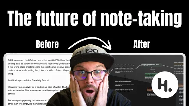
A practical method for turning newsletter ideas into a personal knowledge system hinges on one move: extract only what feels meaningful, then rebuild the argument visually so future-you can navigate it fast. After receiving Julian Shapiro’s email about generating novel ideas consistently, Greg Wheeler copies the article into Heptabase’s whiteboard as plain text first—then deliberately refuses to convert everything into a single “card.” The goal is distillation: each saved unit should represent a concept worth returning to, not a dumping ground of copied text.
The workflow starts by naming the core idea in a prominent heading (using styled text inside a text element). From there, Wheeler skims to find “pockets” of related information and pulls those segments out into separate text elements. This separation matters because it makes the pieces movable—ready to be connected into a visual thought train. Heptabase’s line tool becomes the glue: by hovering and dragging, he links elements into an arrowed map of how the ideas flow. On some connections, he adds short labels that act like “windy road” signs—prompts that tell him what’s coming next without forcing him to reread every supporting paragraph.
As the map grows, Wheeler introduces two additional layers for retrieval and decision-making. First, he turns key prompts into question-titled cards. When skimming later, those questions trigger the right memory path—helping him decide whether to read deeper or move on. Second, he uses layout orientation to control depth: horizontal connections function like “skimming the surface,” while vertical card structures signal that more detail exists if he wants to go deeper. He notes that understanding the “why” isn’t always required; sometimes the practical “what to do next” is enough, and the structure lets him choose.
Color then becomes a retrieval cue and a prioritization mechanism. Wheeler highlights cautionary material in a distinct color (e.g., yellow for “word of caution”) so it stands out years later, and he pulls out a higher-level goal—resonance—by giving it its own visual emphasis. The system culminates in “idea breadcrumbs”: a small set of atomic cards (like “creativity faucet,” “welcome and embrace bad ideas,” and “idea breadcrumbs”) that act as entry points. Each card retains metadata about where it came from and which whiteboard it’s attached to, so revisiting a concept years later lets him jump back into the surrounding context that originally shaped it.
In short, the approach treats knowledge capture as navigation design: distill into meaningful cards, connect supporting fragments visually, and embed prompts, orientation, and color so the system helps him remember, decide, and reconnect—without drowning in copied text.
Cornell Notes
The method builds a personal knowledge management workflow in Heptabase that converts an article into a navigable visual map. Instead of turning everything into cards, it starts with plain text for full context, then extracts “pockets” of related ideas into separate elements and links them with arrows/lines to show the thought flow. Wheeler adds question-titled cards and uses horizontal vs. vertical structure to signal whether a reader should skim or go deeper. Color highlights priorities and cautions so key points resurface years later. The result is “idea breadcrumbs”: a small library of atomic cards with metadata that lets you jump back to the original whiteboard context behind each concept.
Why start by copying the article as plain text instead of immediately creating cards?
How does visual linking improve idea recall compared with linear notes?
What role do question-titled cards play in the workflow?
How do horizontal vs. vertical structures change how information is consumed?
Why use color, and what does it accomplish over time?
What are “idea breadcrumbs,” and how do cards make them reusable?
Review Questions
- If you were distilling a long article into Heptabase, what criteria would you use to decide what becomes a card versus what stays as plain text elements?
- How would you design your own visual “thought train” so that future-you can skim the gist but still know where to go deeper?
- What metadata and visual cues (questions, orientation, color) would you include to make a concept like “creativity faucet” retrievable years later?
Key Points
- 1
Distill first: avoid converting an entire article into one card; save only concepts that feel meaningful to return to.
- 2
Extract related “pockets” of information into separate elements so they can be rearranged and connected into a coherent map.
- 3
Use Heptabase line connections (with optional short labels) to show the sequence of ideas and prompt what comes next.
- 4
Turn recurring prompts into question-titled cards to guide future skimming and decide whether deeper reading is needed.
- 5
Use horizontal vs. vertical structure as a depth signal: horizontal for surface-level gist, vertical for deeper detail.
- 6
Apply color to encode priorities (e.g., cautions) and make key goals stand out during later review.
- 7
Create “idea breadcrumbs” by maintaining atomic cards with metadata that links back to the original whiteboard context.