How I Track Habits and Measure my Life using Obsidian Tracker Plugin
Based on John Mavrick Ch.'s video on YouTube. If you like this content, support the original creators by watching, liking and subscribing to their content.
Install and enable the Obsidian Tracker plugin, then configure it to point to the folder containing daily notes so charts have data to read.
Briefing
Obsidian’s Tracker plugin can turn everyday habit logging into a full measurement system—line graphs for weekly trends, calendar views for threshold and streak patterns, and summary dashboards for averages, medians, and completion rates. The core workflow is straightforward: install the plugin, point it to the folder where daily notes live, log values directly inside each daily note (using inline metadata fields), then reference those fields inside Tracker code blocks to generate visuals and computed stats.
The setup starts in Obsidian settings under Community plugins, where the Tracker plugin is installed and enabled. Before any chart appears, the plugin needs a data source, so the configuration points to the folder containing daily notes. From there, the method for capturing data matters. Instead of relying on traditional frontmatter metadata, the approach uses inline fields inside the daily note—field name, two colons, and a numeric value. Those fields represent multiple dimensions of life, such as energy levels across categories (physical, mental, emotional, spiritual). This makes it easy to log quickly and ensures the Tracker plugin can reliably extract values.
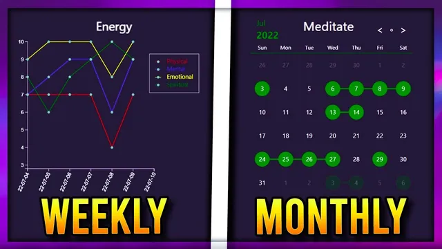
Weekly performance is visualized with a line graph. A Tracker code block is created using a fenced code block labeled as type tracker. The graph is configured to search for specific inline metadata fields (via search type set to data value field), and it defines a date range (start and end dates in year-month-day format). The line graph’s appearance is customized with a title, y-axis maximum (for example, ratings out of 10), legend settings, and gap handling for missing values. To avoid manually typing dates, the workflow can use a templating plugin to derive the start of the week (Monday) and end of the week (Sunday) from the current weekly note title.
Long-term consistency gets handled through two monthly calendar modes. In “annotation mode,” each day displays an emoji or text marker only when the value meets a threshold (for example, 7 or higher). This creates a quick “met the requirement” view for each category. A second monthly mode uses color shading to show streak-like behavior: days get shaded based on the rating, but the streak effect appears only when values exceed the threshold. Color choices are tuned for readability, including circle shading and outlines for “today.”
Finally, summary views compute statistics across time windows. A lifetime summary can aggregate values across all daily notes, while a weekly note limits the calculation to that week’s entries. The Tracker plugin supports arithmetic and functions such as minimum, maximum, median, average, and sum. When multiple datasets (multiple fields) exist, functions need dataset indexing so each category’s average or other metric is calculated separately. The same summary mechanism extends beyond numeric ratings to task tracking: by searching tasks in notes (search type set to tasks), the system counts completed tasks versus total tasks, then calculates completion rate as a percentage using division and multiplication. The result is a single, repeatable measurement framework that turns daily notes into graphs, streak calendars, and performance dashboards.
Cornell Notes
The Tracker plugin for Obsidian can convert inline daily-note logging into charts and computed metrics. Values are stored as simple inline fields (e.g., “energy: 7”), and Tracker code blocks extract those fields to build weekly line graphs, monthly calendar views, and summary dashboards. Line graphs show trends across a date range, while monthly calendars can either annotate days that meet a threshold or shade days to reveal streak-like patterns. Summary views calculate statistics like average, median, min/max, and sum across a chosen time window, and the same approach can compute task completion rates by counting tasks marked as done versus total tasks.
How does the workflow make Tracker able to read habit data from daily notes?
What’s the difference between the two monthly calendar modes described?
How are weekly line graphs configured to show multiple energy categories?
Why does dataset indexing matter in summary calculations like averages?
How does the system compute task completion rate using Tracker?
How can date ranges be automated for weekly graphs?
Review Questions
- What inline metadata format must daily notes follow so Tracker can extract values reliably?
- How would you configure a line graph to display four energy categories on the same chart?
- What changes when switching from numeric habit tracking to task completion rate tracking in Tracker?
Key Points
- 1
Install and enable the Obsidian Tracker plugin, then configure it to point to the folder containing daily notes so charts have data to read.
- 2
Log habit metrics as inline fields in daily notes using “FieldName:: value” so Tracker can extract them with search type set to data value field.
- 3
Create weekly line graphs by defining a date range, setting type to line, and using multiple search targets to generate separate colored lines with a legend.
- 4
Use monthly calendar views in two ways: annotation mode for threshold-based emoji/text markers and shading/streak mode for color-coded streak patterns.
- 5
Build summary dashboards by using Tracker’s functions (average, median, min/max, sum) and dataset indexing so each tracked field gets its own computed result.
- 6
Compute task completion rates by switching from value fields to task search, counting done tasks versus total tasks, then calculating (done/total)*100.
- 7
Automate weekly date ranges with templating variables derived from weekly note titles to avoid manually typing start and end dates.