How to Create and Visualize Scopus Co-Author Networks in VOSviewer || Research Network || Hindi 2024
Based on eSupport for Research's video on YouTube. If you like this content, support the original creators by watching, liking and subscribing to their content.
Install VOSviewer and ensure Java is available, since VOSviewer requires it to run.
Briefing
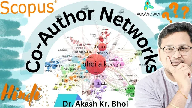
Scopus co-author networks can be built and visualized in VOSviewer by exporting bibliographic data from Google Scholar (or other sources) and then mapping co-authorship relationships into an interpretable graph. The practical payoff is immediate: researchers can see which co-authors cluster together, how dense collaboration is across an author set, and which names sit at the center of a collaboration network—useful for understanding productivity patterns and for sharing results on social media or in reports.
The workflow starts with installing VOSviewer on a Windows system and ensuring Java is available, since VOSviewer depends on it. After installation, the next step is data collection. The transcript walks through pulling publication records from Google Scholar: select relevant items, export citation data (including citation information), and download the resulting file to a local folder. Because VOSviewer can’t read every export format, the author filters the input by choosing the appropriate bibliographic data source during the mapping step.
In VOSviewer, the process then moves to creating a map based on bibliographic data. The key configuration is selecting the data source (the transcript notes that Web of Science formats may not be supported in the same way, so Google Scholar exports are used), then setting thresholds that control the network size. Examples include ignoring documents with very large author counts (to avoid noisy, overly broad collaborations), setting a minimum number of documents per author, and selecting the author field to include. Once these parameters are set, VOSviewer generates a co-authorship network graph.
Three visualizations are emphasized as decision tools: the network view (showing nodes and links between authors), the overlay view (allowing inspection of connections by clicking nodes/edges), and the density view (highlighting where collaboration is strongest). The density layer is particularly important for identifying which co-authors have higher collaboration frequency—areas with stronger density indicate more frequent co-publication relationships.
The transcript also covers practical output and sharing. The generated visualization can be exported as images (such as PNG), with options to adjust formatting and save the graph for presentations or social media. For users who need more than a limited free lookup, the transcript recommends signing in to access a larger number of publications and then exporting the selected document set.
Finally, the guide notes that the same approach can be repeated for other bibliographic sources and other research profiles, and that VOSviewer offers additional controls (like scaling/zooming and switching application views) to refine how the network is presented. The overall message is that once the data export and VOSviewer mapping settings are understood, co-author network analysis becomes a repeatable method for tracking collaboration patterns and communicating research relationships clearly to others.
Cornell Notes
VOSviewer can turn exported bibliographic records into Scopus-style co-author networks by mapping co-authorship relationships as nodes and links. The process begins with installing VOSviewer (and Java), then exporting citation data from Google Scholar to a local file. In VOSviewer, users create a map based on bibliographic data, choose the correct data source, and apply thresholds such as ignoring documents with extremely high author counts and setting minimum documents per author to reduce noise. The resulting network can be viewed in network, overlay, and density modes to identify central collaborators and collaboration hotspots. Exporting the visualization (e.g., PNG) makes it easy to share findings in reports or on social media.
What are the minimum steps to generate a co-author network in VOSviewer?
Why do threshold settings like “ignore documents with a large number of authors” matter?
How do the network, overlay, and density views differ in what they reveal?
How can someone export and share the results?
What should a user do if the dataset is limited in free lookup?
Can this workflow be reused beyond one dataset or one platform?
Review Questions
- What threshold filters would you apply first to reduce noise in a co-author network, and why?
- Which VOSviewer view (network, overlay, or density) would you use to identify collaboration hotspots, and what visual cue indicates them?
- Outline the end-to-end workflow from bibliographic export to saving a shareable network image.
Key Points
- 1
Install VOSviewer and ensure Java is available, since VOSviewer requires it to run.
- 2
Export bibliographic records from Google Scholar (select publications, export citation data, download to a local folder).
- 3
In VOSviewer, create a map based on bibliographic data and select the correct data source format for the exported file.
- 4
Use thresholds to control network size—ignore documents with extremely high author counts and set a minimum number of documents per author to reduce noise.
- 5
Interpret results using three complementary views: network (structure), overlay (interactive connections), and density (collaboration intensity).
- 6
Export the final visualization as an image (e.g., PNG) for sharing in presentations, reports, or social media.
- 7
If free lookup limits results, sign in to access more documents before exporting the dataset for mapping.