How to Create Multi-Column Layout Setup in Obsidian
Based on Prakash Joshi Pax's video on YouTube. If you like this content, support the original creators by watching, liking and subscribing to their content.
Obsidian needs a community CSS snippet to render multi-column layouts; the “MCL multicolumn” snippet is installed by copying it into the Snippets folder in Settings → Appearance.
Briefing
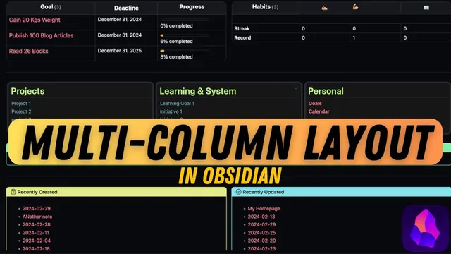
Obsidian doesn’t natively support multi-column layouts, but a community-made “modular CSS layout” snippet set makes it possible to build dashboards, homepage-style pages, and side-by-side content blocks using Markdown callouts and lists. The core workflow is straightforward: download the “MCL multicolumn” CSS snippet from the modular CSS layout repository, paste it into Obsidian’s Snippets folder, then use custom callout tags (and list-based tags) to render content in multiple columns.
After installing the CSS snippet, multi-column layouts can be created in several ways depending on how the content should behave. The first method uses a custom top-level callout named “multicolumn.” Inside that container, multiple sub-callouts (like info, warning, or other callout types) are nested to form columns. Each sub-callout must be separated with a single angle bracket, and the nested callouts become the column cells. With this approach, the layout can include more than just callouts—headings and lists placed inside each sub-callout render within their respective columns. The result is a flexible grid of callout-based columns that works in preview and live preview.
A second method uses a “float” callout. A float callout behaves like a side note: it can be positioned to the left or right, while surrounding text wraps around it. The transcript highlights that the callout needs to be placed above the content it should wrap, and size can be controlled with options like small (default), medium, or large. There’s also a live-preview caveat: specifying only “left” or “right” may not show correctly while editing, but prefixing with “float” (e.g., “float large”) makes the two-column behavior visible in live preview.
A third approach is a “blank” callout, which is designed as an invisible container. It removes the usual callout decoration, making it useful when embedding content that should not display a bordered callout frame. Even with blank decoration removed, the “multicolumn” callout still acts as the top-level wrapper; the blank callout is used inside the sub-callouts.
For list-driven layouts, the “list column” callout creates multi-column structure using an unordered list, but it only works in reading mode—not live preview. A related enhancement, “list grid,” changes the hashtag to produce multiple columns and multiple rows, and it renders in preview. The “list card” variant builds on “list grid” with extra styling to make items appear more card-like. The transcript also notes that list indentation can create nested sublists within these grid/card layouts.
Overall, the modular CSS layout snippet set provides practical building blocks for turning plain Markdown into structured, dashboard-like pages—especially useful for homepage and dashboard setups where multi-column organization improves readability and navigation.
Cornell Notes
Obsidian lacks native multi-column support, but the modular CSS layout “MCL multicolumn” snippet enables multi-column layouts through custom callouts and list tags. Install the “MCL multicolumn” CSS snippet by copying it into Obsidian’s Snippets folder, then use a top-level “multicolumn” callout to create columns via nested sub-callouts separated by a single angle bracket. For side notes and wrapped text, use “float” callouts with left/right and size controls, with special handling to make it appear in live preview. For list-based layouts, use “MCL list column” (reading mode only), “MCL list grid” (multi-row/column), and “MCL list card” (grid with card styling). These options help build dashboard and homepage layouts inside Obsidian.
How does the “multicolumn” callout create multiple columns, and what’s the key syntax requirement?
What’s the difference between using “float” callouts and “multicolumn” callouts?
When would a “blank” callout be useful, and how does it work with “multicolumn”?
Why does “list column” behave differently from “list grid” in Obsidian?
How do “list grid” and “list card” differ, and can lists be nested?
Review Questions
- What installation step is required before any of the custom multi-column callouts will work in Obsidian?
- In the “multicolumn” method, how are sub-callouts separated so they render as separate columns?
- Which list-based layout works only in reading mode, and which one supports multi-row/multi-column grids in preview?
Key Points
- 1
Obsidian needs a community CSS snippet to render multi-column layouts; the “MCL multicolumn” snippet is installed by copying it into the Snippets folder in Settings → Appearance.
- 2
Use a top-level “multicolumn” callout, then nest sub-callouts inside it to create columns.
- 3
Separate nested sub-callouts inside “multicolumn” with a single angle bracket so each sub-callout becomes its own column.
- 4
Use “float” callouts for left/right side notes that wrap surrounding text, and place the float callout above the content it should wrap.
- 5
Prefixing with “float” (e.g., “float large”) helps the left/right wrapped layout appear correctly in live preview.
- 6
For list-based layouts, “MCL list column” works only in reading mode, while “MCL list grid” and “MCL list card” provide grid/card layouts in preview.