How to Make an Academic Poster in PowerPoint (No Graphic Design Skills Needed)
Based on Andy Stapleton's video on YouTube. If you like this content, support the original creators by watching, liking and subscribing to their content.
Set PowerPoint to the conference’s required portrait dimensions (e.g., 841 mm × 594 mm) before designing, so the exported PDF prints at the right scale.
Briefing
Creating an academic poster in PowerPoint becomes straightforward once the canvas is set to the exact conference print size and the layout is built from reusable blocks. The workflow starts by switching from a default slide to a portrait, custom-sized page—specifically 841 mm by 594 mm—so the design can be exported cleanly for printing. With the correct dimensions in place, the rest of the work is mostly copy, paste, and alignment rather than graphic-design wizardry.
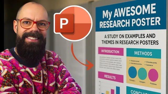
After clearing the initial slide elements, the process moves to PowerPoint’s Design tab and the Slide Size menu, where a custom paper size is selected. The transcript highlights that millimeters can be entered directly, and that the poster canvas should be maximized once the width and height match the target dimensions. From there, the poster’s structure is planned using section headings that mirror common academic layouts: title, author information, abstract/introduction, methods, results, conclusions, plus supporting sections like next work, references, and acknowledgements.
Rather than designing from scratch, the method relies on inspiration and replication. The creator pulls examples from image search—filtered for portrait (“tall”) posters—to find a simple, clean layout that can be rebuilt in PowerPoint. One chosen design becomes a template for “blocking out” the poster: rectangles (or rounded rectangles) are inserted, outlines are set, and shapes are converted into default shapes so they can be reused consistently. Each content area includes a heading and a text region, and the key efficiency move is grouping each section into a single unit. Once grouped, sections can be copied across the poster and resized (for example, making the references and acknowledgements boxes smaller) without redoing formatting.
With the skeleton in place, the focus shifts to content density and visual hierarchy. Text is placed into the section boxes, but the transcript stresses succinctness—turning long paragraphs into bullet points when needed. To improve attention, a large image is added in a dedicated spot; the example uses an AI-generated image prompt (“image of futuristic carbon nanotubes in the sunlight”), then crops and positions it so it immediately draws the eye more effectively than text-heavy layouts.
Fine-tuning comes next through alignment and spacing. Grid lines or guides can be enabled to help placement, but pixel-perfect results are achieved by grouping sections and using PowerPoint’s Align tools (align top, bottom, and other options) to keep everything evenly spaced. Color adjustments are then applied using PowerPoint’s color variants, with the option to incorporate institutional branding via a logo and consistent accent colors.
Finally, the poster must be export-ready for print. The transcript recommends exporting as a PDF through File → Print → Microsoft Print to PDF → “Print entire presentation,” then checking legibility by zooming in and out to confirm text and images aren’t blurry. Font choice is treated pragmatically: readability matters more than avoiding any specific font category, as long as the poster is clear at conference viewing distance.
Cornell Notes
The fastest way to build an academic poster in PowerPoint is to start with the correct portrait page size (841 mm × 594 mm), then create a reusable layout made of grouped text-and-heading blocks. Inspiration from existing poster designs helps determine the section structure—title/authors, abstract or introduction, methods, results, conclusions, plus smaller areas for next work, references, and acknowledgements. After blocking out the layout, the poster improves with succinct text (often bullet points) and a large, attention-grabbing image placed in a dedicated region. Alignment and spacing are refined using grid/guides and PowerPoint’s Align tools, while colors and logos are applied consistently. Exporting via Microsoft Print to PDF and zoom-checking ensures the final file is print-ready and readable.
How does setting the slide size affect the final poster quality?
What’s the most efficient way to build repeated poster sections in PowerPoint?
Where should attention-grabbing visuals go, and how are they handled?
How does the transcript recommend improving readability and reducing clutter?
What tools help make the layout look “pixel perfect”?
What export steps ensure the poster is print-ready?
Review Questions
- What specific slide size values are used to create the portrait poster canvas, and why is matching the conference dimensions important?
- How does grouping poster sections change the speed and consistency of building the layout?
- What combination of alignment tools and visual hierarchy choices (text density, headings, images) most affects how quickly viewers can scan the poster?
Key Points
- 1
Set PowerPoint to the conference’s required portrait dimensions (e.g., 841 mm × 594 mm) before designing, so the exported PDF prints at the right scale.
- 2
Build the poster from reusable layout blocks: add a heading plus a text area inside shapes, then group each block for easy copy/paste.
- 3
Use inspiration from existing academic posters to decide section order and proportions, then replicate that structure in PowerPoint.
- 4
Keep content succinct—convert long paragraphs into bullet points so each section remains scannable at poster distance.
- 5
Add a large, cropped image in a dedicated spot to create visual hierarchy and draw attention faster than text alone.
- 6
Use grid lines/guides and PowerPoint’s Align tools (especially after grouping) to achieve consistent spacing and a “pixel-perfect” look.
- 7
Export via Microsoft Print to PDF and zoom-check the result to confirm text and images remain sharp and readable for printing.