How To Tell If We're Beating COVID-19
Based on minutephysics's video on YouTube. If you like this content, support the original creators by watching, liking and subscribing to their content.
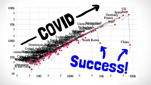
Judge epidemic momentum by whether exponential growth is ending, not by raw case counts alone.
Briefing
COVID-19 reporting often feels like a moving target because case counts change so fast that today’s numbers can be misleading tomorrow. The central insight here is that the key question isn’t just “How many cases are there?” but “Is exponential growth still happening—and has it started to end?” Exponential growth is dangerous precisely because it can’t be easily “eyeballed” once you’re mid-spread; the epidemic can look like it’s still accelerating even when the growth rate is already slowing. That uncertainty matters because the point at which exponential growth stops largely determines how many additional people will become ill.
To make that turning point easier to see, the analysis introduces a global visualization built from real country-level data. Instead of plotting cases against time, it plots the number of new cases (the growth rate) against the cumulative number of cases, with both axes on logarithmic scales. Under exponential growth, new cases are proportional to existing cases, which makes the relationship appear as a straight line. Countries that keep following that line are still in the exponential “rocket ship” phase. Countries that peel away and drop off the main pattern have started to beat back the spread—an “emergency eject button” moment that can be detected even when a country’s current case totals are low.
The method also relies on two practical adjustments. First, it uses logarithmic scaling so that changes by factors of 10 (rather than fixed increments) remain comparable across countries with vastly different case counts. Second, it emphasizes catching changes early by focusing on growth itself—such as the number of new cases over the last week—because slowing growth is much harder to spot when looking only at total cases. When weekly new cases flatten or decline, the epidemic is leaving the exponential zone.
The visualization is designed to highlight deviations from exponential growth, making it easier to answer whether public health measures—testing, isolation, physical distancing, and contact tracing—are actually working in the data. It also reinforces a sobering expectation: countries that haven’t yet had high case counts may still follow the same exponential trajectory later unless interventions interrupt transmission.
Still, the approach comes with caveats. Log scales can visually distort differences, and the choice of axes can make rebounds harder to see after downturns. The graph shows detected cases rather than true infections, and rising testing can make case growth look faster than it would under stable testing. Data quality varies by country and is delayed because growth rates are averaged over recent days to reduce noise. The result is intentionally conservative: it aims to avoid overreacting to short-term fluctuations, so downward trends are more likely to reflect real progress.
Overall, the takeaway is that tracking the rate of change—new cases relative to existing cases—offers a clearer signal about whether an epidemic is still accelerating or finally starting to slow, which is what planning and public understanding depend on most.
Cornell Notes
The core message is that COVID-19 progress is best judged by whether exponential growth is ending, not by raw case totals that quickly become outdated. A new global visualization uses logarithmic axes and plots new cases (growth rate) against cumulative cases, so exponential spread appears as a straight line. Countries that drop off that line show detectable suppression of transmission, while those that remain on it are still in the exponential phase even if current case numbers are low. The method also uses weekly changes to catch slowing growth earlier and reduce day-to-day noise. Because it relies on detected cases, incomplete reporting, and changing testing capacity, the graph is a signal for deviations from exponential growth—not a perfect measure of true infections.
Why is it hard to tell when exponential growth is ending using only total case counts?
How does plotting new cases versus cumulative cases make exponential growth look different?
Why use logarithmic scales on both axes?
What does it mean when a country “plummets downwards off the main sequence”?
What are the biggest reasons the chart might mislead if interpreted as true infections?
Why is averaging growth over the last week considered “pessimistic” rather than overly optimistic?
Review Questions
- How would the appearance of exponential growth change if new cases were plotted against time instead of cumulative cases?
- What specific chart feature would you look for to decide whether a country is still on the exponential “main sequence”?
- List at least three limitations that could cause detected-case trends to differ from true infection trends.
Key Points
- 1
Judge epidemic momentum by whether exponential growth is ending, not by raw case counts alone.
- 2
Plotting new cases against cumulative cases (with log scales) turns exponential growth into a straight line, making deviations easier to spot.
- 3
Weekly new-case trends reveal slowing growth earlier than total-case curves, which can still look exponential mid-spread.
- 4
Countries can appear to be “ahead” only because of timing; without suppression, they may still follow the same exponential trajectory later.
- 5
Testing changes can inflate detected case growth, so case-based growth signals must be interpreted alongside testing capacity.
- 6
Incomplete reporting and overburdened systems introduce noise and delay, so growth-rate estimates should be smoothed rather than taken from single days.
- 7
A downward departure from the exponential pattern is a stronger signal of real progress than isolated daily fluctuations.