How to Use Notion's NEW Dashboard View | Full Guide & Tutorial
Based on The Organized Notebook's video on YouTube. If you like this content, support the original creators by watching, liking and subscribing to their content.
Prepare the relevant databases (such as tasks and projects) before creating a Dashboard View so widgets can pull from existing views.
Briefing
Notion’s new Dashboard View lets business and enterprise users build a single, widget-style dashboard that pulls from multiple databases—tasks, projects, and more—while supporting charts, lists, calendars, and other view types. The practical payoff is a cleaner way to surface key work signals in one place, without the clutter that often comes from stacking many inline databases and linked views.
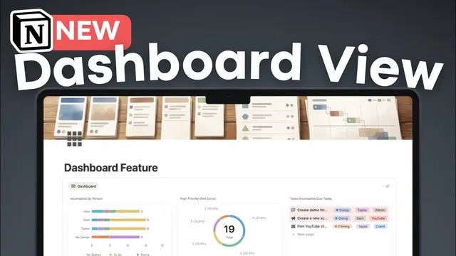
Getting started requires having at least one database ready (for example, a task database and a project database). From there, users type “/dashboard view,” create a new view, and then add widgets by selecting existing database views. Each widget can be tailored: a task widget can show “high priority but not done” items, and additional widgets can be added with the “plus” control. Notion’s dashboard widgets aren’t limited to tables—users can choose from list, gallery, feed, calendar, map, and chart-based presentations, depending on what best communicates the information.
A standout capability is a new chart “number” type, designed to display a single value at the top of a dashboard section. Instead of relying on donut charts for quick totals, users can show a plain number—such as “2 tasks due today and not done”—by filtering the underlying data (e.g., due date equals today, status is not done). Chart titles can be edited or removed, and visual styling like color can be adjusted. Widgets can also be duplicated and reconfigured, such as pairing a number widget with a list widget that shows the specific incomplete tasks due today.
Dashboards also support multiple data sources. Users can add additional widgets from other databases—such as a projects database—then choose different views for each source (timeline by status, or a filtered view like “all projects not complete”). Layout is customizable through drag-and-drop positioning, along with control over widget dimensions (width and height). Once arranged, dashboards can be made more stable for team use by locking views so accidental edits don’t happen.
Two higher-level controls make multi-database dashboards feel cohesive. First, dashboard settings let users show or hide data source titles and icons, and manage which data sources appear. Second, global filters can apply across multiple sources using shared properties like due dates. For example, a single filter can limit both project timelines and task due dates to “this week” or “this month.” Filters can also be layered by owner, producing a dashboard that changes based on who is selected—showing tasks and projects for Alex, then switching to Sam or Taylor.
There are constraints: dashboards cap at 12 widgets total and no more than four widgets per row, and the feature is limited to business and enterprise plans. Performance can degrade if filters aren’t tight or if too many dashboards exist on one page. The recommended approach is to avoid dumping entire databases into dashboards; instead, filter to the most relevant slices (like “high priority” and “not done”) and lean on charts effectively.
Cornell Notes
Notion’s Dashboard View for business and enterprise users turns existing database views into draggable widgets on a single page. It supports pulling from multiple databases (e.g., tasks and projects) and displaying them as charts, lists, calendars, maps, and more. A key upgrade is a chart “number” type that shows a single filtered total—such as tasks due today and not done—without needing donut charts. Dashboards can be customized with widget layout controls, and views can be locked for team stability. Global filters can apply across multiple data sources at once (like due dates or owners), creating a dashboard that updates consistently for different time windows or people.
How does a user create a dashboard widget in Notion’s new Dashboard View?
What makes the new chart “number” type useful, and how is it configured?
How can dashboards show both summary metrics and the underlying items?
How do multiple data sources work inside one dashboard?
What are global filters, and how do they apply across different databases?
What limitations and performance tips should users keep in mind?
Review Questions
- What steps are needed before creating a Dashboard View, and why does having prepared databases matter?
- How would you build a dashboard section that shows a single number for tasks due today but not done?
- What global filter strategy would you use to ensure both project due dates and task due dates stay synchronized on “this month”?
Key Points
- 1
Prepare the relevant databases (such as tasks and projects) before creating a Dashboard View so widgets can pull from existing views.
- 2
Create widgets by adding database views into the dashboard, then choose the most suitable presentation type (including charts and calendars).
- 3
Use the chart “number” type to display a single filtered total at the top of a dashboard section, and configure it with filters like due date and status.
- 4
Pair summary widgets with detail widgets by duplicating a chart and switching the duplicate to a list layout with selected properties.
- 5
Add multiple data sources by inserting widgets from different databases and arranging them with drag-and-drop layout controls.
- 6
Apply global filters across multiple sources (e.g., due dates or owner) to keep different dashboard sections consistent.
- 7
Stay within limits—12 widgets total and four per row—and keep filters tight to avoid page slowdowns.