Ideogram 2.0 is my new Favorite Image Gen! | First Look
Based on MattVidPro's video on YouTube. If you like this content, support the original creators by watching, liking and subscribing to their content.
Ideogram 2.0 introduces Auto Mode plus five style fine-tunes (general, realistic, design, 3D, anime) to steer outputs by intent rather than forcing one-size-fits-all generation.
Briefing
Ideogram 2.0’s biggest upgrade isn’t just a new image model—it’s a new control system that adds five style-specific fine-tunes plus an “auto mode” that picks the right style based on the prompt. In practice, that combination makes it easier to get consistent results across very different creative goals, from photorealistic street scenes to flat 2D design work, to stylized 3D renders, and to a dedicated anime/cartoon look. The result is a workflow that feels less like endless trial-and-error and more like selecting the right “lens” for the job.
Early tests highlight how each style behaves differently. The “general” option leans toward realism but still struggles with fully human anthropomorphism in tougher prompts (like a watermelon character trying to look convincingly human). The “realistic” preset produces lighting and imagery closer to a photograph, with a more natural filmic feel than some competing outputs—especially noticeable in a portrait-style prompt featuring a bearded man and an orange tabby cat perched on his head, plus a cigarette detail. Switching to “design” forces a 2D look that’s better suited to logos and mascots; faces can still appear, but the style is clearly optimized for graphic output rather than lifelike rendering. The “3D” option delivers the most convincing results for prompts that call for depth and a rendered aesthetic, while the “anime” fine-tune turns prompts into a consistent manga/anime visual language—complete with color palette, lighting, and panel-like composition.
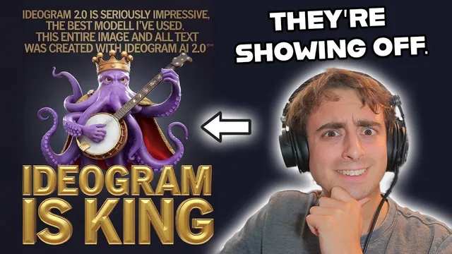
Magic Prompt also gets an upgrade, improving prompt handling and text outcomes. Even when prompts are vague or “lazy,” Magic Prompt tends to expand them into more complex instructions—helping generate recognizable “fruit wars” signage with readable text, and producing logos where spelling stays correct more often than expected. The transcript repeatedly returns to text fidelity as a standout strength, including logo experiments for a VR/AR channel identity and a coffee shop concept (“Frogs Brew”), where the model generates branded-looking marks with consistent lettering.
Comparisons with other generators focus on realism and natural tone. In side-by-side tests against Flux.1 (via Gro) and DALL·E 3, Ideogram’s realistic preset is credited with more natural colors and filmic balance, while competitors are described as more saturated or less convincing in specific details (like the cigarette realism in the street-photography scenario). The anime mode also gets a separate validation pass: it’s used to convert non-anime subjects into anime posters and scenes, including stylized depictions of famous people and landmarks, and it’s framed as the most effective fine-tuned anime option among the tested tools.
Beyond styles and prompt upgrades, Ideogram 2.0 adds color palette mode, letting users apply pre-made palettes (pastel, jungle, Christmas) or custom values to steer overall color harmony. The transcript argues that this feature meaningfully changes the final image’s look while still respecting the underlying prompt. Pricing is also discussed: 10 credits per day for free usage, and an $8/month plan for 400 priority credits, alongside features like upscaling and image-to-image editing. Overall, the core takeaway is that Ideogram 2.0 becomes more controllable—style selection, better prompt expansion, stronger text, and palette control combine to reduce friction and improve coherence across genres.
Cornell Notes
Ideogram 2.0 adds a style system that goes beyond a single “model switch.” The prompt bar now includes Auto Mode plus five style fine-tunes (general, realistic, design, 3D, anime), letting the system choose or the user select the best visual direction. Tests suggest each style behaves predictably: design favors 2D logo-like output, realistic targets photo-like lighting and filmic color, 3D adds depth detail, and anime produces consistent manga/anime aesthetics. Magic Prompt is upgraded too, improving prompt expansion and text accuracy, which helps with signage and logo spelling. Color Palette Mode further steers the overall look using preset palettes or custom values, making color control a first-class feature.
How does Ideogram 2.0’s Auto Mode change the workflow compared with older “pick a model and hope” approaches?
What visual differences show up when switching between general, realistic, design, 3D, and anime?
Why does Magic Prompt matter for text and logos in the transcript’s tests?
How do the realism comparisons with Flux.1 (via Gro) and DALL·E 3 frame Ideogram’s strengths?
What does Color Palette Mode add, and how is it demonstrated?
What makes the anime fine-tune stand out in the transcript’s examples?
Review Questions
- When would you choose Design mode over Realistic or 3D mode, based on the transcript’s examples?
- What kinds of prompt details seem to benefit most from Magic Prompt’s expansion—text, composition, or subject matter?
- How does Color Palette Mode interact with the underlying prompt when the palette conflicts with the theme (e.g., pirate prompt with Christmas palette)?
Key Points
- 1
Ideogram 2.0 introduces Auto Mode plus five style fine-tunes (general, realistic, design, 3D, anime) to steer outputs by intent rather than forcing one-size-fits-all generation.
- 2
Realistic mode is credited with more photo-like lighting and a more natural filmic color balance than competing outputs in the transcript’s street-photography test.
- 3
Design mode reliably produces 2D, logo-friendly results, with text and branding often generated more consistently than expected.
- 4
The anime fine-tune delivers a consistent manga/anime aesthetic and performs well at converting non-anime subjects into anime-style posters and scenes.
- 5
Magic Prompt’s upgrade improves prompt expansion and is repeatedly linked to stronger text accuracy in signage and logos.
- 6
Color Palette Mode adds direct control over overall color harmony using preset palettes or custom values, significantly changing the look of the final image.
- 7
The transcript frames Ideogram’s combination of style control, prompt handling, text fidelity, and palette steering as a major reason it’s a go-to platform for many image-generation tasks.