Journaling - How I Track My Long Term Quality Of Life In Obsidian
Based on FromSergio's video on YouTube. If you like this content, support the original creators by watching, liking and subscribing to their content.
Enable Templates, Dataview, and Periodic Notes to automate weekly note creation and build an aggregated dashboard.
Briefing
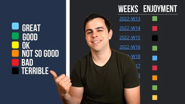
The core idea is to turn Obsidian journaling into a year-at-a-glance dashboard: weekly entries get a simple “enjoyment” rating (color-coded), and a Dataview table automatically aggregates those ratings so it’s immediately clear which weeks went well, poorly, or somewhere in between. The payoff is practical—by the end of a year, it becomes easy to spot patterns in quality of life without manually rereading every entry.
The setup starts with three plugins. Templates must be enabled so weekly notes can be created from a consistent structure. Dataview is required to generate the summary table that powers the “at a glance” view. Periodic Notes (a community plugin) provides the weekly note creation system, and it’s used because some calendar features—like weekly note templates and scripts—are being deprecated in favor of Periodic Notes. The calendar plugin still plays a role for navigation, but the weekly note generation and templating logic shifts to Periodic Notes.
A weekly note template is then built around a YAML header. Key fields include a tag (defaulting to something like “weekly reviews”), aliases (so notes can be found by keywords rather than only by filename), and an “enjoyment” field that stores a color marker. The template uses emoji square cards (e.g., green for a good week, yellow for mixed, red for bad) to make the eventual dashboard readable at a glance. The transcript also covers multiple ways to insert emojis efficiently—macOS emoji picker, Alfred workflows, or an emoji community plugin with an Obsidian command palette toolbar.
Next comes configuration of the calendar and Periodic Notes. The calendar settings can show week numbers and control how weekly notes are created (including the start day, such as Monday). In Periodic Notes, the weekly format is set to use the weekly note template created earlier, and the plugin is pointed to a folder structure like journal/weekly so entries stay organized.
Once weekly notes are being generated, Dataview is used to recreate the thumbnail-style table. A separate note (e.g., “Weeks in color”) runs a Dataview query that builds a table of aliases and enjoyment for all weekly notes under journal/weekly. As new weekly notes are created—like “the one where nothing happened”—their enjoyment colors automatically appear in the table without extra manual work. Sorting is available either through Dataview controls or a sortable plugin, though the workflow described relies on manual sorting.
Finally, the system supports deeper context. The template can be extended with an additional short “why” field so future-you can see why a week received a particular color. There’s also a separate “yearly reviews” page with a different Dataview approach, avoiding a simplistic good/bad ranking for an entire year. For readability on smaller screens, the transcript recommends disabling Dataview column trimming via the Minimal Theme Settings companion app, so long aliases don’t get cut off.
Cornell Notes
A weekly journaling workflow in Obsidian uses a color-coded “enjoyment” rating stored in each weekly note’s YAML header. Templates and Periodic Notes automate weekly note creation into a consistent folder structure (like journal/weekly), while Dataview generates a “Weeks in color” table that aggregates aliases and enjoyment across all weekly notes. Adding a new weekly entry automatically updates the dashboard, making it easy to scan an entire year and spot standout weeks. Optional enhancements include a short “why” field for each color card, a separate yearly review page with a different Dataview strategy, and a readability tweak to prevent Dataview from trimming long alias text.
How does the workflow make a year of journaling searchable and scannable without rereading every entry?
Why is Periodic Notes used instead of relying on calendar plugin weekly templates and scripts?
What role do YAML headers and aliases play in the system?
How are emoji color cards inserted and managed inside Obsidian?
How can the system preserve context—why a week got a certain color—without bloating the dashboard?
What adjustments improve readability when aliases are long or screens are small?
Review Questions
- What specific YAML fields are required for Dataview to build the “Weeks in color” table, and where do those fields live in the weekly note template?
- How does the workflow ensure that adding a new weekly note automatically updates the year-at-a-glance dashboard?
- What are two ways to keep the dashboard useful for future-you beyond just color (e.g., searchability, context fields, yearly review strategy)?
Key Points
- 1
Enable Templates, Dataview, and Periodic Notes to automate weekly note creation and build an aggregated dashboard.
- 2
Create a weekly note template with a YAML header that includes an enjoyment marker (emoji color), tags, and aliases for keyword search.
- 3
Use Periodic Notes to generate weekly notes into a consistent folder structure such as journal/weekly, keeping organization predictable.
- 4
Build a Dataview summary note (e.g., “Weeks in color”) that tables aliases and enjoyment for all weekly notes under journal/weekly.
- 5
Insert emoji color cards efficiently using macOS emoji picker, Alfred workflows, or an emoji community plugin so the enjoyment field stays consistent.
- 6
Add an optional “why” field to each weekly note so the color rating is explainable when revisiting past weeks.
- 7
Improve readability by disabling Dataview column trimming in Minimal Theme Settings if long aliases are cut off.