Notion Charts Have Arrived! My New Life Dashboard Design
Based on August Bradley's video on YouTube. If you like this content, support the original creators by watching, liking and subscribing to their content.
Notion Charts provides native, embeddable chart blocks that can pull directly from Notion databases, reducing the friction of maintaining visualizations.
Briefing
Notion Charts turns life-tracking from a spreadsheet-like record into a dashboard that can surface patterns at a glance—making a “life operating system” in Notion more actionable. The core shift is native chart blocks that can pull directly from Notion databases and be embedded anywhere, eliminating the earlier friction of exporting data into charts and then bringing results back. For anyone tracking goals, projects, habits, and daily performance, that means the system can now highlight what’s progressing, what’s stalled, and where attention is being neglected.
The walkthrough centers on a “life pulse dashboard”: a single, aggregated view designed to reveal the status of an entire life system. It’s built as a set of chart blocks organized into sections—project management, goal setting, daily data tracking, habit management, milestones, and knowledge management—so the dashboard doesn’t become a pile of visuals. The charts are connected to underlying databases (treated like database views), and the creator uses chart settings to count items by properties such as project status, project type (business vs personal), and goal outcomes. A key example: counting projects by status (active, future, next up, on hold, someday maybe) can quickly signal whether there are “many active but no future” items—an immediate prompt to plan ahead.
The dashboard also emphasizes intentional prioritization rather than generic “balance.” One chart breaks down the share of projects by business vs personal, with hover details showing percentages—useful for checking whether emphasis matches the season of life. Another breaks down allocation by “pillars,” the life categories used in the PPV framework, helping users see whether priorities are aligned with stated value goals.
Goal setting is treated as a connected pipeline, not a standalone list. The charts track how many outcome goals support each value goal, and then how progress is fueled through two mechanisms: projects and habits/routines. That dual pathway is presented as a differentiator—many systems track projects only, while this approach shows how habits and routines also advance specific outcome goals. The dashboard then extends into daily tracking metrics like “percent of time on schedule” and “percent of planned work accomplished,” framed as a way to compare planned intent (set the night before) against real-world disruptions.
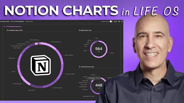
Habit management adds further structure by showing habits per goal (including “high-leverage” habits that advance multiple goals), habits by bundle (morning kickoff, morning startup, evening wind down, end of work day), and habits by pillar. Milestones track accomplishments and disappointments quarterly, with the creator distinguishing true end-of-road disappointments from iterative setbacks. Knowledge management rounds out the system by visualizing learning and consumption patterns—topics by pillar, media by type (articles, tweets, books, podcasts), and tools/skills/services by category.
Notion Charts is largely a paid-plan feature: free plans get only one chart, while paid plans unlock full chart capability. The creator argues that even with one chart, the dashboard concept can still guide how to choose the most revealing visualization. For teams, the same logic scales to sales calls, subscription growth, and workload distribution; pie charts can help identify overloaded vs underutilized owners when paired with thoughtful filtering and chart orientation.
The practical takeaway is less about collecting visuals and more about using them to drive decisions: spot trends, adjust priorities, and iterate on the system. Charts are positioned as a tool to reduce tinkering and increase consistency toward life aspirations—so the dashboard becomes a feedback loop, not a decoration.
Cornell Notes
Notion Charts enables native chart blocks that pull directly from Notion databases, making it practical to visualize life-system data inside Notion pages. The creator builds a “life pulse dashboard” that aggregates projects, goals, habits, daily performance, milestones, and knowledge into one glanceable view. Charts count and break down items by key properties (like project status, business vs personal, pillar allocation, and goal outcomes), turning tracking into actionable signals—such as noticing too many active projects with no future pipeline. A major PPV-specific emphasis is that progress comes from both projects and habits/routines, and the dashboard visualizes both pathways. The result is a feedback loop for monthly/quarterly review and ongoing course-correction, with team use cases like workload distribution and performance metrics.
What makes Notion Charts different from earlier chart workflows, and why does that matter for a life dashboard?
How does the dashboard use project status to create an actionable signal?
Why does the dashboard treat “balance” as optional, and what does it track instead?
What’s the PPV-specific logic behind goal-setting charts?
How does daily tracking convert planning into measurable performance?
How could the same chart approach help teams?
Review Questions
- Which dashboard charts would you build first if you only had one Notion chart available on a free plan, and what property would you use as the source database?
- How would you design a visualization that distinguishes progress driven by projects versus progress driven by habits/routines?
- What daily metric(s) would best reveal whether your planning process is working, and how would you aggregate them for trend detection?
Key Points
- 1
Notion Charts provides native, embeddable chart blocks that can pull directly from Notion databases, reducing the friction of maintaining visualizations.
- 2
A “life pulse dashboard” works best when charts are organized into sections (projects, goals, daily tracking, habits, milestones, knowledge) rather than stacked without structure.
- 3
Counting projects by status can expose pipeline problems—such as having many active items but insufficient future planning.
- 4
PPV-style goal tracking treats progress as coming from both projects and habits/routines, and charts should reflect both pathways to show what’s truly driving outcomes.
- 5
Daily tracking metrics like “percent on schedule” and “percent planned work accomplished” turn intention into measurable feedback and support monthly/weekly trend review.
- 6
Knowledge management charts can reveal where learning effort and media consumption are concentrated, helping users adjust emphasis (e.g., more books vs more tweets).
- 7
Team dashboards can use the same chart logic for performance metrics and workload distribution, with pie charts useful for owner-level breakdowns when paired with thoughtful filtering.