Tell Your Research Story with Litmaps
Based on Litmaps's video on YouTube. If you like this content, support the original creators by watching, liking and subscribing to their content.
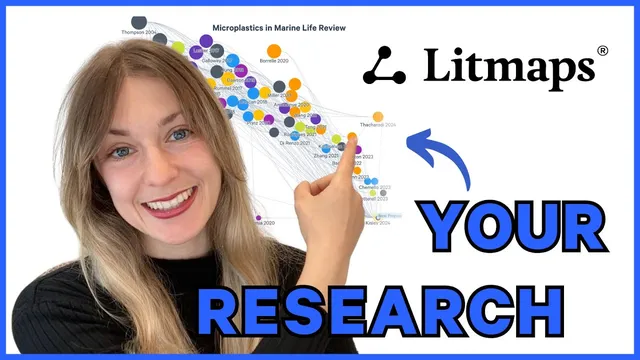
Import a complete set of relevant articles into Litmaps (via file import or manual DOI/ID import) to create a single map for the literature review.
Briefing
Litmaps helps researchers turn a pile of papers into a visual “research story” by importing relevant articles, mapping their relationships, and then reshaping the layout to highlight what matters most. The workflow starts with building a single Litmap from a complete set of sources—either by importing an existing literature review file or by manually bringing in articles using identifiers like DOIs or IDs. Once the papers are loaded, Litmaps can run an “explore related articles” search that expands the research library automatically, giving researchers a structured way to grow beyond the initial set.
After the map exists, the key move is changing the axes to tell a clearer narrative about the literature. By default, Litmaps sorts articles with publication date on the X-axis and citation count on the Y-axis, making it easy to spot older, highly cited “high impact” work in one corner and newer studies in another. But the axes aren’t fixed: researchers can switch to alternative measures that change what the map emphasizes. Sorting by “map connectivity” orders papers by how interconnected they are, which helps identify the most central work in a literature review. Other sorting options include reference count and a Litmaps-specific metric called “momentum.” Momentum adjusts citation counts for the natural advantage older papers have in accumulating citations, so newer papers that have unexpectedly high influence rise into view. A slider lets users tune how strongly that recency bias is corrected, balancing “surprising impact” against raw citation totals.
Litmaps also supports thematic storytelling through visual customization. Articles can be tagged into subtopics, and labels can be added to describe themes or concepts across the map. Titles can appear over the visualization, while per-article labels can be customized using a paintbrush tool. Researchers can further differentiate groups by assigning special icons and colors—using a “halo” ring to make certain papers stand out—so the map communicates structure at a glance rather than requiring readers to decode it from text.
The platform goes beyond existing databases by allowing users to add custom articles, including proposed or not-yet-included work, so the map can reflect the full arc of a research plan. Finally, Litmaps makes sharing straightforward: maps can be shared via URL or email, and images can be exported as screenshots with adjustable export parameters for use in papers, presentations, or other published work.
In short, Litmaps turns literature review work into an interactive, adjustable visual narrative—one that highlights impact, centrality, and recency-adjusted influence, while also making themes and future directions easy to communicate to others.
Cornell Notes
Litmaps turns a literature review into a visual “research story” by importing relevant papers into a single map, then expanding and reorganizing that map to reveal patterns. After import, users can run “explore related articles” to grow their research library and then adjust the axes to change what the layout emphasizes. Default sorting places publication date on the X-axis and citation count on the Y-axis, helping users spot older high-impact work versus newer studies. Alternative views like map connectivity and the momentum metric (which corrects citations for recency) help identify central papers and unusually influential recent work. Tags, labels, icons, and halos add thematic structure, and custom articles plus easy sharing (URL/email or exported images) support communication in publications and presentations.
What are the main ways to get papers into a Litmaps library before building the map?
How does changing the axes help communicate different parts of a literature review?
What is “momentum” in Litmaps, and why does it matter for identifying newer influential work?
How can researchers make themes visible on the map rather than leaving everything as generic nodes?
How does Litmaps support research plans that include papers not yet in its database?
What sharing options make it practical to use a Litmaps visualization in published work?
Review Questions
- How would you decide between using citation count versus map connectivity when reorganizing a Litmaps visualization?
- What problem does momentum address, and how does the cursor control the strength of that correction?
- Describe two different ways Litmaps customization (tags/labels/icons/halos) can change how readers interpret a literature review map.
Key Points
- 1
Import a complete set of relevant articles into Litmaps (via file import or manual DOI/ID import) to create a single map for the literature review.
- 2
Use “explore related articles” to expand the research library automatically from the imported set.
- 3
Change the X/Y axes to shift the narrative—default date vs citations for impact and recency, or connectivity for centrality.
- 4
Use momentum to surface newer papers with unusually high influence, and tune the recency bias correction with the cursor.
- 5
Add structure with tags and labels, and differentiate groups with icons and halo colors for faster reader comprehension.
- 6
Include future directions by adding custom articles, including proposed work not yet in the database.
- 7
Share results through URL/email or export map images for use in papers and presentations.