The Color Temperature Paradox
Based on minutephysics's video on YouTube. If you like this content, support the original creators by watching, liking and subscribing to their content.
Kelvin-based “color temperature” comes from the historical dominance of hot, glowing light sources whose color tracks temperature.
Briefing
A white object can look different under different lighting, yet both human vision and cameras work to make it look “white” anyway—so the camera setting called “color temperature” often behaves in ways that feel backwards. The core idea is that color temperature (measured in Kelvin) originally described the color of hot, glowing light sources, where hotter light is bluer and colder light is redder. But cameras don’t set the image’s color temperature directly; they apply compensation so that objects appear like they normally would under neutral lighting. That compensation can overshoot, producing images that look too yellow or too blue.
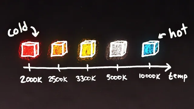
Kelvin is a temperature unit, and that mismatch matters because photographic lighting was historically dominated by incandescent sources such as sun-like radiation and glowing bulb filaments. For a hot object, the color shifts with temperature in a fairly direct progression: red hot → orange hot → yellow hot → white hot → blue hot. This is why people casually associate “warm” light with orange and “cool” light with blue—yet the “warm” feeling often comes from light emitted by objects that are still physically hot enough to glow red or orange, but not hot enough to reach the whiter/bluer range. Typical examples given include incandescent bulbs around 3,000 Kelvin and the sun’s surface around 6,000 Kelvin, with candlelight closer to 2,000 Kelvin.
Real-world lighting isn’t limited to glowing solids. Neon, fireworks, fireflies, fluorescent bulbs, LEDs, and lasers can all produce colors that don’t follow the simple “hotter equals bluer” rule. Even within the hot-source framing, daylight varies widely—from roughly 4,500 Kelvin to above 10,000 Kelvin—depending on direct sun, shade, clouds, time of day, and atmospheric conditions. And color isn’t one-dimensional: light can shift toward green or magenta as well as along a red–blue axis, which is why chromaticity diagrams are needed.
The apparent paradox comes from how cameras interpret the Kelvin setting. When a photographer dials in a high color temperature (like 10,000 Kelvin), the camera assumes the scene is lit by very blue light and compensates by reducing blue in the image. If the actual light isn’t that blue, the correction can go too far, pushing the image past neutral white into an overly yellow look. Conversely, setting the color temperature too low makes the camera add blue to counteract orange/yellow light; if the lighting isn’t that orange, the result can overshoot into an overly blue image. In short: high Kelvin settings tend to yield yellowish images and low Kelvin settings tend to yield bluish images, even though the underlying lighting at high Kelvin is actually blue.
The takeaway is less about Kelvin itself and more about what the camera setting really does: it’s color temperature compensation—an instruction for how to correct the lighting so objects match human expectations—rather than a direct control of the final image’s color temperature. The terminology persists largely due to history and physics, even after modern lighting sources broke the original “temperature equals color” assumption.
Cornell Notes
Color temperature (Kelvin) started as a way to describe the color of hot, glowing light sources: hotter objects glow bluer, cooler ones glow redder. Cameras still use Kelvin-based language, but the setting is not “what color the image will be.” It tells the camera how to compensate for the lighting so a white object looks white and other objects keep their expected colors. Because compensation can overshoot, setting the color temperature too high can produce overly yellow images, while setting it too low can produce overly blue images. The mismatch feels paradoxical only until you remember the camera is correcting the scene, not selecting the scene’s true color temperature.
Why does Kelvin show up in discussions of color, even though Kelvin measures temperature?
How can “warm” and “cool” light feel opposite to the physical temperature story?
What range of Kelvin values can real lighting fall into?
Why isn’t color temperature a complete description of color?
What exactly causes the “color temperature paradox” in camera settings?
How should “color temperature” be interpreted when adjusting a camera?
Review Questions
- If a scene is lit by a light source that is actually less blue than your camera’s color temperature setting assumes, what color shift is likely to appear in the final image and why?
- How does the historical origin of Kelvin-based color temperature relate to incandescent bulbs and the sun’s approximate Kelvin values?
- Why can two lights with the same “color temperature” still produce different perceived colors?
Key Points
- 1
Kelvin-based “color temperature” comes from the historical dominance of hot, glowing light sources whose color tracks temperature.
- 2
Hotter glowing objects shift from red/orange toward yellow/white and then toward blue as temperature rises.
- 3
“Warm” and “cool” are human interpretations that map imperfectly onto physical temperature, because orange light can come from lower glow temperatures than white/blue light.
- 4
Real lighting includes sources like neon, LEDs, fluorescent bulbs, lasers, and fireflies that don’t follow the simple “hotter equals bluer” rule.
- 5
Color isn’t one-dimensional; lights can also shift toward green or magenta, requiring chromaticity concepts beyond Kelvin.
- 6
Camera “color temperature” settings function as compensation for the lighting, so incorrect settings can overshoot neutral white.
- 7
High Kelvin camera settings can yield yellowish images and low Kelvin settings can yield bluish images because of how the compensation is applied.