The Decline Of Usability
Based on The PrimeTime's video on YouTube. If you like this content, support the original creators by watching, liking and subscribing to their content.
Usability should be judged by task success—safe, effective, and efficient operation—rather than by whether users enjoy the experience.
Briefing
Usability hasn’t improved in any meaningful way over the last three years—and the arguments driving modern UI change still recycle the same demands for “research” without producing evidence that actually changes outcomes for everyday users. The core complaint is that today’s interface paradigm keeps drifting away from long-tested principles that make software safe, efficient, and easy to learn, while replacing them with aesthetic minimalism, inconsistent interaction patterns, and feature decisions that don’t map cleanly to how people understand and operate tools.
The discussion starts by tightening what “usability” should mean. Definitions from Wikipedia and software engineering emphasize effectiveness, efficiency, and satisfaction in a quantified context of use—yet the satisfaction piece is treated skeptically, since “usable” doesn’t necessarily require enjoyment. Usability is framed as the ease of completing a predetermined task safely and efficiently, and it’s explicitly separated from aesthetics: a UI can look “fresh” while still failing at basic operational clarity. Likewise, missing features aren’t automatically usability failures; what matters is whether the tool’s design supports the user’s task in the real context.
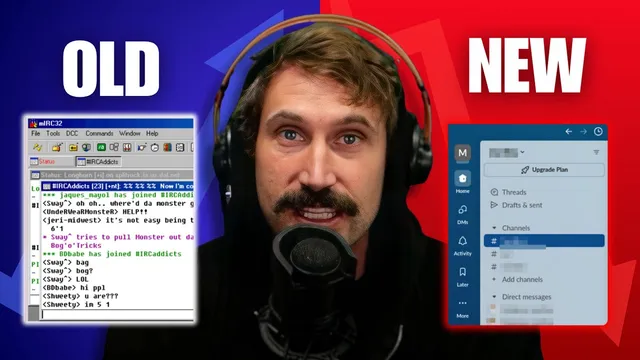
A major thread is consistency—across time, applications, and platforms—but not in the shallow sense of identical pixels. The emphasis is on shared operational concepts: recognizable menu structures (File/Edit/View/Help), predictable interaction affordances, and transferable mental models. The argument points to how major UI conventions converged historically through influential systems and standards, including Apple’s early menu bar approach (introduced with the Lisa in 1983), IBM Common User Access, and later cross-vendor adoption. Even when interfaces overhaul, the best improvements come from redesigning the whole interaction model rather than stripping cues that help users operate software.
From there, the transcript drills into why modern interfaces often feel worse: affordances and visual cues have been flattened or removed. Buttons that once protruded to signal where to press now appear as flat web elements; virtual scrolling and low-contrast icon sets can blur together; and monochrome, stylized icons can become “meaningless” unless users already know the history behind them. The discussion also invokes classic display-design principles (from human factors literature) such as avoiding confusion-inducing similarity, using distinguishable elements, and ensuring that active states (like window focus) stand out clearly.
The most pointed examples target complex professional software and “guideline-driven” toolkits. GNOME’s human interface guidelines are criticized for breaking down as applications grow more complex, with restrictions that remove time-tested UI elements like hierarchical pull-down menus—an approach framed as incompatible with tools such as Blender, where users’ workflows vary dramatically by project stage. Progressive disclosure is also challenged: replacing user-controlled relevance with developer-chosen visibility can slow expert work, especially when “frequently used actions” differ across contexts.
Finally, the transcript tackles the recurring “show the research” culture and counters with the idea that many usability concepts are decades old and grounded in established human-computer interaction principles. It also argues that confusion is often about familiarity and transferable mental models: software that feels “easy” to one group may feel opaque to another, and recent UI shifts can make older conventions feel safer and more discoverable. The bottom line: usability debates keep mistaking churn for progress, while removing cues and interaction patterns that users rely on to work quickly, correctly, and safely.
Cornell Notes
The transcript argues that usability—understood as safe, effective, and efficient task completion—has not meaningfully improved despite ongoing UI churn. It distinguishes usability from aesthetics and from feature absence, emphasizing operational clarity, transferable mental models, and consistent interaction concepts. Classic human-factors ideas like affordances (visual cues that indicate how to operate something) and display-design principles (avoid confusing similarity; make active states stand out) are used to explain why modern interfaces can feel worse. The discussion also criticizes “guideline” approaches that restrict proven UI patterns, especially in complex professional tools where users’ needs vary by workflow stage. Overall, it frames modern UI change as often driven by aesthetics and institutional preference rather than evidence that better supports real tasks.
How does the transcript define usability, and why does it challenge parts of common definitions?
What’s the difference between consistency as “same look” and consistency as “same operation”?
Why do affordances matter, and how do modern interfaces weaken them?
What usability principles are invoked to explain problems with icons and active states?
Why does the transcript say “guidelines” can fail for complex professional software?
How does familiarity explain why some interfaces feel “easy” to some people and “hard” to others?
Review Questions
- Which usability components should be prioritized when judging an interface: aesthetics, feature completeness, or task-based operational clarity? Why?
- Give an example of “consistency” that is operational (mental-model transfer) rather than purely visual. How would you test whether it improves usability?
- What kinds of visual cues (affordances, focus indicators, icon distinctiveness) most directly affect safety and error rates in everyday software use?
Key Points
- 1
Usability should be judged by task success—safe, effective, and efficient operation—rather than by whether users enjoy the experience.
- 2
Aesthetics and “freshness” can coexist with poor usability; the transcript treats operational clarity as the deciding factor.
- 3
Consistency matters when it preserves recognizable interaction concepts (like menu conventions), not when it forces identical visuals across platforms.
- 4
Affordances and visual cues (button shape, focus indicators, distinguishable icons) reduce guessing and speed up correct action.
- 5
Modern UI trends like flat controls, low-contrast icon sets, and virtual scrolling can weaken discoverability and structure perception.
- 6
Rigid UI guidelines can harm complex professional workflows when they remove time-tested patterns or impose developer-chosen visibility.
- 7
Perceived usability is strongly shaped by familiarity and transferable mental models, so “easy” often reflects what users learned first.