The importance of your note-taking interface
Based on Reflect Notes's video on YouTube. If you like this content, support the original creators by watching, liking and subscribing to their content.
Treat a note-taking UI as a thinking environment, not just a storage tool, because thinking drives downstream actions.
Briefing
A note-taking interface should be treated like a “home base” for thinking—not just a place to store information. When the UI is simple, visually clear, and genuinely beautiful, it lowers cognitive load, strengthens emotional buy-in, and helps ideas flow with less friction. That combination matters because note-taking isn’t a side task; it shapes how people remember, organize, and act on their own thoughts.
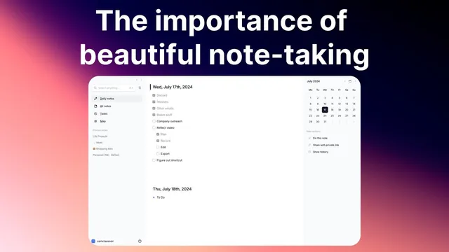
The argument starts with visual clarity and mental focus. Uncluttered layouts reduce cognitive load, freeing mental energy for thinking rather than navigation—where to put something, how to format it, or how to find the right tool. The result is faster capture and easier review later, since a cleaner structure supports recall. White space is presented as a practical design lever for this: the interface should make it easy to concentrate on content instead of managing the environment around it.
From there, the discussion shifts to emotional connection. A note app should feel good to open in the morning, creating positive associations that encourage consistent use. If the interface feels ugly or unpleasant—something like “janky” or visually uncomfortable—people are less likely to reach for it when a spark of thinking hits. Beauty here isn’t framed as decoration; it’s described as motivation that keeps note-taking from becoming a chore.
Beauty also ties directly to creativity and inspiration. The transcript draws an analogy to physical workspaces: people invest effort in lighting, layout, and aesthetics in offices because it supports focus and comfort. The same logic should apply to digital spaces. Instead of spending time customizing and rearranging, the ideal is a pre-built environment that lets someone “land” and start thinking immediately.
Several additional interface principles follow. Cross-device consistency is emphasized so the experience stays familiar across desktop, tablet, and smartphone; switching interfaces too drastically can break the mental flow and create hesitation. The “disappearing interface” is described as the ideal state where the tool fades into the background and attention stays on writing—an effect associated with minimal UI and modes like focus views.
Finally, the interface should reduce decision fatigue. Complex folder structures, unclear features (like backlinks), and extra UI elements force constant micro-decisions while trying to capture thoughts. The goal is fewer distractions and more support for the natural flow of ideas—potentially including features like inline audio memo recording.
The comparison between Reflect and Apple Notes is used to illustrate these points rather than to bash either product. Reflect is praised for white space, simplicity, and a professional, confidence-building look; Apple Notes is criticized mainly for visual discomfort and higher cognitive friction in this user’s experience. The transcript concludes that paying for a note app is justified if it’s used daily, with Reflect priced at $120 per year, and a direct challenge to choose whichever app feels beautiful enough to invite frequent use.
Cornell Notes
A note-taking app should function as a “home base” for thinking, so its interface needs to be both simple and beautiful—not merely functional. Uncluttered design reduces cognitive load, letting people spend more mental effort on ideas and less on formatting or navigation. Aesthetics also matter because positive emotional associations make it easier to open the app consistently when inspiration strikes. The best interfaces feel seamless across devices, “disappear” while writing, and minimize decision fatigue from confusing organization systems. Features that match a person’s workflow—like quick audio memo capture—can further support the flow of thought.
How does visual clarity translate into better thinking during note-taking?
Why does emotional connection to a note app affect whether people take notes?
What does “beauty” mean in this context, and how is it justified?
What is the “disappearing interface,” and why is it considered the ideal?
How can interface complexity create decision fatigue while capturing thoughts?
Why does cross-device consistency matter for note-taking quality?
Review Questions
- What mechanisms connect uncluttered UI (white space, fewer controls) to improved recall and faster note capture?
- How do emotional factors—like enjoying the app enough to open it daily—change the effectiveness of a note-taking system?
- Which interface traits reduce decision fatigue, and how do they affect the ability to capture ideas in real time?
Key Points
- 1
Treat a note-taking UI as a thinking environment, not just a storage tool, because thinking drives downstream actions.
- 2
Use visual clarity and white space to reduce cognitive load so the brain focuses on ideas instead of navigation.
- 3
Build positive emotional associations with the app so note-taking feels like a go-to habit rather than a chore.
- 4
Design for creativity by applying the same logic as physical workspace aesthetics—comfortable, pre-built, and ready to use.
- 5
Maintain cross-device consistency so switching devices doesn’t break the mental flow of capturing thoughts.
- 6
Aim for a “disappearing interface” where attention stays on writing and the tool fades into the background.
- 7
Minimize decision fatigue by avoiding confusing organization systems and making key features easy to use during capture.