thematic analysis | how to present the results
Based on Qualitative Researcher Dr Kriukow's video on YouTube. If you like this content, support the original creators by watching, liking and subscribing to their content.
Present the thematic framework to readers within the first few minutes, then move through main themes as separate sections.
Briefing
A results chapter built from thematic analysis should be organized around a clear thematic framework shown to readers early, then unfolded theme-by-theme with evidence and interpretation. The central rule is straightforward but often missed: readers need to see the framework—usually in a table or diagram—within the first few minutes, before the narrative moves into individual themes. From there, the chapter should cycle through the main themes (typically separate sections), with each section introducing the theme briefly, then grounding it in data extracts (quotes) and follow-up interpretation.
Order matters less than coherence. Instead of arranging themes strictly by frequency or by which participant discussed them most, the chapter should follow a story that makes sense. A practical way to achieve that flow is to imagine explaining the findings to someone else—at a conference, to a friend, or to family—and ask what would come first for comprehension. If starting with one theme forces too many references to themes the reader hasn’t met yet, it’s better to begin with a different theme that provides context, then return later. The guiding principle is common sense: the sequence should feel understandable and readable, not mechanically “correct.”
Within each theme section, the structure should stay consistent: define the theme, present evidence, and interpret what that evidence means. Evidence in qualitative work is primarily extracts—participant quotes—used to show how the theme appears across the dataset. A key mistake is treating the section like an exhaustive walkthrough of one participant after another. Instead, the focus stays on the theme: move across participants as needed to strengthen the point, but avoid exhausting a single interviewee’s data before moving on. The approach can vary by research design—participant-centered structures may be more acceptable in ethnography or detailed case studies—but the default remains theme-centered.
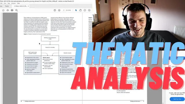
Presentation format is flexible, with no universal rule that tables, models, or visuals must be used. Still, tables are strongly recommended for summarizing the thematic framework at the start. A good table can include theme names, definitions, coding frequency or strength (if relevant), and sometimes example extracts. Visual tools can complement the table: simple diagrams or models are useful when relationships between themes matter, but they shouldn’t be forced when the topic is straightforward. Audience preferences also matter; some readers find models easier to grasp than text, while others struggle with them.
The transcript illustrates these choices through a published mixed-methods study on English Medium Instruction (EMI), funded by the British Council, where qualitative results were analyzed thematically. Different presentation tools were used depending on what needed to be communicated. For “approaches to EMI,” results were discussed in text rather than modeled because relationships weren’t the focus. For “driving forces,” the theme was handled similarly because responses were limited and fairly consistent. For “attitudes,” complexity increased: advantages were organized into a model, while challenges were presented using both a table and a model. The study also used tables to show differences across groups (students, content teachers, and EAP staff) and even included percentages of interview data tied to advantages versus challenges to signal relative emphasis. When the analysis moved into more specific sub-challenges (e.g., language-related versus institutional), the presentation returned to text-only sections.
Overall, the results chapter becomes a navigable narrative: show the framework early, keep each theme section theme-focused with selective extracts and interpretation, and choose visuals only when they add clarity for the reader and fit the nature of the themes.
Cornell Notes
The results chapter for thematic analysis should be built around a thematic framework that’s presented to readers immediately—often via a table—then expanded theme-by-theme. Each theme section should start with a brief definition, followed by qualitative evidence (participant extracts) and interpretation, without turning the section into an exhaustive participant-by-participant account. Theme order should prioritize coherence and readability over frequency or participant prominence, using a “story” logic that makes comprehension easy. Visuals are optional: tables are especially useful for summarizing the framework, while models/diagrams help when relationships among themes matter. Format choices should match the study’s needs and the audience’s preferences.
What is the most important structural rule for presenting thematic analysis results?
How should a researcher decide the order of themes in the results chapter?
What’s the key mistake to avoid inside individual theme sections?
When are tables useful in thematic analysis write-ups?
When should models or diagrams be used instead of (or alongside) tables?
How did the EMI study vary presentation methods across themes?
Review Questions
- How would you justify the order of themes in a results chapter if two themes have similar frequency but different roles in your narrative?
- What criteria would you use to decide whether a theme should be presented with a table, a model, or text-only?
- In a theme section, how would you balance using enough participant extracts for evidence without turning the section into an exhaustive participant-by-participant account?
Key Points
- 1
Present the thematic framework to readers within the first few minutes, then move through main themes as separate sections.
- 2
Choose theme order based on narrative coherence and reader comprehension, not solely on frequency or participant prominence.
- 3
For each theme section, start with a brief definition, then provide qualitative evidence (extracts) and follow with interpretation.
- 4
Keep sections theme-focused by selecting relevant extracts across participants; avoid exhausting one participant’s data before moving on.
- 5
Use tables to summarize the full thematic framework early, including definitions and—when appropriate—coding frequency or strength.
- 6
Add models/diagrams only when they clarify relationships or classifications; don’t force visuals for straightforward topics.
- 7
Match presentation choices to the study’s needs and the audience’s preferences (some readers prefer visuals, others don’t).