Track Habits With a Heatmap Calendar in Obsidian
Based on Prakash Joshi Pax's video on YouTube. If you like this content, support the original creators by watching, liking and subscribing to their content.
Install and enable Data View and Heatmap Calendar, with Data View’s JavaScript queries and inline JavaScript queries turned on.
Briefing
A heatmap calendar in Obsidian turns habit tracking into an at-a-glance visual system—color intensity shows how often and how strongly daily activities happen, and different configurations support goals, streaks, and scaled measurements. The setup hinges on two plugins: Data View (to query your note properties with JavaScript) and Heatmap Calendar (to render the calendar grid). Once installed, the approach is straightforward: store daily habit data as note properties, then embed a small JavaScript snippet in a dedicated “heat map calendar” note to pull those properties and color the calendar cells.
The workflow starts with enabling Data View’s JavaScript querying. In Obsidian, Data View must have JavaScript queries and inline JavaScript queries turned on. Next, Heatmap Calendar is installed and enabled. With both plugins ready, the tracker depends on having structured data. The transcript uses a “daily note” folder containing daily notes with four properties—exercise, spent, mood, and writing—so each day has values that can be visualized. A separate note (for example, “heat map calendar”) then hosts the JavaScript code that renders the heatmap.
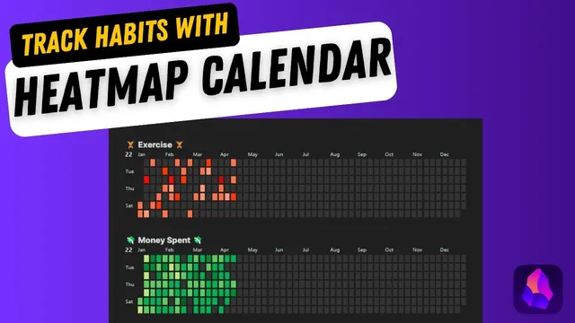
The first configuration produces a basic intensity heatmap. By copying an example script from the Heatmap Calendar documentation/GitHub and adjusting two key parts—(1) the data view query source folder (e.g., “daily note”) and (2) the property name to visualize (e.g., “exercise” with a capitalized property key)—the calendar begins coloring cells based on the numeric values in those daily notes. Light colors represent low values, while darker/redder cells represent higher values. Clicking into a day reveals the underlying property value (e.g., workout durations like 15 minutes vs. 78 minutes), and the heatmap automatically maps the lowest value to the lightest color and the highest value to the darkest.
A second configuration adds goal-based targeting. By introducing intensityScaleEnd (set to the target, such as 30 minutes for daily exercise), the heatmap can switch from “relative intensity” to “goal met vs. not met.” In the example, days that reach or exceed the target are colored uniformly (e.g., black or another chosen hex color), while lower days remain unfilled or differently colored. The transcript notes that colors can be customized using hex codes from a color palette site.
A third style supports “don’t break the chain” streak tracking using a boolean-like property (such as a checkmark). Instead of numeric intensity, the calendar uses a property that indicates whether the habit happened, so the grid visually reinforces consistency. Finally, a scaled intensity version supports measurements on a fixed range. For mood tracked on a 1–10 scale, the script sets intensityScaleStart to 1 and intensityScaleEnd to 10, then expands the color palette so each value range gets distinct tints. The transcript even mentions using ChatGPT to generate the repetitive color-code list.
Overall, the method provides a flexible template: numeric properties for intensity, target thresholds for goal achievement, checkmark properties for streaks, and start/end scales for bounded metrics—turning daily habit data into a readable calendar without manual charting.
Cornell Notes
Heatmap Calendar in Obsidian can visualize daily habit data directly on a calendar by coloring each day based on note properties. The setup requires two plugins: Data View (for JavaScript queries) and Heatmap Calendar (for rendering). After creating daily notes with properties like exercise, spent, mood, and writing, a separate “heat map calendar” note embeds JavaScript that queries those properties and maps values to colors. Numeric properties create an intensity heatmap; adding intensityScaleEnd enables goal-based coloring (e.g., 30 minutes of exercise). Boolean/checkmark properties enable a “don’t break the chain” streak style, while start/end scales support fixed-range metrics like mood from 1 to 10.
What are the two plugins needed to build a heatmap calendar in Obsidian, and what must be enabled in Data View?
How does the basic intensity heatmap decide what color each day gets?
How can the calendar be configured to show whether a daily goal was met?
How does the “don’t break the chain” style differ from intensity-based tracking?
What changes are needed to visualize a fixed-range metric like mood from 1 to 10?
Review Questions
- If you want the heatmap to visualize “writing” instead of “exercise,” what two script elements must be updated?
- How does intensityScaleEnd change the meaning of the heatmap compared with a basic intensity setup?
- Why might mood values from 1–10 appear in only one color unless the color palette is expanded?
Key Points
- 1
Install and enable Data View and Heatmap Calendar, with Data View’s JavaScript queries and inline JavaScript queries turned on.
- 2
Store habit data as properties in daily notes (e.g., exercise, spent, mood, writing) inside a consistent folder so the heatmap can query them.
- 3
Create a dedicated “heat map calendar” note and paste a Heatmap Calendar JavaScript snippet, then customize the folder query and the property key to visualize.
- 4
Use the basic intensity configuration to color days by relative numeric magnitude, where low values map to light colors and high values map to dark colors.
- 5
Add intensityScaleEnd to turn the heatmap into a goal tracker (e.g., color days that meet a 30-minute exercise target).
- 6
Use a checkmark/boolean property for “don’t break the chain” streak visuals instead of numeric intensity.
- 7
For fixed-range metrics (like mood 1–10), set intensityScaleStart and intensityScaleEnd and supply enough color tints so different values don’t collapse into the same shade.