Ultimate Tailwind CSS Tutorial // Build a Discord-inspired Animated Navbar
Based on Fireship's video on YouTube. If you like this content, support the original creators by watching, liking and subscribing to their content.
Tailwind CSS trades semantic, hand-authored CSS for utility classes that map directly to CSS properties, enabling faster iteration and consistent styling via shared scales.
Briefing
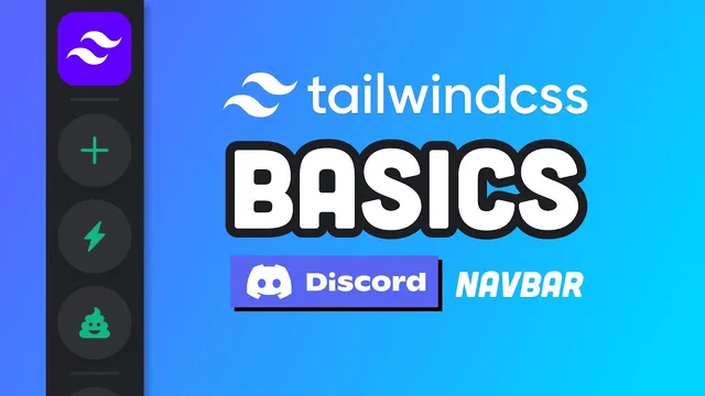
Tailwind CSS is positioned as a faster way to build highly customized UIs by composing large sets of utility classes directly in markup—trading “semantic CSS” for a functional, utility-first workflow that can still produce polished, brand-accurate designs. The tutorial’s core payoff is a Discord-inspired animated sidebar: fixed layout, custom colors matched to Discord, hover animations that morph shapes, and tooltips that appear smoothly—plus dark mode support.
The walkthrough starts by answering what Tailwind is and when to use it. Tailwind is essentially a library of CSS utility classes that lets developers write less custom CSS while keeping styling consistent through a shared design scale (notably for spacing). Unlike Bootstrap, it doesn’t ship pre-built components, which can mean more work than a component framework—but it offers deeper control over customization. The setup is framed as approachable for beginners because development tooling (like VS Code IntelliSense) reveals what each utility maps to in actual CSS, and production builds can remove unused styles.
From there, the tutorial moves into project setup for a component-based JavaScript app (using React as the example). It generates a React app via Create React App, installs Tailwind-related dependencies, and uses a configuration override to integrate Tailwind with the build pipeline. The Tailwind CLI generates a config file, and the global CSS includes Tailwind’s directives so the utilities are available. In the Tailwind config, two key performance/behavior changes are highlighted: enabling Just-In-Time compilation (to build CSS on the fly) and purging unused CSS for smaller production bundles.
The UI build begins with a flexible container using Tailwind’s layout utilities (e.g., `flex`, `flex-col`). The sidebar itself is fixed to the top-left (`fixed`, `top-0`, `left-0`) and sized responsively (`h-screen`, `w-16`). Background color and shadow come from Tailwind’s palette and shadow utilities, but the tutorial then tackles branding accuracy: the default gray doesn’t match Discord, so the Tailwind theme is extended with custom color tokens (like `primary` and `secondary`) and the gray shades are replaced with values reverse-engineered from the Discord app. The result is subtle but visually aligned.
For the animated icon buttons, the sidebar uses a reusable React component that accepts an icon as a prop. Styling is partly done with Tailwind utilities and partly via custom CSS classes built using Tailwind’s `@layer` and `@apply` directives. Hover behavior uses Tailwind variants (e.g., `hover:`) to change background and text colors, while shape morphing is achieved by animating border radius from a circular form to a rounded-square form (via `rounded-*` utilities) combined with `transition-all` and optional timing/easing utilities.
Tooltips add another layer: the tooltip content is rendered but hidden by default using a scale transform (`scale-0`). Because the tooltip itself can’t be hovered while invisible, the tutorial uses Tailwind’s `group` and `group-hover:` pattern so the tooltip scales to visible (`scale-100`) when the parent icon is hovered. Finally, dark mode is enabled through a config strategy that relies on a `dark` class on a parent element; elements use the `dark:` variant for alternate colors, with a custom hook (in the full source) managing the user’s preference via local storage.
Overall, the project demonstrates how Tailwind’s utility composition, theme customization, and variant system can recreate a complex, interactive UI—without relying on heavy custom CSS or pre-built component libraries.
Cornell Notes
Tailwind CSS is presented as a utility-first styling system that can speed up UI development while still enabling deep customization. The tutorial demonstrates this by building a Discord-inspired animated sidebar in a React app: a fixed layout, Discord-matched colors via Tailwind theme extension, hover animations that morph icon shapes using border-radius transitions, and tooltips that animate in using `group-hover` with scale transforms. Dark mode is implemented by enabling a `dark` class strategy in Tailwind config and using `dark:` variants for alternate styling. The key takeaway is that Tailwind’s utilities, variants, and theming tools can recreate brand-specific, interactive UI patterns with minimal bespoke CSS.
What makes Tailwind different from traditional “semantic CSS,” and what tradeoff does that create?
How does the tutorial integrate Tailwind into a React project and improve build performance?
How is the sidebar layout constructed using Tailwind utilities?
How does the tutorial match the sidebar colors to Discord specifically?
What technique creates the animated icon hover effect that changes from a circle to a rounded square?
How do tooltips appear on hover even though the tooltip starts hidden?
How is dark mode implemented in this Tailwind setup?
Review Questions
- Which Tailwind config options are used to enable Just-In-Time compilation and why does that matter for build speed?
- Why does the tooltip use `group-hover` instead of `hover:` on the tooltip element itself?
- What combination of utilities produces the circle-to-rounded-square animation on icon hover?
Key Points
- 1
Tailwind CSS trades semantic, hand-authored CSS for utility classes that map directly to CSS properties, enabling faster iteration and consistent styling via shared scales.
- 2
Tailwind doesn’t include pre-built components, so developers must compose UI from utilities—but gain finer control over customization.
- 3
JIT mode compiles CSS on demand, and purging unused CSS can shrink production bundles.
- 4
A Discord-like sidebar can be built with fixed positioning (`fixed`, `top-0`, `left-0`), full-height sizing (`h-screen`), and width from the spacing scale (`w-16`).
- 5
Brand-accurate colors come from extending the Tailwind theme and replacing default palettes with values reverse-engineered from the target app.
- 6
Animated icon hovers are achieved by pairing hover variants that change border radius and colors with `transition-all` (and optional timing/easing utilities).
- 7
Tooltips animate in by hiding with `scale-0` and revealing with `group-hover:scale-100`, avoiding the problem of hovering an invisible element.