Visualize Your Options: A Step-by-Step Guide to Using Flowcharts for Decision-Making
Based on Zsolt's Visual Personal Knowledge Management's video on YouTube. If you like this content, support the original creators by watching, liking and subscribing to their content.
Build decision flowcharts by separating soft factors (relationships, quality of life) from hard factors (cost of living, financial feasibility) before drawing branches.
Briefing
Decision-making rarely comes down to a clean yes-or-no choice; it’s usually a chain of tradeoffs under uncertainty. A practical way to handle that complexity is to build a decision flowchart that forces the “soft” and “hard” factors into explicit branches—then refine it as gaps and assumptions surface. The core payoff is clarity: the flowchart becomes both a thinking tool and a communication device that can withstand tough follow-up questions from others.
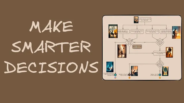
The walkthrough centers on John, a software engineer weighing three options: move to a new city for a new job, search for a job in his current city, or stay put. He starts by separating considerations into two buckets. First come the soft factors—how the move would affect relationships and the quality of life in the new place. Then come the hard financial factors—cost of living and the financial implications of moving now. If the move looks financially feasible and the quality of life is strong, the decision is straightforward: take the new job. If either condition fails, the chart routes John toward alternatives.
A key refinement happens when the initial draft reveals a logic flaw: the “stay put” path was drawn as if poor quality of life in the new city automatically meant staying in the current job. The corrected version adds a missing step—John can still evaluate employment options in his current city even if the new city’s quality of life is poor. Only if a suitable job can’t be found does staying in the current job become the best choice. That correction illustrates the broader value of flowcharts: they expose reasoning gaps early, before the decision hardens.
Beyond the decision branches themselves, the method emphasizes linking supporting evidence without cluttering the main diagram. For example, John can attach a stakeholder/relationship map to the “impact on personal relationships” node. Instead of cramming details into the flowchart, the node links to an embedded Excalidraw-style drawing where relationships are mapped around John; hovering previews the content, and clicking opens the details. The same approach works for research-heavy inputs like cost of living: a linked markdown table can hold expense categories and figures, keeping the primary flowchart readable while still preserving the data behind each decision point.
Two additional decision insights round out the framework. First, outcomes are shaped by unpredictability and incomplete information, so the chart should avoid black-and-white thinking. Rather than labeling quality of life as simply “good” or “bad,” the flowchart can use a scale—“better but not best,” for instance—so each decision point can be treated as a probability or “in bets” scenario. Second, emotions and gut signals can be useful data, but only when grounded in experience. The guide suggests recording feelings directly on the flowchart using emojis (e.g., boredom for staying put, anxiety for a stressful choice, relief for a promising option). After the decision, revisiting the chart helps evaluate whether the probabilities and emotional signals were aligned with the eventual result.
The overall message is practical: build the chart, link the evidence, represent uncertainty with scales, and capture emotional signals—then review what worked once the outcome is known.
Cornell Notes
A decision flowchart helps turn complex choices into explicit branches that combine “soft” factors (relationships, quality of life) with “hard” factors (cost of living, financial feasibility). Using John’s job/city dilemma, the method shows how a first draft can contain a logic gap—fixing it requires adding missing evaluation steps (e.g., even if the new city’s quality of life is poor, John should still check current-city job options before deciding to stay). The chart stays readable by linking supporting material—like a relationship map or a cost-of-living markdown table—behind clickable nodes. Finally, decisions should be treated as probabilistic rather than binary, and feelings can be recorded on the chart with emojis to learn from how emotions influenced the outcome.
How does the flowchart structure John’s decision between moving, searching locally, or staying put?
What logic flaw appears in the first version of the decision flowchart, and how is it corrected?
How can supporting details be added to a flowchart without cluttering the main diagram?
Why does the framework recommend replacing yes-or-no thinking with probabilities or “in bets” thinking?
How can emotions and gut feelings be incorporated into the flowchart responsibly?
What’s the purpose of revisiting the decision diary after the outcome?
Review Questions
- When would a decision flowchart route you from “poor quality of life in a new city” to “stay put,” and what intermediate step must be included?
- How do linked supporting materials (like a relationship map or a cost-of-living table) improve readability and decision quality?
- What does it mean to treat decision points as probabilities, and how can a scale be used instead of yes-or-no labels?
Key Points
- 1
Build decision flowcharts by separating soft factors (relationships, quality of life) from hard factors (cost of living, financial feasibility) before drawing branches.
- 2
Use the chart to stress-test logic; if a path skips an evaluation step, revise the flow until all relevant options are considered.
- 3
Keep the main diagram readable by linking evidence behind nodes—such as a relationship map or a markdown cost table—rather than embedding every detail.
- 4
Represent uncertainty with scales or “in bets” thinking instead of binary yes-or-no outcomes, acknowledging that outcomes can diverge from expectations.
- 5
Record emotions on the chart with emojis (and optional text) to capture gut signals as learnable inputs, especially in domains where experience is strong.
- 6
After the decision, revisit the chart to evaluate whether your probability judgments and emotional signals aligned with the eventual result.