What Does Earth Look Like?
Based on Vsauce's video on YouTube. If you like this content, support the original creators by watching, liking and subscribing to their content.
Earth’s appearance depends on which wavelengths are captured and how they’re translated into human-visible colors, not on a single objective “look.”
Briefing
Earth’s “true” appearance isn’t a single picture—it changes depending on what wavelengths, perspectives, and map-making choices are used, and that mismatch is exactly why so much remains unseen. From Mars or Saturn, Earth can be photographed as a distant “point of light,” but even the famous Blue Marble is only a human-friendly slice of reality: it relies on visible light and on a particular convention for what counts as “up.”
Human vision is limited to a narrow band of electromagnetic radiation. Visible light is just one part of an effectively infinite spectrum, with red light having longer wavelengths than blue and violet. Push shorter than visible and the same physics becomes ultraviolet, X-rays, and gamma rays—still light, just invisible to the eye. Stretch longer and the spectrum becomes infrared, microwaves, and radio waves. The practical consequence is that “what Earth looks like” depends on which portion of that spectrum is rendered into colors humans can interpret. A remote control’s signals are a simple example: the button press is invisible, but a mobile phone camera can detect the wavelengths and make them visible. The night sky similarly contains frequencies beyond unaided sight, and tools like Chromoscope.net translate other bands into human-perceivable color maps.
Even within visible-light imagery, orientation and geometry distort perception. The Blue Marble’s familiar look reflects a “north equals up” bias rather than an objective standard. Apollo 17 originally captured the image differently, and NASA rotated it afterward to match the conventional idea of “up.” Shadows also reveal that Earth’s appearance is dynamic: the US Naval Observatory’s live animation shows which parts of the planet are in Earth’s shadow at any moment, and solar eclipses add other moving shadows, like the Moon’s dark smudge seen from above.
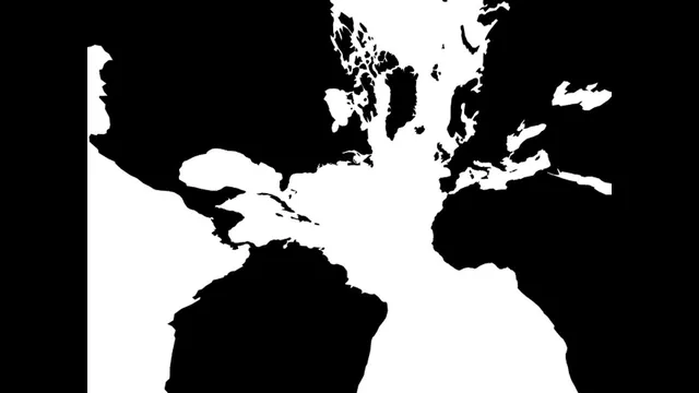
Then there’s the problem of projection. A globe is three-dimensional and faithful, but flat maps require projecting a sphere onto a plane, guaranteeing distortion. The Mercator projection preserves shapes reasonably well for navigation but exaggerates area near the poles—Greenland can look as large as Africa, and Greenland’s reality is closer to 1/14th of Africa’s size. Other regions flip the distortion in different ways: Alaska and Brazil can appear similar on Mercator even though Brazil is nearly five times larger. The video walks through alternative projections—Gall–Peters for area accuracy, Mollweide for equal areas with more pleasant shapes, Gnomonic for shortest great-circle routes, Winkel Tripel as a compromise, and Dymaxion for visualizing connectivity.
The takeaway lands on a broader theme: perception is a tiny slice of what exists. Julian Bayliss’s story illustrates how “new Earth” can still be found even with modern tools. While using Google Earth, he spotted dark green vegetation that looked like a rain forest. An expedition confirmed it—along with roughly 12 new species near Mabu, including snakes, chameleons, butterflies, and new plants—highlighting estimates that Earth may host around 8–8.5 million species while only about 1.5–2 million have been discovered. The result is a clear message: if vision is limited by physics and convention, discovery still depends on looking beyond the default view.
Cornell Notes
Earth’s appearance isn’t fixed; it depends on what humans can perceive and how images are constructed. Visible-light photos like the Blue Marble show only a narrow slice of the electromagnetic spectrum, while ultraviolet, X-rays, infrared, microwaves, and radio waves would produce radically different “looks” if translated into human-visible colors. Even visible images are shaped by conventions such as “north equals up,” and by projection choices that distort area and shape when mapping a globe to a plane. The same limitation of perception helps explain why new biodiversity can still be found—Julian Bayliss used Google Earth to locate an unseen rain forest and helped document many new species. The core point: human sight is narrow, but the world is still full of discoveries.
Why doesn’t a photograph of Earth equal Earth’s “real” appearance?
How can the same event be invisible to the eye yet visible through technology?
What does “north equals up” bias change about how Earth is shown?
Why do flat maps always distort Earth?
How did Google Earth help lead to a newly discovered rain forest?
What does the species-discovery estimate imply about human perception?
Review Questions
- If Earth were imaged using only infrared or only ultraviolet wavelengths, what kinds of visual features would likely change first, and why?
- Compare Mercator and Gall–Peters: which property each projection tends to preserve, and what distortion shows up as a result.
- What kinds of “biases” (spectral, orientation, or projection) can make two accurate representations of Earth look fundamentally different?
Key Points
- 1
Earth’s appearance depends on which wavelengths are captured and how they’re translated into human-visible colors, not on a single objective “look.”
- 2
Visible light is only a narrow slice of the electromagnetic spectrum; ultraviolet, X-rays, infrared, microwaves, and radio waves would produce different visual renderings of the same planet.
- 3
Conventions like “north equals up” can rotate or reorient real Earth imagery, changing how familiar images are perceived.
- 4
Flat maps inevitably distort a globe because projecting a sphere onto a plane cannot preserve all properties at once.
- 5
Mercator projection exaggerates area near the poles, making places like Greenland appear much larger than their real size.
- 6
Alternative projections (Gall–Peters, Mollweide, Gnomonic, Winkel Tripel, Dymaxion) exist because different tasks require different trade-offs.
- 7
Even with modern mapping tools, human perception remains limited—field discoveries like Julian Bayliss’s rain forest show how much biodiversity can still be found.