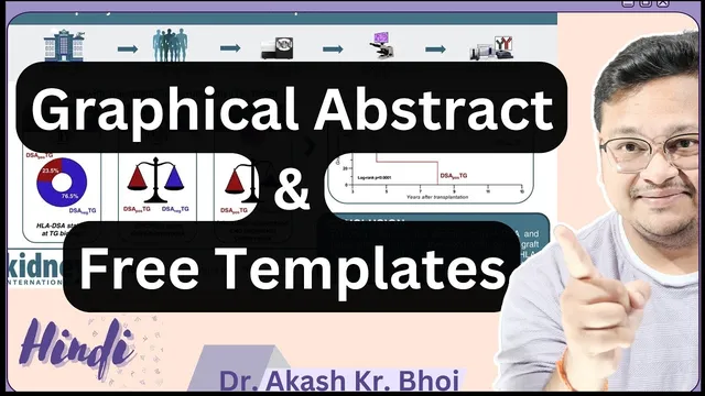
What is Graphical Abstract for Research Paper || Free Graphical Abstract Templates || Hindi
Based on eSupport for Research's video on YouTube. If you like this content, support the original creators by watching, liking and subscribing to their content.
A graphical abstract is a visual, poster-like summary meant to communicate a paper’s core message quickly, often before a reader opens the full PDF.
Briefing
Graphical abstracts turn research findings into a fast, visual “at-a-glance” summary—helping readers decide quickly whether a paper is worth deeper reading. Instead of forcing people to scan a full PDF, a well-designed graphical abstract delivers the paper’s core message in seconds, which can boost engagement, citations, and visibility when shared on platforms like social media.
The transcript frames a graphical abstract as a poster-like visual that guides prospective readers through the study’s purpose, approach, and key outcomes using attractive, clear graphics. That speed matters because many researchers and reviewers skim feeds and thumbnails; a strong graphical abstract can function like a compelling preview that signals relevance before anyone opens the full paper. It also supports networking: when researchers share their graphical abstract, others can connect with the work more easily and understand what the study contributes without reading line-by-line.
Practical guidance centers on how to design one that meets journal expectations and remains readable. The process should stay simple and informative—there’s no need to cram every table, result, or figure into a single image. Color should be used strategically, and layout elements should be aligned so the visual flow is easy to follow. The transcript also emphasizes that graphical abstracts must be tailored to the target audience: clarity and relevance come from choosing what to highlight (often the most important parts of the reading) rather than adding unnecessary text.
Technical requirements are treated as non-negotiable. Image resolution is highlighted as a key factor for print and digital clarity, with 300 DPI called out explicitly and guidance suggesting higher quality up to 600 DPI. File format and image size depend on the submission platform and journal instructions, and the output should be saved in an appropriate figure format (with the option to attach it alongside the paper). Fonts and file types should match what publishers request, and additional text should be avoided if it reduces readability.
To make creation easier, the transcript points to free graphical abstract templates available online, including PowerPoint-based PPT templates that can be edited directly. Example templates are described as having sections for introductory content, methods, results, and discussion—often arranged as a single-slide layout. Users are encouraged to download templates, replace placeholders with their own images and text, and then customize colors and backgrounds to fit their research area.
Finally, the transcript contrasts “good” versus “poor” graphical abstracts. Poor examples are described as visually cluttered, with unclear levels, excessive or confusing text, and graphics that don’t communicate the message quickly. Better examples keep the message clean and readable, maintain sharp text even when enlarged, and use visual cues (like arrows) to show where the reader should start and how the story progresses. The overall takeaway: a graphical abstract should be designed for fast comprehension, journal compliance, and maximum impact when shared publicly.
Cornell Notes
A graphical abstract is a poster-like visual summary that helps readers grasp a paper’s purpose, methods, and key findings quickly—often in the time it takes to scroll past a thumbnail. The transcript stresses that it should be simple and informative, highlighting only the most relevant parts rather than cramming in every table or result. Design quality depends on readability: strategic color use, aligned elements, and avoiding unnecessary text. Technical compliance matters too, including journal-specific image size, file type, and resolution (300 DPI is explicitly mentioned, with guidance up to 600 DPI). Free, editable templates (often PowerPoint/PPT) can speed up creation, but the final output must still match publisher instructions and remain clear when enlarged.
Why does a graphical abstract matter for research visibility and readership?
What design principle distinguishes a strong graphical abstract from a weak one?
How should researchers decide what content to include?
What technical requirements affect whether a graphical abstract looks professional?
How can templates help, and what must still be customized?
Review Questions
- What role does a graphical abstract play in a reader’s decision to open a paper?
- List the main design and technical factors mentioned that affect readability (e.g., resolution, text amount, alignment).
- How do the transcript’s “good” and “poor” graphical abstract examples differ in clarity and content selection?
Key Points
- 1
A graphical abstract is a visual, poster-like summary meant to communicate a paper’s core message quickly, often before a reader opens the full PDF.
- 2
Keeping the design simple and focused improves comprehension; cramming every result or table into one image reduces clarity.
- 3
Strategic color use and aligned layout elements help the reader follow the research story without confusion.
- 4
Readability depends on technical quality—300 DPI is explicitly mentioned, with guidance up to 600 DPI, plus journal-specific image size and file type.
- 5
Submission requirements vary by platform and journal, so image format, font choices, and output specifications must follow the provided instructions.
- 6
Free, editable templates (often PPT/PowerPoint) can speed up creation, but researchers must replace placeholders and customize formatting to fit their own study.
- 7
Good graphical abstracts maintain sharp text and clear visual flow (e.g., arrows showing start and progression), while poor ones look cluttered and unclear.