Why Diagrams Matter in PKM: A Beginner's Guide
Based on Zsolt's Visual Personal Knowledge Management's video on YouTube. If you like this content, support the original creators by watching, liking and subscribing to their content.
Diagrams strengthen PKM by making thinking spatial, which helps clarify relationships, timing, and context.
Briefing
Diagrams matter in personal knowledge management because they turn thinking into something spatial, navigable, and reusable—especially when writing and linking aren’t enough to clarify relationships, timing, and context. The core claim is that visuals don’t merely decorate ideas; they catalyze spatial thinking. Even everyday language relies on spatial metaphors (“reach for a lofty goal,” “the future lies up ahead”), and good diagrams make those mental pictures explicit. Poor diagrams, by contrast, add noise—so the PKM community benefits from treating diagramming as a practical skill, not an aesthetic afterthought.
A useful diagram in PKM should focus on one idea per illustration and combine text with images so the viewer can grasp the point quickly. The standard offered is demanding but concrete: the diagram should be simple enough to draw on a napkin while explaining it to a friend. That emphasis on clarity connects to a broader principle—illustrations must be readable and intentional, not just “static” pictures. The talk also distinguishes between visuals that clarify thinking and those that confuse it, arguing that diagram quality depends on more than content; it depends on structure, labeling, and how consistently the diagram communicates meaning.
To make diagrams actionable, the guide organizes them by three frames of reference: time, arrangement, and context. Time diagrams—especially timelines—help people understand past, present, and future by answering when something happens and how long events are separated. Arrangement diagrams focus on placement and structure: examples include hierarchy diagrams and tree maps for organizational relationships, floor plans for spatial layouts, and layout diagrams for organizing information on a page or website. Context diagrams support comparison and decision-making by showing environments, tradeoffs, and feedback. The examples range from continuum diagrams for tradeoffs to quadrant tools like SWOT-style quadrants and the Boston box for strategy, sign diagrams and system dynamics for feedback loops, and tools like circle maps, double bubble maps, Venn diagrams, and bubble maps for exploring attributes and relationships. Decision trees and influence diagrams round out the set by visualizing decision points and stakeholder relationships.
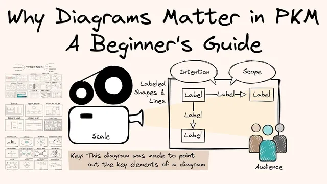
Finally, the guide lays out what makes a diagram “good” in practice, drawing on Abby Covert’s criteria: include visual elements such as scale, shapes, lines, labels, and keys. It also stresses intention, audience, and scope—diagrams should communicate information effectively for a specific purpose. A recurring pain point is that keys and notations are often missing or unclear, particularly when diagrams evolve across a series. The recommendation is to establish simple conventions for line types, colors, shapes, and labels so diagrams can be reused across multiple PKM documents without losing meaning. The takeaway is straightforward: pick a diagram type, try it immediately, and build a personal library of clear, consistent visuals that make knowledge easier to understand and act on.
Cornell Notes
Diagramming is presented as a core PKM skill because visuals make thinking spatial—helping people understand time, structure, and context in ways that plain writing and linking often can’t. Good diagrams focus on one idea per illustration, mix text and images, and should be simple enough to draw on a napkin for someone else. The guide groups diagram types into three frames of reference: time (timelines), arrangement (hierarchies, tree maps, floor plans, page layouts), and context (tradeoff tools, quadrants like SWOT-style analysis, feedback and system dynamics, and comparison maps). Quality depends on more than artwork: clear labels and an explicit key, plus consistent conventions for symbols and notation, make diagrams reusable across documents.
Why does diagramming improve personal knowledge management beyond writing and linking?
What traits define a “good” diagram for PKM use?
How do time diagrams help PKM thinking?
What’s the difference between arrangement and context diagrams?
Why are diagram keys and consistent notation so important?
Review Questions
- Pick one diagram type from the three frames (time, arrangement, context). What single question should it answer for your own PKM?
- Design a simple diagram that could be drawn on a napkin. What labels and key would you include to prevent misinterpretation?
- Compare a hierarchy/tree map to a Venn/bubble-style comparison map. When would each be the better choice for organizing knowledge?
Key Points
- 1
Diagrams strengthen PKM by making thinking spatial, which helps clarify relationships, timing, and context.
- 2
A strong PKM diagram communicates one idea per illustration and is simple enough to draw and explain quickly.
- 3
Organize diagram choices by frame of reference: time (timelines), arrangement (structure and layout), and context (comparison, tradeoffs, feedback).
- 4
Context diagrams are especially useful for decision-making, showing tradeoffs, feedback loops, and stakeholder relationships.
- 5
Good diagrams rely on more than visuals: labels, shapes, lines, and an explicit key are essential for clarity.
- 6
Reuse depends on consistency—use stable conventions for line types, colors, shapes, and labels across documents.
- 7
Start small: choose a diagram type and try it immediately to build a personal library of reusable visuals.