Write the Docs Portland 2017: Building navigation for your doc site: 5 best practices by Tom Johnson
Based on Write the Docs's video on YouTube. If you like this content, support the original creators by watching, liking and subscribing to their content.
Treat documentation findability as a navigation and information-design problem, not only a writing-quality problem.
Briefing
Finding the right help page is often the real bottleneck in documentation—not writing clarity. Usability testing in a controlled lab setting showed that users frequently “flounder around” in help systems: they skim, click, watch videos, and still fail to recognize answers even when the correct information sits on the screen. Designers also get blindsided because workflows that feel intuitive internally don’t translate into navigation paths users actually take. A later round of third-party usability testing echoed the same theme—documentation that feels redundant, circular, and poorly organized—leading to a central goal: improve “findability” so users can locate what they need.
A practical response starts with treating navigation as an information-design problem, drawing on universal design principles such as hierarchy, progressive disclosure, immersion, desire lines, modularity, and wayfinding. The first fix is building a real hierarchy in product sidebars. Instead of flat lists that only show a product name, the sidebar should reveal scope—how many pages exist and how they group—so users can grasp complexity at a glance. Hierarchies help users understand both “the list of parts” and “the sense of the whole,” but they must avoid deep nesting (folders inside folders inside folders), which first paralyzes users with too many choices and then overloads them with too much information. A well-scoped sidebar also helps users realize what they didn’t know was available.
Next comes progressive disclosure: show only the necessary options at each level. Documentation portals can mirror a path-finding experience—portal homepage for choosing a product, product page for narrowing scope, and section/page levels for details—so users aren’t forced to choose from everything at once. Examples cited include Microsoft Azure’s approach to presenting options early, and AWS’s more scan-friendly link lists that keep choices visible above the fold.
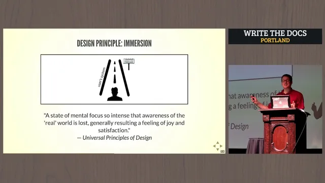
Navigation shouldn’t stop at the sidebar. Users tend to click inline links while reading, so navigation within content matters. This aligns with “immersion”—keeping attention on the page—and with bottom-up navigation, where links connect actions, descriptions, and concepts directly to what the reader is already processing. The tradeoff is maintenance: dense inline linking can create decision overload and becomes hard to keep valid as page names and locations change.
The remaining best practices focus on surfacing what people already want and reducing fragmentation. Popular topics should be elevated based on metrics—moving high-traffic pages higher in navigation and featuring them on index pages. Desire lines also matter: documentation should make the most common user paths obvious, similar to how people’s real-world walking routes can be observed and then formalized. Finally, modularity reduces information fragmentation by consolidating small, disconnected chunks into longer, self-contained topics, supported by on-page tables of contents. When workflows are complex, wayfinding elements—process maps, contextual links, next-step links, and breadcrumbs—help users contextualize where they are and where to go next.
The takeaway is straightforward: documentation success depends on guiding users to content, not just producing accurate content. When these principles are applied, even basic navigation choices take on new meaning for real users trying to find answers fast.
Cornell Notes
Usability testing repeatedly shows that users struggle to locate help content even when answers exist on the page. The remedy is to treat documentation navigation as an information-design system built for “findability,” not just clarity of writing. Key moves include creating a clear hierarchy in product sidebars, using progressive disclosure to limit choices at each level, and supporting inline navigation so readers can follow links while staying focused on the page. Popular topics should be surfaced using real usage metrics, and modularity should prevent fragmented “pinball” experiences by consolidating content into self-contained topics. For complex flows, wayfinding tools like process maps, next-step links, and breadcrumbs help users understand where they are and what comes next.
Why do users fail to find answers even when the correct content is visible?
What makes a documentation sidebar helpful instead of overwhelming?
How does progressive disclosure reduce choice overload in docs?
Why emphasize inline links and “immersion” in documentation navigation?
How do desire lines and metrics improve “findability” for common tasks?
What does modularity change about how users experience documentation?
Review Questions
- Which navigation change would most directly address your users’ current failure mode: missing the right page, missing the right section on the page, or getting lost between topics?
- Where in your docs do you currently rely on deep nesting, and what would progressive disclosure look like if you limited choices at each level?
- What inline-link strategy could you adopt to support bottom-up navigation without creating an unmanageable number of broken or confusing links?
Key Points
- 1
Treat documentation findability as a navigation and information-design problem, not only a writing-quality problem.
- 2
Build a real hierarchy in product sidebars so users can understand both scope and the overall structure at a glance.
- 3
Avoid deep nesting in navigation; it tends to paralyze users with too many choices and then overload them with too much information.
- 4
Use progressive disclosure so each documentation level shows only the options users need at that moment.
- 5
Support inline navigation inside content because readers often click links while staying immersed in the page.
- 6
Surface popular topics based on usage metrics and align them with desire lines—make the most common paths easy to see.
- 7
Reduce fragmentation by consolidating content into modular, self-contained topics and add on-page tables of contents for orientation.