Write the Docs Portland 2017: Error Messages: Being Humble, Human, and Helpful... by Kate Voss
Based on Write the Docs's video on YouTube. If you like this content, support the original creators by watching, liking and subscribing to their content.
Treat error messages as a trust-repair moment, not a technical footnote, because users interpret failures as broken reliability.
Briefing
Error messages are often treated as an afterthought, but they’re actually a high-stakes moment to rebuild user trust when software fails. When something goes wrong, users don’t just see a technical glitch—they feel frustration, interpret it as broken reliability, and quickly lose confidence. Clear, well-written errors can turn that breakdown into an opportunity: users learn what happened, what they can do next, and what to expect, even when the fault isn’t theirs.
A useful way to design error messaging starts by separating error types. User errors happen when someone submits incorrect input—like failing to meet form requirements. These are usually the easiest to handle because the interface can point directly to the mistake and provide immediate guidance, often with inline tooltips near the problematic field. System errors are different: they include outages, bugs, database failures, or other issues where the user didn’t do anything wrong. For system errors, the key requirement is still communication—explain what’s known, guide users through recovery steps, and avoid leaving them guessing whether they caused the problem.
The core standard for good error messages is the “three H’s”: humble, human, and helpful. Humble means taking responsibility without sounding defensive—even when the cause might be third-party or external. Human means using language people actually use; phrases like “error required action not allowed” feel robotic and alien. Helpful is the most important: errors must tell users what to do next and set expectations so they can move forward without panic.
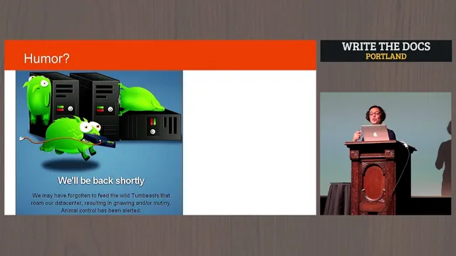
Examples illustrate what works and what backfires. A message like “unknown error occurred” feels cold and untrustworthy because it offers no empathy or direction. By contrast, an apology such as “could not reach the Netflix service” pairs humility with plausible context (network issues) and a concrete next step (check network settings). Some technical-sounding errors—like “exception has been thrown by the Target of an invocation”—fail because they use jargon users can’t act on. Even when humor appears to soften the blow, it can undermine trust if it skips the three H’s; jokes that don’t explain the problem or the consequences of clicking “retry” can feel like mockery, especially in high-risk contexts like banking.
Beyond tone, effective error writing follows practical usability rules. Users scan and skim when they’re already stressed, so the most important information must come first: acknowledge a problem, state what it is, then provide the next action. Avoid clutter and fancy explanations; if more detail is needed, it belongs elsewhere. Write with an “object first, action second” structure—lead with what the user needs to accomplish, then specify the action (e.g., “To return to the previous page, press the back button”). Use active verbs instead of passive phrasing to avoid sounding like responsibility is being dodged.
A final test frames the goal in human terms: how would the message sound to a non-technical person—like a 94-year-old grandparent using a tablet? The answer should be plain, direct, and empathetic. In the end, good error messages acknowledge the failure, apologize when appropriate, explain what’s known, and help users get back to what they were trying to do—fast enough to prevent trust from collapsing further.
Cornell Notes
Error messages aren’t just technical outputs; they’re a trust-repair tool when software fails. The talk breaks errors into user errors (the user did something wrong, like incorrect form input) and system errors (outages, bugs, database issues where the user isn’t at fault). Good messages follow the “three H’s”: humble (take responsibility even if it’s not fully your fault), human (use everyday language), and helpful (tell users what to do next and what to expect). Effective writing also prioritizes scanning behavior: put the problem first, remove clutter, use clear actions with active verbs, and avoid jargon or humor that skips guidance. The result is faster recovery and less frustration.
How should error messages differ for user errors versus system errors?
What are the “three H’s” and why does “helpful” carry the most weight?
Why do jargon-heavy errors undermine trust?
How can design choices like color and layout affect comprehension?
What writing patterns help users find the next step quickly?
When does humor in error messages backfire?
Review Questions
- What distinguishes a user error from a system error, and how should that distinction change the guidance you provide?
- How do the “three H’s” work together to rebuild trust, and what happens when one of them is missing?
- Rewrite this idea using the talk’s principles: “The page will refresh.” What object-first, action-second, active-verb version would you use for stressed users?
Key Points
- 1
Treat error messages as a trust-repair moment, not a technical footnote, because users interpret failures as broken reliability.
- 2
Classify errors as user errors or system errors to decide whether the message should correct input or explain an external failure.
- 3
Use the “three H’s”: humble (apologize and take responsibility), human (everyday language), and helpful (clear next steps and expectations).
- 4
Avoid jargon and vague statements like “unknown error occurred”; users need actionable, plain-language causes and fixes.
- 5
Design for scanning: put the problem first, remove clutter, and provide the next action immediately.
- 6
Write with “object first, action second” and active verbs to make instructions feel direct and trustworthy.
- 7
Don’t rely on color alone; pair icons and readable text so color-blind users can still recognize errors.