Customizing your Object Types ⚙️
Based on Capacities's video on YouTube. If you like this content, support the original creators by watching, liking and subscribing to their content.
Custom object types can be configured with per-type settings that change creation behavior, link rendering, and display layouts.
Briefing
Custom object types in Capacities can be tuned with extra per-type settings that make note-taking feel purpose-built—especially when different kinds of notes (meetings, interests, quotes, projects) demand different defaults. The biggest practical win is reducing repetitive setup: once a type is configured, new entries and embedded links automatically appear in the right format, with the right layout and the right level of detail.
A key setting is the calendar integration for custom object types that include a date-time property. When such a type is configured, Capacities adds a button to the daily note that creates a new object with the date automatically filled in. That button works for any calendar day: clicking it from “today” links the object to today’s date, while clicking it from a past daily note links it to that day instead. For workflows where one entry per day is the goal—like daily tracking—there’s an option to restrict creation to a single object per day. After the first object is created, the daily-note button disappears, preventing duplicate entries and keeping the information unified. For other types—like meetings—multiple entries per day remain possible when the restriction is not enabled.
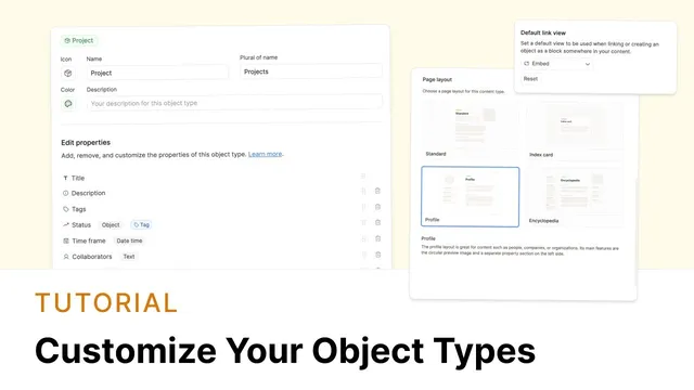
Another high-impact customization is the default link view. Links inside Capacities can render in different styles (for example, embedded views, small cards, wide cards, or standard inline links). If someone repeatedly changes the same object type’s links into the same view, the default link view setting can lock in that preference per object type. That saves clicks and makes embedded content feel consistent—projects can default to an embed view, while quotes can default to a small-card style that looks more inviting during review.
Templates extend the same “less friction” idea. Object type settings allow templates to pre-fill structure and formatting, including using date variables in titles so daily objects can automatically present the correct date. Templates can also include reusable text or formatting so recurring note types start from a ready-made scaffold rather than a blank page.
Layout options further tailor how information is presented. Capacities offers multiple page layouts—encyclopedia (properties left, blocks middle, sidebar right), index card (compact, quote-like), standard (properties with notes beneath), and profile (circular image with properties). For profile-style pages, image handling can be adjusted by cropping to fill the circle, and pages can be set to wide or centered widths depending on whether the content benefits from extra horizontal space.
Finally, card views in gallery-style browsing can be customized per object type. The card determines what’s visible at a glance (such as picture, object type, tags), and that choice propagates everywhere the view is used—so an embedded Einstein link can consistently appear as the same small card. For people object types, showing a content preview instead of the picture is one way to achieve the circular-image look. Overall, these settings are designed to impose structure that matches each note category, so users reach the right information faster and spend less time reformatting.
Cornell Notes
Capacities’ custom object types can be configured with per-type settings that change how entries are created, linked, displayed, and browsed. Date-time object types gain a daily-note button that creates new objects with the date auto-filled; an optional “one per day” restriction prevents duplicates for daily tracking workflows. Default link view settings reduce repeated formatting by making embedded links render in a consistent style (e.g., embed for projects, small cards for quotes). Templates can use date variables to auto-fill titles and formatting, while layout options (encyclopedia, index card, standard, profile) control where properties and content appear. Gallery card views let users choose what shows at a glance, and those card styles apply everywhere that view is used.
How does the calendar setting work for custom object types with a date-time property?
When should someone enable the “only create one per day” restriction?
What problem does the default link view setting solve?
How do templates and date variables speed up creating daily objects?
How do layout options differ, and what’s the practical impact?
What can be customized in gallery card views, and how does it affect embedded content?
Review Questions
- If a custom object type has a date-time property, what determines the date that gets auto-filled when creating an object from a daily note?
- How would you configure default link view settings to make quotes consistently appear as small cards while projects appear embedded?
- Which layout would best support reading notes where properties and content should be visible together, and why?
Key Points
- 1
Custom object types can be configured with per-type settings that change creation behavior, link rendering, and display layouts.
- 2
Date-time custom object types add a daily-note button that creates new objects with the daily note’s date auto-filled into the date-time property.
- 3
A “one object per day” restriction prevents duplicate daily tracking entries by removing the daily-note creation button after the first object is created.
- 4
Default link view settings reduce repeated formatting by making links for a given object type consistently render as embed, small card, wide card, or inline.
- 5
Templates can include date variables to auto-fill titles and formatting, speeding up repeat creation of daily objects.
- 6
Layout options (encyclopedia, index card, standard, profile) control where properties and content appear, including profile image cropping and wide vs centered page width.
- 7
Gallery card views define what’s visible at a glance and apply across the workspace wherever that card view is used.