How I Think Visually: My Sketched Mind in Action. Reflections on Exploring Visual PKM with Jerry.
Based on Zsolt's Visual Personal Knowledge Management's video on YouTube. If you like this content, support the original creators by watching, liking and subscribing to their content.
Start reading by mapping primary ideas from a book’s table of contents, then attach secondary and peripheral ideas as understanding deepens.
Briefing
A visual note system can turn reading into a living network of ideas—especially when illustrations and concepts are built from linked components rather than copied, embedded images. The central insight from the discussion is that changing a single element (like a typo or text layout) can automatically propagate across every place that element appears, and that this “cascade” enables a more connected, associative way to think about books, concepts, and their relationships.
The conversation centers on visual personal knowledge management (PKM) and the workflow behind “Sketch Your Mind,” a framework tied to a workshop and a self-paced course. The approach starts with mapping a book’s primary ideas before deep reading. In session one, participants create an “idea atlas” derived from a method associated with Richard Paul and Linda Elder: capture the table of contents first, then attach secondary and peripheral ideas as the reading deepens. The atlas is treated as a grounding structure—so the book doesn’t float as isolated notes, but becomes anchored to an explicit map of its core claims.
From there, the workshop moves through a sequence of hands-on outputs. Participants build concept maps and idea atlases, then create “concept visuals,” followed by story planning and visual “Zettelkasten” card creation. The cohort culminates in a “book on a page” showcase that consolidates the work into a single visual artifact. In cohort 13, the example reading includes Tiny Experiments, where the atlas begins at the table-of-contents level and evolves after listening to author podcasts or watching author videos.
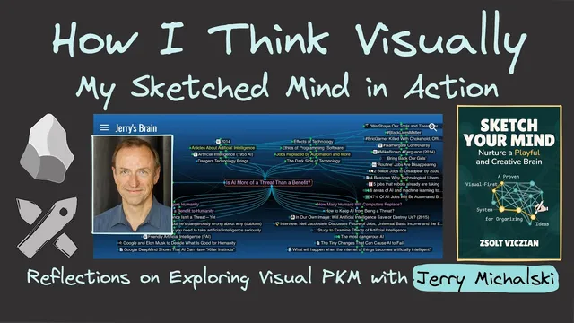
A key technical and creative point emerges around how illustrations are assembled. The system described uses linked, modular visual components—so an illustration is built from cards, which are built from smaller pieces. That structure matters because it makes edits global. Jerry Mikowski’s feedback highlights a common limitation in many illustration tools: reusing the same image doesn’t guarantee that changes ripple through every dependent illustration. The follow-up demonstrates the advantage directly: correcting a typo or adjusting text formatting in one place updates all drawings where that element appears, including multiple book-on-a-page contexts.
The discussion then connects this illustration “trickle effect” to navigation and association in Obsidian-based workflows. In this setup, images aren’t embedded inside each visual node; they’re linked to shared assets and to other notes. That design creates a “second dimension” of thinking: the same icon can appear across unrelated topics, and tracing its usage can surface unexpected conceptual connections. A standout example links a clock illustration to two different frameworks: the Greek time duality of Kronos (ticking, productivity) versus Kairos/Chyros (unfolding, presence), and James P. Carse’s contrast between finite and infinite games. Spotting the same clock across Tiny Experiments and Carse’s finite/infinite game discussion reframes “time in weeks” as a lived experience—some moments feel long, others short—and ties productivity seriousness to the playful, ongoing nature of infinite games.
Overall, the takeaway is that a linked visual system can make a knowledge base feel “alive”: reading produces visual summaries, summaries connect to other notes through shared components, and the resulting network supports reflection, discovery, and deeper understanding. The framework is positioned as an entry point via Sketch Your Mind, with further practice through the self-paced course and cohort-based hands-on sessions.
Cornell Notes
The discussion argues that visual PKM becomes more powerful when ideas and illustrations are built from linked components rather than copied, embedded assets. An “idea atlas” grounded in primary ideas (starting from a book’s table of contents) helps readers attach secondary and peripheral concepts as they go. Workshop outputs progress from concept maps to concept visuals, story planning, and Zettelkasten-style cards, ending in a “book on a page.” The most striking benefit comes from global edit propagation: fixing a typo or layout once updates every illustration that reuses the same element. When images are linked in an Obsidian-based system, tracing shared icons across notes can reveal unexpected conceptual connections—like Kronos/Chyros time and finite/infinite games.
How does the “idea atlas” method change the way someone reads a non-fiction book?
Why does listening to an author’s podcast or watching an author video matter in this workflow?
What is the practical advantage of building illustrations from linked cards and components?
How does the system in Obsidian create “associative navigation” beyond visual summaries?
What unexpected connection was found by tracing a shared clock illustration?
How do the workshop sessions translate the framework into concrete deliverables?
Review Questions
- What steps make up the idea atlas workflow, and how does it relate to primary vs secondary ideas?
- How does linked illustration design enable global updates, and why does that matter for consistency across a knowledge base?
- Describe the conceptual chain that connects Kronos/Chyros time to finite/infinite games in the clock example. What role did shared visual components play?
Key Points
- 1
Start reading by mapping primary ideas from a book’s table of contents, then attach secondary and peripheral ideas as understanding deepens.
- 2
Treat author media (podcasts/videos) as part of the knowledge capture process; build mind maps that preserve the author’s perspective.
- 3
Build visuals from modular, linked components so edits (like typos or layout changes) propagate across every dependent illustration.
- 4
Use a linked-asset approach in Obsidian so shared icons and images become navigation bridges between notes.
- 5
Trace where the same visual element appears across the vault to surface unexpected conceptual connections.
- 6
Structure practice around repeatable workshop outputs: concept maps/idea atlases, concept visuals, story planning, Zettelkasten cards, and a final book-on-a-page showcase.