Journey of collaborating on the Commander plugin with phibr0 and Johnny
Based on Obsidian's video on YouTube. If you like this content, support the original creators by watching, liking and subscribing to their content.
Commander centralizes command-adding functionality across multiple Obsidian UI surfaces, replacing earlier fragmented plugins that worked only in specific locations.
Briefing
Commander is an Obsidian plugin built to let users add and manage commands across many parts of the app’s interface—left ribbon, mobile quick actions, status bar, editor and file menus, and a newly released Explorer pane command. Its core value is UI flexibility: instead of scattering separate “add-command” plugins for each UI surface, Commander consolidates them into one polished system that makes it easier to add or remove command entries without hunting through settings.
The project began as a consolidation effort. Earlier, a customizable sidebar plugin existed for the left ribbon, while other developers created variants for other UI areas such as right-click menus and status/title bars. The idea behind Commander was to unify those capabilities into a single plugin that works across the interface, while also improving the experience. The team set two guiding goals: centralize command-injection plugins for different parts of Obsidian’s UI, and reduce the friction of configuring those command placements.
Collaboration shaped both the workflow and the product. With team members in different time zones, work ran asynchronously using an iterative approach that paired design and feature development to create fast feedback loops. Task management used ClickUp with a Kanban flow (backlog → to do → in progress → close), while design discussions happened in Figma through comment threads tied to specific UI regions. Code work moved through GitHub, and user feedback arrived via Google Forms and pre-made GitHub issue forms.
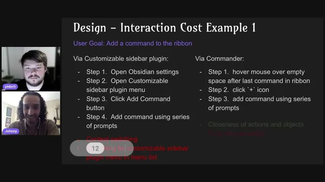
Design decisions were driven by two principles: keep Commander’s UI consistent with Obsidian’s core design language, and minimize “interaction cost”—the mental and physical effort required to complete a task. That thinking shows up in concrete UI changes. For example, adding a command to the ribbon used to require navigating through multiple settings menus and scanning for the right plugin panel. Commander replaces that with a hover-based “plus” affordance near the ribbon’s empty space, letting users perform the action closer to the target UI element. Another example targets hiding commands: rather than burying the action in a generic settings submenu, Commander surfaces “hide command” controls within the specific ribbon menu where the command lives, with the team considering a future right-click workflow directly on the ribbon.
On the engineering side, the plugin uses TypeScript and Visual Studio Code, with Preact chosen over React for size and mobile performance reasons—Commander stays under half the size of a typical React-based plugin. The team also reflected on what went well and what needs improvement: the collaboration process worked smoothly because expectations were aligned early and the project scope stayed manageable, but design files needed better organization and code needed cleanup.
Looking ahead, Commander’s roadmap focuses on improving macros (currently commands plus basic delays, with plans for editor-focused actions like typing), addressing GitHub issues, and continuing small UX refinements. The team’s advice centers on setting expectations early, designing with feasibility in mind so developers can implement efficiently, and sharing ideas early in community spaces with enough mockups or wireframes to ground the discussion. The result is a plugin that aims to feel native to Obsidian while making command configuration faster, more consistent, and easier to maintain across devices.
Cornell Notes
Commander is an Obsidian plugin that lets users add and manage commands across multiple UI surfaces—left ribbon, mobile quick actions, status bar, editor/file menus, and an Explorer pane command released recently. It consolidates earlier, fragmented “customizable” plugins that only worked in specific places (like the left ribbon or certain menus) into one more polished system. The team built it with an asynchronous, iterative workflow using ClickUp, Figma, Discord, and GitHub, and it’s guided by two design principles: match Obsidian’s design language and reduce “interaction cost.” Examples include hover-based “add command” controls on the ribbon and context-specific “hide command” options within the ribbon menu. The roadmap emphasizes better macros, issue-driven improvements, and ongoing UX refinements.
What problem does Commander solve compared with earlier command-injection plugins?
How does the team define and use “interaction cost” in its UI decisions?
What’s the ribbon example of reducing interaction cost, and what trade-off comes with it?
How does Commander handle hiding commands, and what future interaction is being considered?
Why did the developer choose Preact over React for Commander?
What does the collaboration workflow look like, and how does it support iteration?
Review Questions
- How do Commander’s design choices reduce interaction cost, and where do they intentionally accept trade-offs like lower discoverability?
- Compare the hover-based “add command” approach with a settings-menu approach: what steps are removed, and what new user risk is introduced?
- What criteria led to choosing Preact over React, and how does that choice connect to Commander’s target environments like mobile?
Key Points
- 1
Commander centralizes command-adding functionality across multiple Obsidian UI surfaces, replacing earlier fragmented plugins that worked only in specific locations.
- 2
Two design principles guide Commander: match Obsidian’s core design language and reduce interaction cost (mental and physical effort).
- 3
Hover-based UI affordances (like the ribbon’s plus icon) can cut steps dramatically, but they can also reduce discoverability.
- 4
Context-specific controls (like hiding commands within the ribbon menu) help users act on the exact UI element they’re working with.
- 5
The team used an asynchronous iterative workflow with ClickUp, Figma, Discord, and GitHub, plus structured user feedback via Google Forms and GitHub issues.
- 6
Preact was chosen over React to keep bundle size smaller and improve load speed, particularly on mobile.
- 7
Commander’s roadmap prioritizes macro improvements, issue-driven enhancements, and ongoing UX refinements informed by community feedback.