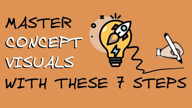
Mastering Concept Visualizations: A Simple Workflow for Creating Effective Visuals
Based on Zsolt's Visual Personal Knowledge Management's video on YouTube. If you like this content, support the original creators by watching, liking and subscribing to their content.
Define the visualization’s job first: decide what the viewer should think or feel after seeing it.
Briefing
Concept visualizations are a practical way to make abstract ideas easier to remember and understand by pairing images with targeted text—especially when the message is nuanced and not well served by a generic picture. They sit in their own category, distinct from fine art and from data visualization: the goal isn’t aesthetic perfection or charts, but functional clarity for concepts like metaphors (a rocket for “launch,” a typewriter for “author”) or for processes and flows (including step-by-step systems such as a PKM workflow). Used in presentations, storytelling, marketing, and teaching, the payoff is straightforward: visuals reduce boredom, improve recall, and help audiences grasp meaning faster when the chosen imagery matches the intended message.
The workflow for building these visuals starts with discipline rather than inspiration. Instead of waiting for a “muse,” the process begins by defining the message the visualization must deliver—what the viewer should think or feel after seeing it. From that message, the creator generates search-ready language: keywords plus synonyms and antonyms (often with help from ChatGPT) to widen the pool of possible images and avoid settling for the first obvious icon. The next decision is structural: determine whether the concept needs image-plus-text, text-only, a diagram, or a composed scene made from multiple icons. For simple cases—such as user interface design—a single icon can be enough.
Only after these choices come the search and sourcing phase. Inspiration can come from places like Flat icon, Google/Google Images, and The Noun Project, but the workflow warns against jumping straight into stock-image browsing before the message is clear. A key differentiator is reuse: before grabbing a new icon, the creator recommends checking an existing icon library—particularly in systems like Obsidian where images can be referenced and connected across notes. By copying icon references rather than new image files, the same visual element can link multiple ideas inside an Obsidian vault, increasing “connectivity” and making concept maps more informative. In Excalidraw Brain, reused icons can show how many parent and child nodes attach to a concept, revealing which ideas are most connected (for example, a “paper airplane” icon appearing across multiple notes and contexts).
The later steps focus on creativity as a loop, not a one-off event. The creator recommends building cognitive loops by sketching even when drawing skills are limited, externalizing ideas so they can be discussed, and seeking feedback from others to refine the visualization. Practice then becomes the engine: repeatedly translating messages into visuals, iterating on keywords and imagery, and returning to the work after a few days to strengthen the “muscle” for visual thinking.
To make the approach concrete, the transcript ends with an exercise: visualize how effective reading across disciplines requires identifying whether a subject is best understood as a system of supporting systems (likened to a pulley system where parts work together to lift a weight) or as a system of conflicting systems (likened to a central point pulled in multiple directions, where balance depends on competing forces). The point is to compare solutions and discuss why different visual metaphors fit the same underlying concept.
Cornell Notes
Concept visualizations translate abstract ideas into image-and-text representations that are easier to remember and understand than words alone. A repeatable workflow starts by defining the exact message the viewer should take away, then generating keywords plus synonyms and antonyms (often using ChatGPT) to search effectively. The creator recommends choosing the right format—image-plus-text, text-only, a diagram, or a composed scene—before looking for visuals. Sourcing should be paired with reuse: in Obsidian, reusing icon references from an existing icon library helps connect ideas across notes and improves concept-map connectivity. Creativity is treated as a loop: sketch, share for feedback, revisit later, and practice until visual thinking becomes a skill.
What makes a “concept visualization” different from fine art or data visualization?
Why does the workflow insist on starting with the message instead of searching for stock images immediately?
How do synonyms, antonyms, and homophone-style wordplay improve the search for visuals?
What’s the advantage of reusing icons from an existing library in Obsidian?
What are “cognitive loops,” and how do they fit into creating better visuals?
How does the final exercise illustrate the supporting-systems vs conflicting-systems reading skill?
Review Questions
- What steps in the workflow ensure the visualization matches a nuanced message rather than a generic stock-image metaphor?
- How does icon reuse change the way ideas connect inside an Obsidian vault compared with using one-off images?
- In the supporting-systems vs conflicting-systems metaphor, what does “balance” represent, and how should that affect reading strategy?
Key Points
- 1
Define the visualization’s job first: decide what the viewer should think or feel after seeing it.
- 2
Generate search-ready language from the message, including synonyms and antonyms, to avoid settling for the first obvious icon.
- 3
Choose the right visual format (image-plus-text, text-only, diagram, or composed scene) before searching.
- 4
Prefer inspiration sources like Flat icon, Google Images, and The Noun Project, but don’t start with stock-image browsing before the message is clear.
- 5
Reuse icons from an existing library—especially in Obsidian—by copying references so visuals connect across notes.
- 6
Treat creativity as iterative practice: sketch, share for feedback, revisit after a few days, and refine through cognitive loops.
- 7
Practice translating daily prompts (like quotes) into visuals to build “visual thinking” muscle over time.