Napkin AI is Transforming the Way We Create Research Visuals
Based on Andy Stapleton's video on YouTube. If you like this content, support the original creators by watching, liking and subscribing to their content.
Summarize research abstracts into three to four bullet points before turning them into visuals, since dense text makes slides harder to read.
Briefing
Napkin turns research text—like a paper abstract—into presentation-ready visuals in minutes, cutting the usual bottleneck of designing figures from scratch. The workflow starts by extracting a few key points from a source (often an abstract), then feeding that condensed text into Napkin, which generates diagram-style images that can be edited, styled, and exported directly for slides.
The process begins with choosing what to present: a peer-reviewed paper, a personal research project, or any research material. Instead of pasting long text into slides, the method recommends summarizing the abstract into three to four bullet points. To do that quickly, the transcript suggests using a large language model such as ChatGPT to convert the abstract into concise takeaways—aiming for the “rule of three” because it tends to read cleanly on a slide and avoids cramming audiences with dense information.
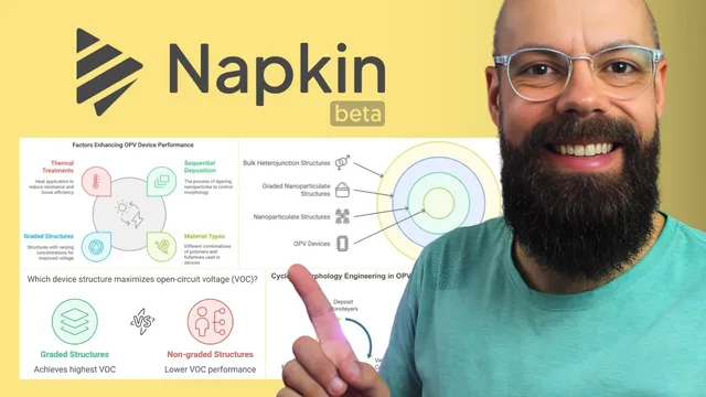
Once the key points are ready, they’re copied into Napkin via a “create new napkin” step. A “generate visuals” panel then produces multiple layout options, ranging from process-like diagrams to other figure styles. Some styles may not fit the content, but the user can iterate until a suitable structure appears. After selecting a preferred template, Napkin offers styling controls: adjusting colors, line thickness, whether the graphic sits inside a framed square, and other visual formatting choices.
Editing is handled directly on the generated graphic. Text can be changed by double-clicking elements, with options to toggle boldness and resize text for better readability. The transcript emphasizes that these adjustments are fast—using undo when needed—so the figure can be tuned to match the presenter’s tone and the slide’s design constraints.
Export options make the output immediately usable in research presentations. The graphic can be downloaded as PNG, SVG, or PDF, with settings for light or dark color modes and background visibility. The workflow also supports exporting individual figures derived from the same source text, which helps when a talk needs multiple visuals rather than a single summary image.
Finally, Napkin is described as being in beta and free for limited usage: users can create three napkins for free forever, with additional plans (including an Enterprise option) for heavier use. The overall takeaway is a practical pipeline: summarize research into three to four bullets with ChatGPT, paste into Napkin, generate and refine a diagram, then export in the format that best fits conference slides.
Cornell Notes
Napkin streamlines research slide design by converting condensed text (often a paper abstract) into editable, diagram-style visuals. The workflow recommends using a large language model like ChatGPT to extract three to four key points, since slides read better with fewer bullets. Those points are pasted into Napkin, which generates multiple figure templates; users then choose one and adjust styling (colors, line thickness, framing) and text directly on the graphic. Finished visuals can be exported as PNG, SVG, or PDF with options like light/dark mode and background control. With Napkin in beta, limited free usage is available, making it accessible for PhD students and researchers.
Why does the workflow push for three to four key points instead of using the full abstract on a slide?
How does the text-to-visual pipeline work from research material to a slide-ready figure?
What kinds of edits are possible after Napkin generates a visual?
What export formats and settings make the output practical for conference presentations?
How does Napkin handle multiple figures from the same source text?
What does the beta pricing description imply for researchers trying the tool?
Review Questions
- If a paper abstract yields five or six important ideas, what strategy does the workflow recommend to fit slide-friendly visuals?
- Describe the steps needed to go from an abstract to an exported PNG or PDF using Napkin.
- What editing controls in Napkin help align a generated diagram with a presenter’s design preferences?
Key Points
- 1
Summarize research abstracts into three to four bullet points before turning them into visuals, since dense text makes slides harder to read.
- 2
Use a large language model like ChatGPT to extract key points quickly from the abstract, then paste those bullets into Napkin.
- 3
Generate multiple diagram options in Napkin and iterate until the layout matches the content (process-like, structured, or other figure styles).
- 4
Refine the chosen graphic by adjusting styling such as color, line thickness, and framing, then edit text directly on the figure.
- 5
Export visuals in presentation-friendly formats (PNG, SVG, or PDF) with settings for light/dark mode, background, and high resolution.
- 6
Napkin’s beta offering includes limited free usage (three napkins free forever), with paid plans for heavier or professional use.