Random Numbers, Histograms, and Distributions in Desmos
Based on Duddhawork's video on YouTube. If you like this content, support the original creators by watching, liking and subscribing to their content.
Desmos’s normal distribution uses mean and standard deviation to set the bell curve’s center and spread.
Briefing
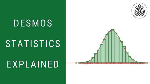
Desmos can generate random numbers from a chosen statistical distribution, then use those samples to build histograms that gradually “converge” toward the theoretical curve—especially for the normal distribution. The core workflow is: pick a distribution (mean and standard deviation for normal), generate many random observations from it, plot the results, and then compare a histogram of the sample to the distribution’s bell curve. As the sample size grows, the histogram’s shape becomes increasingly faithful to the underlying model, turning randomness into a measurable pattern.
The lesson starts with Desmos’s built-in normal distribution and how its parameters control the curve. Setting a mean of 10 and a standard deviation of 3 centers the bell curve at 10, where the highest density occurs. The standard deviation then quantifies spread: using the familiar empirical rule, about 68% of values fall within 1 standard deviation of the mean (7 to 13), about 95% within 2 standard deviations (4 to 16), and about 99% within 3 standard deviations (1 to 19). Cumulative probability is also used to interpret tail behavior—for example, the chance of getting a value below 4 is around 2.2%, making values outside 4 to 16 relatively uncommon.
With that distribution defined, Desmos’s random function becomes the bridge from theory to simulation. Using random with the normal distribution, a single draw produces one observation (such as 11.6, plausibly near 10). To generate a sample, the transcript uses a count parameter n (an integer) to create a list of random observations, then plots those points along the x-axis. A key practical feature is seeding: changing a seed value (like 1, 2, or 3) forces a different but reproducible set of random draws, effectively “rolling the dice” again for the entire sample.
The next step is histograms, which translate the raw random points into frequency bins. A histogram takes the dataset and a bin width, then counts how many observations land in each interval (e.g., between 3.5 and 4.5, 4.5 and 5.5, and so on). With only 10 observations, the histogram looks jagged and far from the smooth bell curve. Increasing the sample size to 100 makes the pattern clearer but still imperfect: even with a normal distribution, finite samples won’t match the theoretical shape exactly.
To make the comparison more meaningful, the histogram can switch from counts to relative frequency (so bin heights represent proportions, such as 0.15 for 15 out of 100 in a bin). As the number of observations rises further—into the thousands and beyond—the histogram aligns more tightly with the normal distribution curve. Adjusting bin width also matters: smaller bins produce a histogram that more closely traces the underlying density function. The result is a practical “reverse engineering” loop: generate data from a known distribution, build a histogram from that data, and watch the sample distribution converge toward the theoretical normal curve as randomness averages out.
Cornell Notes
Desmos can simulate random data from a chosen distribution and then visualize it with histograms. For a normal distribution, setting a mean (like 10) and standard deviation (like 3) determines where the bell curve peaks and how wide it spreads. Using the random function, Desmos generates n observations from that distribution; changing the seed produces a different reproducible sample. A histogram bins those observations and shows how often values fall into each interval. With small samples the histogram is noisy, but as the number of observations increases (and bin width is adjusted), the histogram’s shape converges toward the theoretical normal distribution curve.
How do mean and standard deviation change the normal distribution in Desmos?
What does the “68–95–99” style rule mean for values generated from N(10, 3)?
How does Desmos generate random numbers from a distribution, and what role does the seed play?
Why does a histogram look “wrong” with only 10 random observations?
What changes make a histogram converge toward the normal distribution?
Review Questions
- If the mean is changed from 10 to 7 while keeping the standard deviation at 3, what happens to the peak location and the expected ranges for 68%, 95%, and 99% of values?
- How would increasing bin width likely affect the histogram’s ability to match the smooth normal density curve?
- What effect should changing the seed have on the sample, and what should remain the same?
Key Points
- 1
Desmos’s normal distribution uses mean and standard deviation to set the bell curve’s center and spread.
- 2
The empirical rule provides expected ranges: about 68% within ±1 standard deviation, 95% within ±2, and 99% within ±3.
- 3
The random function can generate lists of observations from a specified distribution, producing simulated data for analysis.
- 4
A seed value makes random samples reproducible; changing the seed regenerates a different sample of the same distribution.
- 5
Histograms convert random samples into binned frequencies; small samples produce noisy, jagged histograms.
- 6
Switching to relative frequency and increasing sample size makes histogram shapes more comparable to theoretical distributions.
- 7
Smaller bin widths improve the histogram’s approximation of the continuous density curve.