How I Planned my PhD | 4 Year GANTT Chart in A4 Bullet Journal and Power Point | Digital Download
Based on Ciara Feely's video on YouTube. If you like this content, support the original creators by watching, liking and subscribing to their content.
Build a month-by-month Gantt chart that sequences analysis first, then writing, so paper and thesis deadlines have a clear work runway.
Briefing
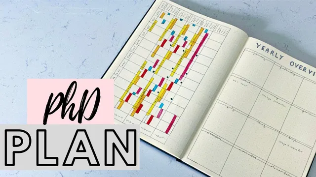
A four-year PhD plan is mapped out as a color-coded Gantt chart that turns an abstract research timeline into a month-by-month schedule of classes, analysis, paper writing, teaching/TA, conferences, holidays, and thesis work. The core value is practical: the chart makes deadlines and “what must happen before what” visible—so analysis work is scheduled ahead of paper submissions, conference deadlines are tied to deliverables, and recovery time (holidays) is treated as non-negotiable.
The plan spans roughly 2019–2023 and is built around a repeating rhythm common in computer science PhD work: collect or use data, run analysis and modeling, then write up results as papers or thesis chapters. Early on, the schedule includes a boot camp to bring students up to speed, followed by a stretch of coursework (mid-January to mid-May, and mid-September to mid-December). After the first year, the chart shifts away from classes toward teaching activities—specifically TA work—while keeping the same analysis-to-writing cycle.
Color coding distinguishes long, less-flexible commitments from research time. Yellow blocks mark fixed obligations such as boot camp and classes. An orange tone is reserved for analysis phases, which are treated as the engine of progress: half of an analysis period runs through December and January, then writing begins. Blue marks holidays, with an explicit emphasis on taking time off during a PhD to avoid burnout and to keep the overall plan realistic.
Paper production is scheduled as a sequence rather than a single event. One paper is already submitted by late February, followed by a short break, then a second paper moves through analysis and into writing. The chart also includes non-thesis activities that temporarily redirect focus—most notably an entrepreneurship course—plus conferences marked in green, with the expectation that submitted papers or general participation will align with those dates.
The schedule accounts for summer work beyond standard research cycles. It anticipates data collection during the summer, potential additional paper writing if new findings emerge, and an internship likely spanning three months in the second full year. The final year changes more noticeably: a live user study is planned over the summer, tied to following marathon runners up to an October marathon, and then the remainder of the timeline shifts toward finishing analysis and producing the thesis in a “main finished version,” ideally by December but more likely around three and a half years after starting.
To make the plan usable, the creator pairs an A4 bullet journal version with a digital version built in a PowerPoint-style table. In the digital setup, each month is represented as a grid of small cells (roughly week-sized), and filling the chart is done by selecting cells and applying color. The digital table is positioned as fast to customize and update—after the paper version is already planned—taking under 10 minutes to fill once the structure exists. The overall message is that a visual Gantt chart helps researchers coordinate papers, conferences, and thesis milestones while keeping time off and fixed commitments firmly in view.
Cornell Notes
A four-year PhD timeline is organized as a color-coded Gantt chart that links research tasks to real deadlines. The schedule follows a repeating cycle: analyze data and model results, then write papers or thesis chapters, with breaks and holidays built in as planned blocks. Early months include boot camp and coursework; later years shift toward TA/teaching while keeping analysis-to-writing as the core workflow. Conferences, an entrepreneurship course, an internship, and a final-year live user study are placed so deliverables line up with submission dates. A digital PowerPoint table version mirrors the A4 bullet journal and is designed to be quick to update, making it easier to track progress and adjust when plans change.
How does the plan structure PhD work across years, and why does that matter for meeting deadlines?
What role do fixed commitments (like classes and boot camp) play in the Gantt chart’s color system?
How are conferences, internships, and courses integrated without derailing the main research cycle?
What changes in the final year, and how does the plan handle a long-running user study?
Why include a digital PowerPoint table version in addition to the A4 bullet journal chart?
Review Questions
- If you were to copy this planning approach, what would you schedule first: analysis blocks or writing blocks—and what dependency does the chart assume?
- How does the chart’s treatment of holidays (as dedicated blue blocks) affect the realism of long-term PhD planning?
- Which elements in the plan are most likely to force schedule changes, and how does the color-coded system help manage those shifts?
Key Points
- 1
Build a month-by-month Gantt chart that sequences analysis first, then writing, so paper and thesis deadlines have a clear work runway.
- 2
Treat fixed commitments (boot camp, coursework, other long obligations) as dedicated blocks so research time is planned around them.
- 3
Mark holidays explicitly; recovery time is scheduled as part of progress, not as an afterthought.
- 4
Use separate color categories for analysis, writing, teaching/TA, conferences, and non-thesis courses to make tradeoffs visible at a glance.
- 5
Integrate conferences and submission deadlines by placing them alongside the analysis and writing work needed to produce deliverables.
- 6
Plan summer work beyond routine research by including data collection, potential additional papers, and internships as time blocks.
- 7
Mirror the plan in a digital table (e.g., PowerPoint-style grid) so updates are fast when circumstances change.