How to Make a Scientific Poster using Canva | Presenting Research Papers at Online Conferences
Based on Ciara Feely's video on YouTube. If you like this content, support the original creators by watching, liking and subscribing to their content.
Choose a landscape canvas size when online conferences expect screen-friendly posters, and use Canva’s Resize tool to match conference dimensions.
Briefing
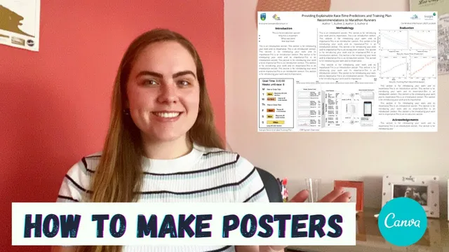
Scientific posters for online conferences are increasingly expected in landscape format, and Canva can be used to build a clean, readable layout when standard academic templates fall short. The core workflow is straightforward: start from a landscape canvas size, import key figures from the research paper, and then design the poster so it remains legible when viewed on screens and zoomed in.
The process begins with creating a Canva design on canva.com and choosing a poster size. Because many online conferences display posters on screens, landscape orientation matters even though most academic posters traditionally use portrait. With few ready-made landscape templates available, the approach is to create a custom template from scratch. Canva’s “Resize” tool lets the poster be adjusted to the exact dimensions needed, which is useful when conference guidelines specify particular sizes.
Next comes the figure-first layout. Graphs and other visuals are uploaded from a computer and placed into the poster, then resized to fit the overall composition. The key practical challenge is scale: posters are often viewed from a distance and then zoomed, so elements must be sized for both the full canvas and close-up readability. Canva’s grid and alignment guides help keep spacing consistent and ensure sections don’t look awkward when the poster is zoomed.
After the figures are positioned, the design fills in the academic essentials. A title is added along with affiliations and author information. Contact details are included in a dedicated area (formatted as first name dot last name, institute dot ie in the example), and each figure gets a short caption to clarify what the graphic represents. Font choice is kept intentionally simple for research presentation—readability first—though more stylized fonts can be reserved for social-media-style designs.
The poster then gets structured into sections using visual separators. Simple lines and light gray color blocks are used to divide content into an introduction, methodology, results, and an acknowledgements section. Canva’s color palette tools can match the tones already present in uploaded images, helping the poster look cohesive without manual color hunting.
Finally, the text content is arranged to match the poster’s purpose. The example uses a fairly text-forward layout with paragraphs and bullet points, but the balance is adjustable: some posters can be more bullet-heavy with larger fonts, depending on what makes the work easiest to understand. Conference metadata—conference name, date, and location—is added near the top so the poster is self-contained for attendees.
The takeaway is that a strong scientific poster isn’t just about aesthetics; it’s about engineering readability for screen viewing. Building a custom landscape template in Canva, with figures scaled for zoom, clear headings, and consistent spacing, turns research outputs into a format that conference audiences can actually parse quickly. The same Canva workflow can also be extended to other online conference materials, such as teaser trailers for papers.
Cornell Notes
Landscape posters are increasingly required for online conferences, and Canva can be used to create a custom layout when academic templates don’t fit. The workflow starts by selecting a poster canvas size (and resizing to conference dimensions), then uploading and placing key graphs from the paper. Figures are resized and checked for readability at both full-canvas and zoomed-in views, using Canva’s grid/alignment tools to keep spacing consistent. The design then adds academic essentials—title, affiliations, authors, contact info, figure captions, and conference details—followed by sectioning into introduction, methodology, results, and acknowledgements using simple lines and color blocks. The result is a cohesive, screen-friendly poster that can be tailored to the amount of text and visual density needed.
Why does landscape orientation matter for online conferences, and how does that change the poster-building approach?
What’s the most important step for figure placement in a Canva poster?
Which academic elements should be included beyond the main title and figures?
How can sectioning improve readability without overcomplicating the design?
How should font and text density be handled for research posters?
Review Questions
- When building a landscape poster in Canva, what checks should be done to ensure figures remain readable at different zoom levels?
- Which elements should appear in the poster’s header area besides the title, and why?
- How do simple separators and a consistent color palette help structure an academic poster?
Key Points
- 1
Choose a landscape canvas size when online conferences expect screen-friendly posters, and use Canva’s Resize tool to match conference dimensions.
- 2
Upload and place the most important graphs early, then resize them while checking legibility at both full-canvas view and zoomed-in view.
- 3
Use Canva’s grid and alignment guides to keep spacing consistent and prevent sections from looking uneven when zoomed.
- 4
Include core academic details—title, affiliations, authors, contact information, figure captions, and acknowledgements—so the poster is complete and self-contained.
- 5
Section the poster with simple lines or light gray blocks and clear headings (e.g., Introduction, Methodology, Results) to improve scanability.
- 6
Keep fonts readable for research audiences; adjust text density (paragraphs vs bullet points) to match what makes the work easiest to understand.
- 7
Add conference metadata (name, date, location) near the top so attendees can identify the context quickly.