The ultimate guide to Notion Charts (9 examples)
Based on Thomas Frank Explains's video on YouTube. If you like this content, support the original creators by watching, liking and subscribing to their content.
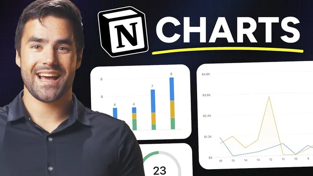
Notion Charts are native database layout views that graph directly from database properties, letting dashboards stay synced with live data.
Briefing
Notion Charts turn database views into live, configurable graphs—so teams can build dashboards that pull directly from their data instead of maintaining separate spreadsheets. The core breakthrough is that charts are “native layout types” for Notion databases: once a chart view is added, it can graph almost any database property, sort it, style it, and—crucially—respond to filters and formulas. That combination is what makes the examples practical, from tracking Pokémon stats to monitoring task throughput and sales performance.
The guide starts with a simple bar chart built from a Pokedex-style dataset. A chart view is created by switching a database view’s layout type to “Chart,” then selecting a chart type (vertical bar, horizontal bar, line, or pie). The x-axis is mapped to a property (like the Pokémon name), while the y-axis is mapped to a numeric property (like HP). The y-axis can use different aggregation modes—values, sum, or average—so the same chart framework can show individual records or rollups across groups. Sorting is then applied (for example, HP high to low), and styling options such as auto-color, grid lines, axis labels, and data labels help make the chart readable.
From there, the examples scale in complexity by changing what “grouping” means. Instead of plotting each Pokémon, the guide groups by Pokémon type and graphs the average HP per type. In task management, charts become operational: an automation sets a “completed” date when a task status changes to done, enabling a line chart that counts tasks completed each day. Another chart uses a relation between tasks and projects to show task status distribution per project, and a “workload” chart uses a horizontal bar layout with filtering to exclude completed tasks—so managers can see who is overloaded based on “to-do” and “in progress” counts.
Level two introduces formulas as a way to create new chart-ready groupings. A multi-select “type” property can’t directly produce only “single vs dual” categories, so a formula computes a “type count” (length of the type list) and the chart graphs that derived value. The guide then builds customer-specific sales charts using another formula (“order total”) that sums product prices across related sales records via map and sum. A line chart is filtered to a single customer, then embedded into a database template using self-referential filters—so every new customer page automatically gets its own chart.
Level three delivers multi-series comparisons. Notion can’t natively multi-series multiple properties from a single record, so the guide uses a modeling workaround: create a separate “stats” table where each row represents one stat value tied to a Pokémon, then group by stat type to generate multi-series charts. For sales comparisons, it creates formula properties that bucket orders into “current period” vs “last period” and compute “day in cycle,” letting a line chart compare the last 30 days against the prior 30 days on the same graph.
Finally, the guide addresses practical constraints: free plans get only one chart view, exports are limited (charts can be downloaded as PNG/SVG rather than exported normally), and future improvements are expected—especially drill-downs that would let users click a data point to see the underlying database rows. The overall message is clear: charts become genuinely powerful when combined with relations, filters, and formulas that reshape raw data into the exact groupings dashboards need.
Cornell Notes
Notion Charts are database layout views that graph data directly from Notion properties, enabling dashboards without exporting to spreadsheets. The guide shows how to map x- and y-axes, choose chart types (bar, line, pie), and use numeric aggregations like values, sum, and average. Practical dashboards rely on relations (tasks↔projects, sales↔products) and filters (e.g., exclude completed tasks) to control what data appears. Formulas unlock new groupings—such as “single vs dual type” via type list length or customer-specific sales totals via map/sum across related records. For multi-series comparisons, the guide uses data modeling and formula “bucketing” to compare current vs previous periods on the same chart.
How does a basic Notion chart decide what goes on the x-axis and y-axis?
Why do numeric aggregation options (values vs average vs sum) matter once grouping changes?
How does the “tasks done per day” chart get its x-axis data?
What’s the difference between showing tasks by project and building a workload chart?
How can formulas create chart categories that don’t exist as properties?
How does the guide build multi-series charts despite Notion’s limitation on multi-property series?
Review Questions
- In a Notion chart, what changes when the x-axis represents groups of multiple records rather than individual records?
- Describe how relations and filters work together in the workload chart to prevent completed tasks from skewing results.
- Why does the guide create a separate stats table for multi-series charts, and what properties does that table need?
Key Points
- 1
Notion Charts are native database layout views that graph directly from database properties, letting dashboards stay synced with live data.
- 2
Chart creation starts with selecting a chart layout type and mapping x-axis and y-axis properties, then choosing an aggregation mode like values, sum, or average.
- 3
Filters can be applied to charts to change which underlying rows contribute to the graph, enabling “active work only” views like workload charts.
- 4
Relations let charts pull from connected databases (tasks↔projects, sales↔products), making it possible to chart rollups that aren’t stored directly on a single table.
- 5
Formulas are the main tool for creating new chart categories and metrics—such as type counts, completion dates, and customer-specific order totals.
- 6
Self-referential filters in templates allow each new customer page to automatically show a chart filtered to that page’s customer record.
- 7
Multi-series comparisons often require data modeling (e.g., a stats table) and formula bucketing because Notion can’t multi-series multiple properties from a single record directly.