Tour of My 2022 Notion Dashboard (4 free templates)
Based on Red Gregory's video on YouTube. If you like this content, support the original creators by watching, liking and subscribing to their content.
The dashboard uses a full-year 2022 date database to generate month pages and a dynamic “this week” view filtered by a week-number formula (Monday–Sunday).
Briefing
A 2022 Notion “home base” dashboard is built to cut down on low-value task churn while still tracking goals, content, and results in one system. The centerpiece is a calendar-style daily workflow that feeds from a full-year database of dates, then funnels into a smaller set of goal and content databases—so the year doesn’t end with thousands of random entries that never mattered.
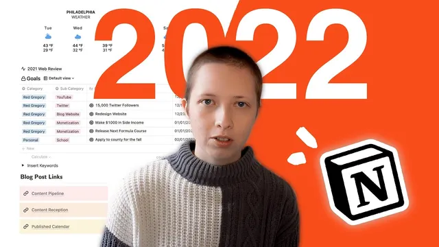
At the top of the dashboard sits an Indify weather widget for the week, followed by a “this week” view pulled from a 2022 database that pre-fills every day and splits it into month pages with custom cover images. Those covers are generated using Notion’s Files & media property set to card preview, letting each month page stay visually organized without cluttering the page body. Each day page includes a colorable timetable (7am–11pm) with columns for tasks and notes, leveraging recent Notion table features like colored columns.
Task management is intentionally constrained. Instead of creating recurring micro-tasks like “go walk the dog,” the system pushes scheduling toward tasks tied to broader outcomes. A favorites toggle exposes quick access to the underlying databases, including a “Step one” timetable page that prompts scheduling for today or the rest of the week. That week filter uses a formula based on Notion’s week-number formatting—matching dates between Monday and Sunday—so the dashboard always surfaces the right slice of the year.
Goals are handled separately in a dedicated goals database, designed to track ambitious targets without turning them into task spam. Each goal includes a start date, a time span (stored as a select), and a “desired end” formula that uses dateAdd to calculate the end date from the start plus the chosen time span. Progress rolls up from “keys to success” sub-goals via relations and a sum of checkbox completion, so checking off milestones automatically updates the parent goal. A timeline view maps each goal from start to desired end.
Content planning and performance tracking run in parallel through two linked databases: a content calendar for blog posts and a promotional post database for Twitter promotion. A Kanban-style pipeline moves items from ideation to published, with filters that keep the published board from filling up indefinitely (e.g., published after one week ago). Each blog post card stores SEO fields like sub headline, meta description, category, and keywords, plus a planned work window and a “reception” metric that gets assessed after the post has had time to perform.
Promotional tweets are connected directly to the blog posts. The system uses formula-driven checkboxes to prompt analytics collection after set delays: one week to fill likes/comments/reception, and three weeks to decide whether to repost. Additional views surface “social reception” and “insert social analytics” lists where analytics are still missing, making it easier to measure what worked and repeat what didn’t.
Finally, the dashboard includes a bookshelf system with genres, ratings, and cover rollups, plus a keyword list built from last year’s top search terms and expanded using Google Keyword Planner. The goal is to systemize SEO by reusing proven keywords in titles and article text. The result is a single dashboard that ties daily planning to goals, content production, promotion cycles, and measurable outcomes—without drowning in irrelevant tasks.
Cornell Notes
The 2022 Notion dashboard is designed to reduce “random task” clutter while still supporting daily planning, long-term goals, and content execution. A full-year 2022 database generates month pages and week views, using formula filters to show only Monday–Sunday tasks for the current week. Goals live in a separate database where a “desired end” date is calculated from a start date plus a time span using dateAdd, and progress rolls up from sub-goals via relations and checkbox completion. Blog and Twitter promotion are managed through linked databases with Kanban pipeline views and formula-driven prompts to collect analytics after one week and to decide on reposting after three weeks. The system also ties SEO keyword research to content planning and tracks reading via bookshelf/genre rollups.
How does the dashboard avoid turning recurring life tasks into thousands of entries?
What’s the mechanism behind the “this week” view in the 2022 date database?
How is a goal’s “desired end” date calculated from a start date and a selected time span?
How do blog posts and tweets stay connected, and how does the system prompt analytics collection?
What keeps the published content pipeline from becoming unusably large?
How does the dashboard operationalize SEO keyword research instead of treating it as a one-off task?
Review Questions
- Which formula-based approach ensures the dashboard shows only the current Monday–Sunday week, and what does capital W versus lowercase w change?
- Describe how progress rolls up from “keys to success” to a parent goal, including what property types are involved.
- How do the one-week and three-week formula checkboxes change the promotional tweet workflow over time?
Key Points
- 1
The dashboard uses a full-year 2022 date database to generate month pages and a dynamic “this week” view filtered by a week-number formula (Monday–Sunday).
- 2
Month cover images are created via Notion’s Files & media property set to card preview, keeping pages clean while staying visually organized.
- 3
Task management is intentionally constrained: daily timetables exist, but the system discourages recurring micro-tasks that don’t connect to goals.
- 4
Goals are tracked in a separate database with a desired end date calculated using dateAdd from a start date plus a selected time span, and progress rolls up from sub-goals via relations and checkbox completion.
- 5
Blog production uses a Kanban pipeline (ideation → published) with filters to prevent the published board from accumulating indefinitely.
- 6
Twitter promotion is linked to blog posts through relations and uses formula-driven checkboxes to prompt analytics after one week and repost decisions after three weeks.
- 7
SEO is systemized through a maintained keyword list built from past analytics and expanded with Google Keyword Planner, then applied during blog planning.